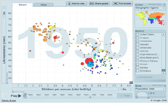
Data visualization is the visual representation of data in different formats like pictorial or graphical.
It actually abstracts a large amount of data to help people easily understand and make a decision on the data. It drills down insight into the data and pulls out the meaningful parts. It is basically used in the data analysis arena.
Data visualization is the art of representing the data in such a way that even a non-analyst can understand it very easily. It includes the use of elements like colors, dimensions, labels that can create visual masterpieces.

Jump to Section
Why Is Data Visualization Important?
Data visualization is a very important factor for the industry. It enables a human to easily understand a large amount of complex data using charts and graphs over spreadsheets.
You can do the experiment with data to explore the new scenarios by making real-time adjustments. It also helps the industry in many ways. It:
- Easily captures the areas in which data needs to be improved.
- Enables to easily understand customer behavior in particular areas through data.
- Helps you understand which areas need more attention through data.
- Enables forecasting total sales.
- Facilitates making a decision on a large number of data regarding prices, updates, and more.
Data visualization tools
Nowadays, data visualization tools are far better than spreadsheets. They offer better visualizations via infographics, geographic maps, bars, and charts after all.
These visualizations enable the user to manipulate or explore the data for analysis in a better way.
There are many tools for data visualization, but one of the best on the market is Tableau.
Data Visualization tools and spreadsheets
There are many tools for data visualization in the market that help you to create interactive dashboards. Each one of the tools has its pros and cons, so you should explore them to see what works best for you. My personal preference is Tableau.
Why invest in a tool like a Tableau?
I mean you can use Excel to accomplish the same thing instead, right?
From my point of view, Data visualization tools provide more benefits.
The capacity of most data visualization tools far exceeds those of Excel. Just a reminder, Excel has 1,048,576 rows by 16,384 columns. But some data visualization tools can have as much data as you have the memory to support it.
Data visualization tools also provide us endless and instant flexibility. They are in-memory analytic tools. It means that they load the data into your computer’s memory and it will allow you to slice, dice, and analyze data in real-time. They also need to be “read-only,” which means that it doesn’t destroy your actual data. That would be better, as it encourages you to experiment because you do not need to worry about destroying your data.
Data Connectivity Opportunities
Data visualization tools also provide more data connectivity opportunities than Excel does. A few applications can interface locally to an information source, which can either be CSV/Excel sends out, or guide associations with MySql, Google Analytic, and so on as it additionally encourages scalability.
You can easily hit a “refresh” button and the data is up to date by using a form of reference links instead of imports. This means that once you have built your report, you will never have to create it again.
Bring Data from Different Channels
Data visualization tools also help you to bring together your data from different channels so you can get a complete picture. This is vital because, in order to drive results in the digital space, you can no longer look at practices in silos. The same applies to your data. You can’t really create a strategy in the digital space without combining your channels into one place.
Core Difference Between Data Visualization and Spreadsheet Tools
Below are the differences between data visualization and spreadsheet tools:
1.) Exploring Data
Organizations remain competitive within their markets with the help of Finding key insights in data. Spreadsheet tools and data visualization tools differ greatly when we talk about the ability to explore data and find insights.
You must already have an idea of where the data needs to lead for you to find critical insights when working with Spreadsheet tools. Because excel saves data in a tabular format, it means you have to do the mapping to get your answer by building formulas and visualizations and analyzing the information. That is the reason that the process of drilling down into data is less flexible and makes it harder to explore information on a granular level.
On the other hand, data visualization tools allow you to freely explore data without knowing the answer you want ahead of time. You are able to spot correlations and trends with drill-down and data blending features that are built-in, and then dig down to understand what caused them to happen, rather than the other way around.
2.) Automation Functionality
Many organizations depend on up-to-date data to make critical decisions. Spreadsheet tools and data visualization tools can work with static and live data from multiple sources. A spreadsheet tool includes physically programming forms or making macros that consequently update the worksheet’s information when you open the document.
An easy macro can be created with Excel’s Power Pivot and macro recorder tools. When we are creating advanced macros or manipulating existing ones, we need to have Visual Basic Application knowledge. By the way, creating macros can be time-consuming, but reduces the time it takes to complete repetitive tasks in the long run.
When we talk about data visualization tools, it is simpler with creating processes and calculations. We can type the formula once, and then store it as a field. Then, it can be applied to all rows referencing that source when we are creating calculations in a tabular format. By this process, we can make it easier to create and apply recurring processes. Data visualization tools also provide users to create custom formulas.
3.) Visualizations
We first manipulate the data on the cell level, then manually create visualizations like graphs, charts, etc in Excel. To simplify visualization creation, first, we need to have a deep understanding of how the features of Excel work.
Data visualization tools visualize data from the start, and they allow you to see the consequence right away. Data visualization tools can differentiate correlations using color, size, labels, and shapes and give you context as you drill down and explore on a granular level.
Summary
You can say data visualization is art. Data visualization tools are very important for any organization because, with them, we can make a very easy and quick decision on a large amount of data on the basis of graph or pictorial representation. Data visualization tools are very easy that even a non-technical person can understand them easily.
- COVID-19: How We Are Dealing With It as a Company - March 23, 2020
- Agile Testing – The Only Way to Develop Quality Software - February 8, 2019
- How to Perform System Testing Using Various Types Techniques - May 16, 2018

