This article will help you understand one of the most important features of Power BI i.e slicers and waterfall model. Let me start with the waterfall model and then will be discussed as to when and where to use these features.
Waterfall Model in Power BI
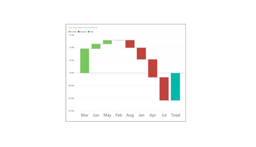
Waterfall model is used to show the running total as the value increases or decreases. Let’s First, understand what is running total. It is the summation of all values which is updated each time, a new value is added into the series into the Running Total. The other name of Running Total is Partial Sum. The waterfall model shows the same behavior whether running total increased or decreased based on positive or negative changes in the values. You can identify easily just by looking in the visual whether the value is increased or decreased by giving a different color format for increasing or decreasing. Waterfall model also called Bridge Charts because first and last values placed on the x-axis and other values creates a formation which depicts as a bridge. You can understand it better by looking in the image given below. This is a Waterfall Model. Now I will tell you as when to use this chart.
How to create a Waterfall Chart
We will need to create a Waterfall Model which will show estimated sales vs actual sales. For that, we will use the sample file provided by Power BI team. You can also get this file by login in the Power BI service.
Steps are as follows:-
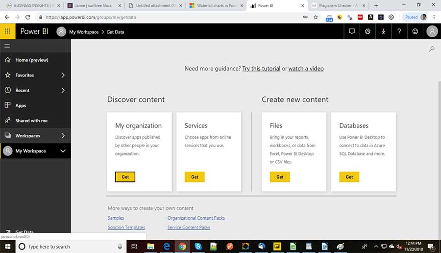
- Select Get Data which will open a get data window.
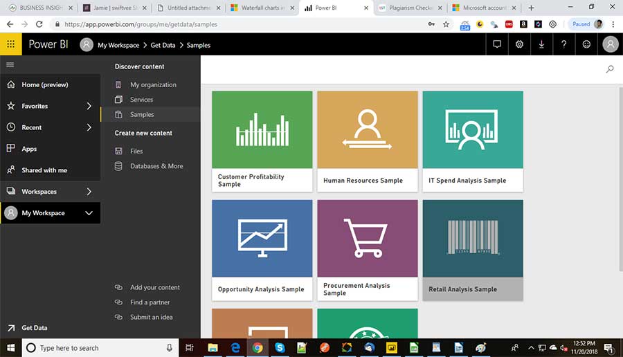
- Select Samples which will show all the sample reports. We need to select Retail Analysis Sample and start working into the report.
- First select the waterfall model from the visualization pane.
- Select the column Total Sales Variance from the field’s pane into the y-axis.
5 Select the column Fiscal Month and add in the category.
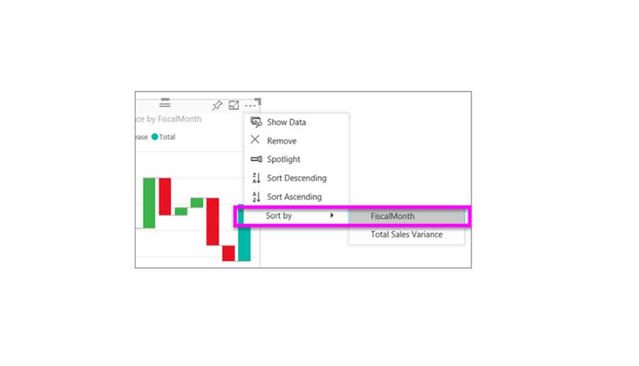
- Sort the graph by Fiscal Month column. On the top right corner of the graph click on (…) ellipses and then sort by fiscal month. The graph will look like as shown below.
- You can also drag the column Territory to the Breakdown filter to check the changes month by month.
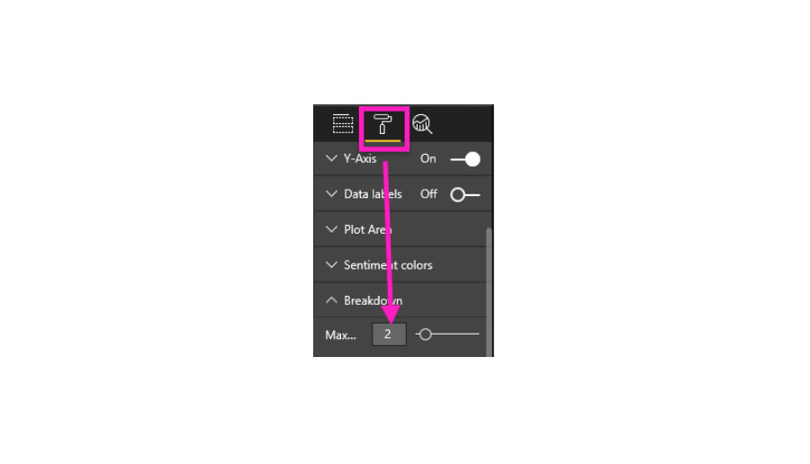
- We can add the contributors to increase or decrease by month. The default value is 5. But suppose if you want 2 contributors you can easily change it by going to Format and then select Breakdown and then select maximum value 2 as shown below.
Now let discuss about funnel chart.
How to create a Slicers in Power BI
To create and use a slicer we should first know as what is a slicer. Suppose you have a districts manager’s data and you have created a report for all districts managers. Now if you want to see the single District manager’s data then you definitely need to use slicer feature into your report. Slicer help in filtering out the required data based on the selecting option given in the slicer. Let’s understand it with an example.
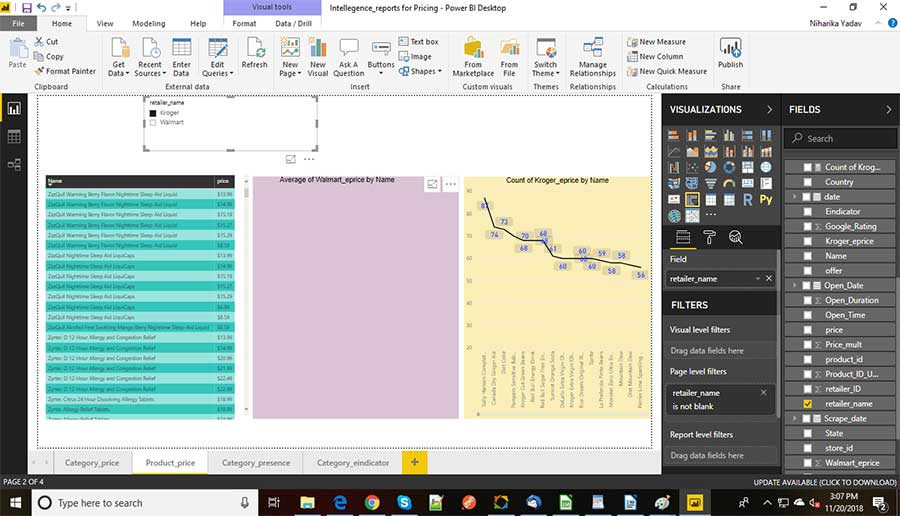
You can use any report to create it. Here I am using a Pitch competitor report which contains data of two big e-commerce organizations Kroger and Walmart. The report looks like as shown below.
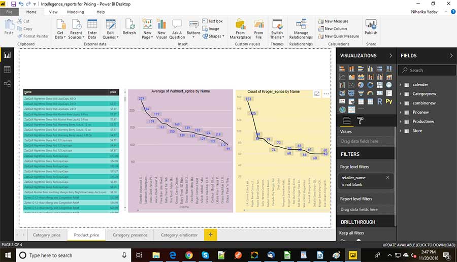
The report is showing the average price for each product and count of each product. Now our goal is to filter the data based on City, Zip and Retailer’s Name. It means if we select a City from slicer it will show the data based on selected city only. Now let’s create the slicers one by one starting with Retailer’s name.
Steps are as follows:-
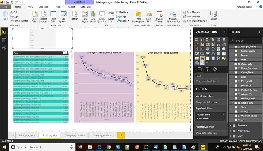
- Select the visual slicer from visualization panel as shown below.
- Drag the column Combine new> Retailer’s Name into the canvas. It will create a slicer with two options Kroger and Walmart as shown below.
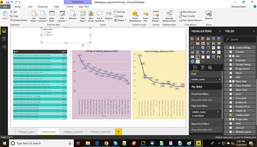
If you select Kroger from the slicer it will show data related to Kroger only and data related to Walmart is showing blank. You can also refer to the images shown below.
Similarly, The other two slicers will also be created by using the same approach as discussed above. Select the column with City and zip code accordingly and therefore, the data will be filtered depending on the selected data.
When to use slicer and its Limitations
Slicers are used in the following scenarios:-
- When you have a large amount of data and you are not able to see the complete data. In that case, you can filter the data based on slicer and can easily access the data.
- You can show the hidden column in the tables.
- Create a slicer by putting next to the important visual.
However, there are certain limitations:-
- It cannot be pinned into the dashboard.
- Slicer does not support visual level filters.
- Drill down is not supported.
Conclusion
In this article, we have discussed, what a waterfall model is and how to create it. We have also learned as what is a slicer followed by explaining as when to use it and how to create it with its limitations. I have briefed you about both the features of Power BI. However, If you have any queries then you can always write to me in the comment section given below.
Thank You.
- What Products Should You Sell on Amazon? - November 18, 2020
- 10 Reasons Why You Should Start Selling on Amazon - October 22, 2020
- Comparative Study of Top 6 Web Scraping Tools - September 3, 2020