Data Visualization is a clear platform of extracted data information which can be processed in a graphical or chart format. It visualizes the context like graphs, patterns, correlation, and trends. Due to these contexts data is easily recognized by using DV tools. Data maintains a visual report for better performance, operations, network, hardware, and statistics. Therefore, DV plays an important role in big data analytics because it really helps in mining the big number of data in a quick manner.
Jump to Section
Why Data Visualization?
Data visualization contains a visualize report of the final data. Then, it lets you interact and familiar with the data. DV tools go beyond data mining, data analysis, graphs, and standard charts. It can absorb the data in a quick format and allow users to make the fast & quick decision. It also plays a vital role in modern data analytics and advanced big data projects. Because at the end of the financial year for a company they needed sorting of the data. Here, DV tool helps to transform the big data into the data charts for understanding the data easily.
It has achieved a dominant position for newly Business Intelligence (BI) tools. There are so many data visualization tools but Google Charts and Tableau are the successful leading vendors for business intelligence. So, let’s understand most successful data visualization tools in brief.
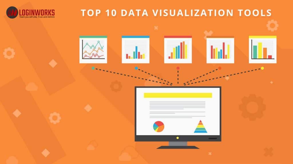
Top 10 Data Visualization Tools
- Tableau
- D3.js
- Google Charts
- Infogr.am
- Datawrapper
- Plotly
- NVD3
- Visual.ly
- Sigma JS
- FusionCharts
Tableau
It is the fastest data emerging data visualization and Business Intelligence tool. It creates a way for users to understand the data easily and make the better decision with the data. Tableau is well designed for sharing information, fast analysis, and visualizes the context of the data. It is also available for free for 1-year validity for tableau desktop version. Tableau contains its alternatives products like icCube, Exago, Spatial Key, ZAP Business Intelligence, and Cyfe etc. It contains big brand customers like Citrix, Pandora, and Barclays. It also contains tableau pricing for different professions as follows.
- Tableau Personal Edition: $35
- Tableau Professional Edition: $70
- Public Cloud Tableau Server: $35
- Tableau Complete Hosted: $42
Note: Tableau Reader and Public are available free. Also, Tableau Desktop and Server come with a free trial of 14 days (Complete features). You can also download it from its official website. But, after the trial period, you will have to pay for further use.
Features: Tableau
- Provides drag-&-drop and Toggle view.
- Patented technology developed from Stanford University
- List of native connectors for data view
- Highlight and data filter option
- Share dashboards, Embed dashboards and dashboard commenting
- Create interactive and Mobile-ready dashboards
- Data notifications of Tableau Reader for data viewing
- Create “no-code” solution for data queries
- Translate queries to DV tools
- Import all sizes and ranges of data
- Metadata management and Automatic updates
- High Security authentication at any level
- Tableau Public for data sharing
D3.JS (Data-Driven Documents)
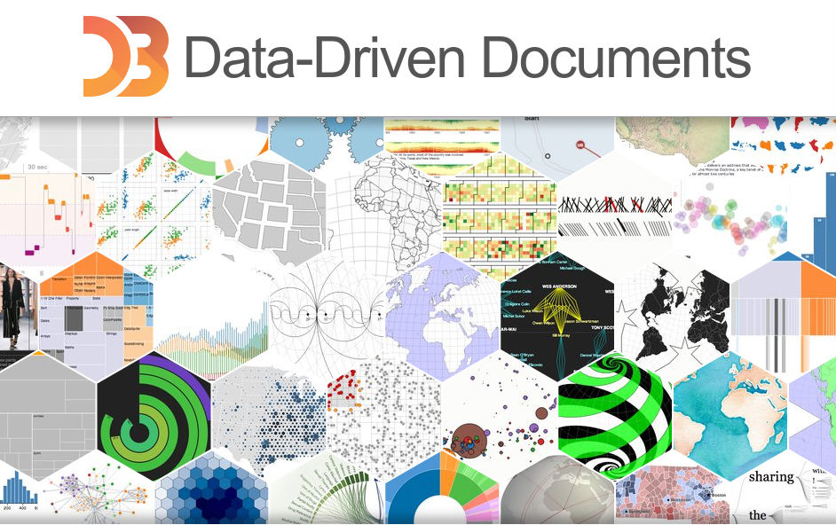
D3 is a JavaScript (JS) library which manipulates the documents based on the extracted data. D3 contains data in CSS (Cascade Style Sheet), HTML (Hyper Text Markup Language), and SVG (Scalable Vector Graphics) formats. It was released on Feb ’2011 and come under BSD license. First of all, D3 convert arbitrary data into the DOM (Document Object Model) session. Then, apply Data-Driven-Transformation (DDT) to the object document. An object document is modified by using W3C DOM application. It is a dynamic, online, and interactive DV tool that used in a big number of dynamic websites. D3.js is developed by Mike Bostock. As a result, it contains several pricing scenarios. So, let’s have a look into this as follows.
- Developer: $7 per month, It requires an only personal account and provide unlimited collaborator, public & private repositories.
- Team: $9 per month, it requires only company account details, Team permission, user permission, public and private repositories. Megapack of $25 for first five users.
- Business: $21* per month, it requires multiple companies information like LDAP, CAS, and SAML. 24/7 full backend support. Host server Azure, AWS, and GCP with quick response.
Features: D3.js
- It is easy to learn and use.
- More flexible than Tableau and Sigma
- Support a large number of datasets.
- Flexible curve functions.
- Open source environment
- No need of plugin for work.
- Amazing data visualization
- It is reliable and robust. So, you can easily download the small part of D3.js that you want to use.
- No need to download complete data library.
- DOM data manipulation
- Easily build chart component.
- Program reusability.
Google Charts
Google charts create a dynamic web service that further develops graphical charts. It is purely based on JavaScript library which is used to develop web applications by using interactive Google charts. It contains a wide range of charts gallery like as spline charts, pie charts, area charts, line charts, and bar charts etc. To understand the Google charts, you will need the basic understanding of HTML and CSS script code. Charts are made up of SVG forms like Chrome, Safari, Firefox and Internet Explorer.
Features: Google charts
- Google charts are totally free to use and open source for the non-commercial environment.
- Woks dynamically on all browsers and mobile devices like as iOS and Android.
- It supports multi-touch screen platforms like iOS (iPad/iPhone) and Android (Cell Phones/Tablets)
- It contains light weighted library call as loader.js
- Google charts use “Json“ to configure the charts.
- Allow modification even after chart generation
- No restriction for axis (x, y). It supports both on multiple charts.
- Prints dynamic charts using web pages.
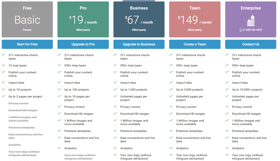
Infogr.am
![]()
Infogr.am is a way to create interactive and beautiful charts, infographics and maps etc. It is an application based framework and created in Latvia and Riga. This tool also defines the digital chart to share the information in a corporate world. It does not need any programming code to use it. It was founded in June 2012. The great thing about this tool, it is available in 4 international languages like as German, French, Spanish, and Portuguese. You can switch any language by clicking on the drop-down menu button. Data works in synchronization while working with big data. As a result, let’s understand its pricing as follows.
Features: Infogr.am
- Free to use and easy to learn
- Strong and attractive visualization
- Multiple contrast options
- User-Friendly (UF) Interface
- Data Reliability and Simplicity
- It allows adding beautiful GIFs and stickers
- Provide AMP support.
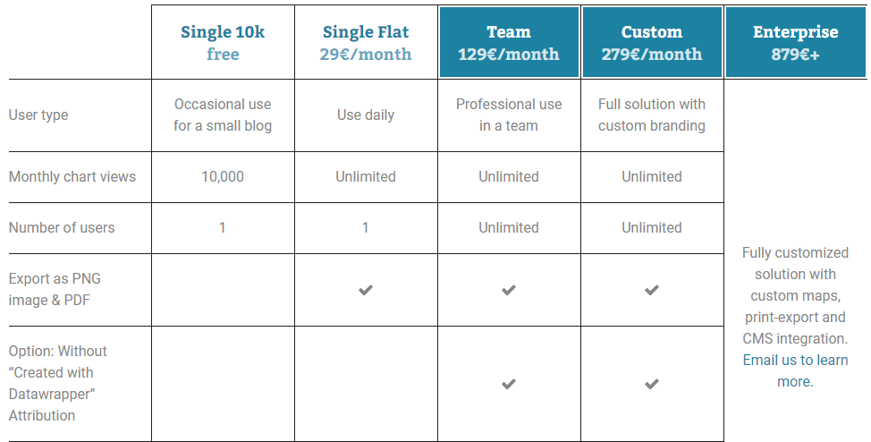
Datawrapper
Datawrapper is an open source visualization method to create simple embedded charts in minutes. All charts are totally hosted based on “datawrapper.de”. You can also make your own data visualization plugins. It was founded by Kayser-Bril, Nicolas, Gregor Aisch, and Mirko Lorenz. It also available in five international languages like as French, Spanish, Chinese, Portuguese, and Italian. This tool does not need any programming language to introduce the result. It contains the very simple process to visualize the data. First of all, take the data and then copy & paste into the tool. It will take a while then it will publish your data in a minute in graphical format. As a result, let’s understand its pricing schema as follows.
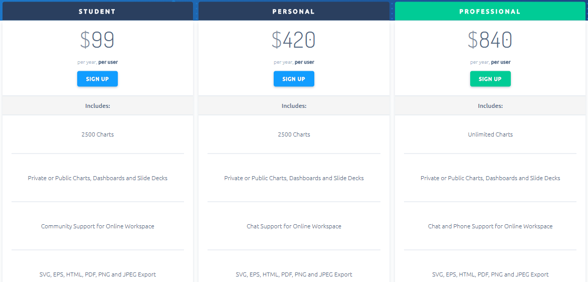
Plotly
It is a technology-based company that is well known for its URLs. Plotly was founded by Chris Parmer, Alex Johnson, Jack Parmer, and Matthew Sundquist. It develops online tools like Analytical and Data Visualization tools. It supports online data visualization, graphical representation, statistics, and analytics collaboration libraries for REST, Python, R, Perl, MATLAB, Julia, and Arduino. Now, let us understand its pricing schemas as follows.
Features: Plotly
- It creates many charts like heat maps, scatters plots, histograms, bar charts, error bars, 3D (WebGL based), box plots, line plots, subplots, multiple-axes, and charts, and area charts.
- It requires the basic touch of programming languages like R and Python.
- Most of all charts are represent in R-Graph.
- It contains big SQL client chat and phone support.
NVD3
NVD3 is a flexible framework that turns the data into dynamic charts. It is a reusable component of “D3.js”. NVD3 requires basics of JavaScript programming and (HTML/CSS). It also provides simple line charts for better user understanding. NVD3 comes under Apache license 2.0. It also creates multiple-bar charts. It contains a huge number of data charts format and every format contains their backend source code. To download this data visualization tool, you will need a library “d3.v3.js”. NVD3 provides powerful analytics to its clients for the finance industry.
It contain many types of charts like as MonitoringCharts, BulletChart, forceDirected, LineChartZoom, DiscreteBarChart, MultiBarChart, MultiBarChart2, MultiBarHorizontalChart, DonutCharts, PieCharts, ScatterChart, SparklinePlus, parallelCoordinates, linechart, CandlestickChart, HistoricalBarChart, ohlcChart, sunburst, boxPlotCustomModel, CumulativeLineChart, TimeSeries, ScatterPlusLineChart, LineWithFocusChart, boxPlot, MultiChart, StackedAreaChart, LinePlusBarChart etc.
Visual.ly
![]()
Visual.ly creates a visual content platform that creates infographics and data visualization reports. It was launched by Adam Breckler, Tal Siach, Lee Sherman, and Stew Langille in 2011. Visual.ly is used only for commercial purpose. It allows high-quality data for visualization content. It also provides service in different format like Ebooks, Social Media, Photography, Videos, Infographics, Interactive Microsites, and Report & Presentation etc. 80% stakeholders reported that visual.ly is more effective as compared to other text-based tools. It delivers fast service to its client and it has made trust with big MNC’s like Cisco, Salesforce, Spotify, AMEX, VISA, Gerber Life Insurance, Rosetta Stone and so on. It is free to download for simple design and infographics.
Sigma JS
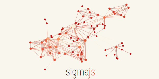
Sigma JS is a JavaScript library that is used to create the interactive graphical presentations. These days JS framework is being published for data visualization. It supports vivaGraph.js, alchemy.js, and d3.js data visualization tools. In comparison with these tools, sigma.js is very popular. Because it creates face directed graph with built-in functions. Sigma.js works on an algorithm as “force atlas 2”.
It is well designed to create customized web applications that turn the data into data visualization. Sigma executes on any dynamic browser that supports canvas. Sigma.js works faster with “WebGL” browser. It also contains its APIs like as Camera API, Render API, Graph API, Public API, and Event API etc. It also requires basic of JavaScript programming. Sigma.js is free to use, you can download this tool for free. Just go to the website and you will find the download option at the front.
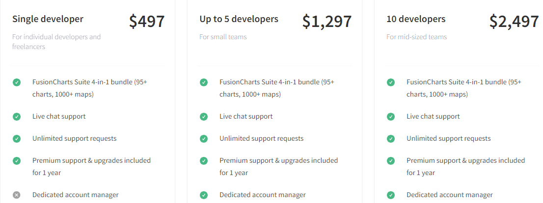
FusionCharts
FusionCharts is a multi-national software organization that is a part of Info soft Global Ltd. It supports interactive charts solution with 90+ charts and 1500+ maps. It covers highly extensible plugin for most popular frameworks like JQuery, ASP.NET, and Angular.JS. Due to these frameworks, you can easily integrate FusionCharts with other libraries and current stack.
It contains features like customization of charts, exploring and exportation of charts, integrating with the server-side script, automatic selection of right visualization of your data. It provides beautiful chart gallery like as 2D & 3D Pie Charts, FusionMaps XT, Column & Bar Charts, Line & Area Charts, FusionCharts XT, FusionWidgets XT, Combination Charts (Dual Y), Pareto Charts PowerCharts XT, Stacked Charts, Combination Charts (Single Y), Bubble & XY Charts, Charts Zoom, and Scroll Charts etc. As a result, let’s understand the pricing scenarios as follows.
Conclusion
I hope you enjoyed this article, there are a lot of DV tools but I only informed top 10 tools. These tools are much in demand these days. But, the tableau is one of the most emerging tools for data visualization. I informed basics of these tools including their features and pricing conditions. If you are planning to enter in Business Intelligence industry, then these tools will help you to improve your career growth.
Thank you!
I excel when it comes to making bespoke data dashboards and visualizations that users and clients absolutely love. Sharing about things I enjoy doing is my hobby, whether it's about a project, collaboration, feedback, or just simple how-to guides about visualization.
If you have something to ask or share, I'd love to hear from you!
- Business Intelligence Vs Data Analytics: What’s the Difference? - December 10, 2020
- Effective Ways Data Analytics Helps Improve Business Growth - July 28, 2020
- How the Automotive Industry is Benefitting From Web Scraping - July 23, 2020
1 thought on “Top 10 Data Visualization Tools”