You all must be aware of the term and if not now you will definitely be aware after reading the blog.
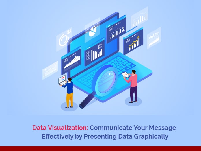
Data visualization is the presentation of data into various pictorial formats in a very attractive and effective manner. Data is presented keeping the audience in mind.

The concept of data visualization is taken from the common human concept from the way the human brain processes information. It is easy to read the data if we use charts or graphs to visualize the large amounts of complex data lists or reports.
Jump to Section
What Is Data Visualization?
Data visualization is an effective way to convey a message to the viewers. You can filter and experiment with the different scenarios by making slight adjustments in the visuals. The data visualization makes it easier to detect patterns, trends, and outliers in groups of data.
How We Do Data Visualization Right
Researching from the different sources, the Loginworks team gathers the information that the world produces (which is 2.5 quintillion bytes of data every day). The total data we have gathered is vast. We have greatly expanded our data gathered in the last 2 years.
Now, this is too much data to handle and difficult to manage and does not make sense at all. Even the person who generated the data is unable to understand it. Data visualization is used to represent this data in an interactive form. The goal is to communicate the data sense to the person who needs information.
Thus, the improved quality of data can give meaningful insights and make it easy for faster decision making for various and important industries.
To distinguish, filter the data, and fetch the information the various types of charts, plots, graphs, matrix, tables are used. The future scope in data visualization is high as with the enormously increasing data day by day.
Business Intelligence Tools
At Loginworks, we use different Business Intelligence tools such as Tableau, QlikView, Qlik Sense, SAP Lumira, Sisense, Google Data Studio, and Microsoft Power BI, among others.
- The very first common goal to use business intelligence software is to turn data into insights and action.
- BI tools help in faster reporting, analysis, or planning.
- They help to improve data quality.
- BI tools help in making better business decisions.
- They help to create an attractive dashboard to represent your data.

You can download Power BI from the link given below:
https://www.microsoft.com/en-us/download/details.aspx?id=45331
You can check the tutorial provided by Microsoft from the link given below:
https://powerbi.microsoft.com/en-us/learning/
Power BI is a business intelligence tool. It gives you multiple data connectivity sources. It also offers a variety of visuals to represent your data. Therefore, you can instantly share your BI reports anywhere and on any device.
The end-user can create their own reports in minutes using the drag-and-drop functionality provided.
Power BI and DAX Function
It seems easy to work on Power BI using the drag and drop functionality. The power of Power BI is the Data Analysis Expression language (DAX) function.
Microsoft introduced the DAX with Power Pivot in Excel in 2010. Data Analysis Expression language (DAX) is a functional language similar to Excel functions. DAX has more powerful functions in comparison to Excel.
- There are two types of calculations to work in DAX. First, the calculated column. Second, is the calculated measure.
- Both have different behavior and different uses.
- The DAX functions used are the same.
- The data model stores calculated columns and uses RAM.
- While the Calculated Measures do not store in the data models.
Power BI Has a Cost
The Microsoft Power BI is a paid tool and it provides you 30 days trial period. Hence, you can easily master it in 30 days if you utilize it every single day. Meanwhile, Practicing DAX functions will build a strong logic, which will help to manipulate or simplify the data in any way you want.
Power BI provides you with a very decorative and interactive way to communicate with the data with its reports. Thereafter, you can show seasonality and trends. The slicer gives the flexibility to filter the other visuals on the page. Furthermore, to change the scenarios according to the time or the other entities.
Power BI Has Inbuilt Themes
Apart from that, there are various beautiful options for color palettes. In addition, Microsoft provides the inbuilt Microsoft themes in the Power BI desktop. As a result, to beautify the dashboard reports, you can apply a custom Report Theme. Thus, for that, you need a JSON file to load into Power BI Desktop and apply it to your report. In fact, You can get the various theme JSON file online from the Microsoft marketplace.
With Power BI, You Can Save Reports for Later Use
As a rule, from Microsoft Power Bi Desktop, you can publish a Power BI report to the Microsoft Power Bi Service. Thereafter, the report is saved into the Favorites, Recent, and My Workspace. Lastly, you get the feature to generate links and share your report with your coworkers, client, or others. When you share a dashboard or report, the people you share it with can view it and interact with it, but cannot edit it. In conclusion, you cannot share the report or dashboard directly from Power BI Desktop.
Power BI Updates
Many new features are added like artificial intelligence and machine learning. As a result, Microsoft power BI is becoming a more powerful analyzing tool with such wonderful upgrades.
We are living in a world of digitalizing and social media platforms. Data is the heart of every industry platform nowadays. It can be the most powerful weapon in the world and for the world. It is said to be true that “Presenting the data graphically is an Art of the Data Visualization to Communicate Your Message Effectively”.
We hope you liked our blog. Please feel free to share your feedback and comments in the section below. To know more about our services please visit Loginworks Softwares Inc.
I excel when it comes to making bespoke data dashboards and visualizations that users and clients absolutely love. Sharing about things I enjoy doing is my hobby, whether it's about a project, collaboration, feedback, or just simple how-to guides about visualization.
If you have something to ask or share, I'd love to hear from you!
- Business Intelligence Vs Data Analytics: What’s the Difference? - December 10, 2020
- Effective Ways Data Analytics Helps Improve Business Growth - July 28, 2020
- How the Automotive Industry is Benefitting From Web Scraping - July 23, 2020
Very Useful Post