Jump to Section
Data Visualization
Data visualization is the presentation of data into various pictorial formats in a very attractive and effective manner. Data is presented in keeping the audience in mind.
The concept of data visualization taken from the common human concept of the way the human brain processes information. It is easy to read the data if we use charts or graphs to visualize the large amounts of complex data lists or reports.
Data visualization is an effective way to convey a message to the viewers. You can filter and experiments with the different scenarios by making slight adjustments in the visuals. Data visualization makes it easier to detect patterns, trends, and outliers in groups of data.
In theory, data visualization sounds great. Who wouldn’t rather show their business metrics in visuals than in raw numbers? But that can be a lot more complex in practice. When you are working with the wrong tool, importing data can be tough. Then actually using it to build visual charts and graphs that make sense can be next to impossible.
Nonetheless, data visualization need not be complicated. Klipfolio’s dashboard solution simplifies every part of the process of data visualization. Import your data easily. Then the dashboard tool to create a variety of nice visualizations of results.
It’s that easy, with Klipfolio.

Klipfolio

Klipfolio is a Canadian software company founded in 2001 and headquartered in Ottawa, Ontario. With the emergence of XML, RSS, news aggregators, and widgets in 2001, the company initially focused on the consumer market and later moved into the dashboard and business intelligence space.
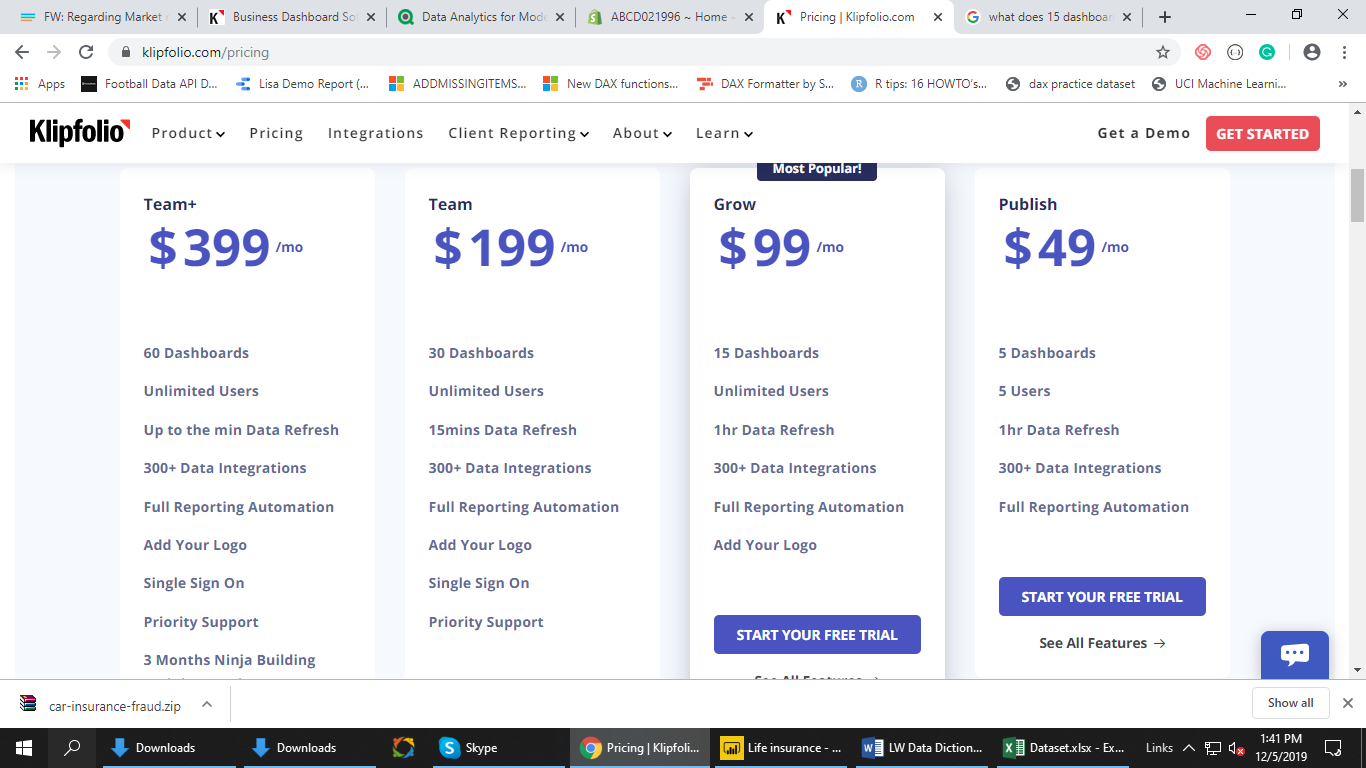
It offers you a flexible dashboarding and reporting tool that delivers performance, simplicity, concurrency, and affordability, not possible with other business intelligence tools. Klipfolio is the perfect tool to the most intelligent business decisions, take the best course of action, and drive your business towards success and help to build a data-driven team culture that promotes sharing within teams and throughout your organization. The trial is for 14 days, and the package is shown in the figure.
Starter Plan – $29/mo (billed monthly)
- 4 Users
- 4 Dashboards
- Klip Editor
- Mobile App
- Publish Links
- Usage Statistics (Beta)
Publish Plan – $49/mo (billed monthly)
- All Starter plan features, plus:
- 8 Users
- 8 Dashboards
- Download Reports
- Email Reports
- Embeds
- Client Management
Grow Plan – $99/mo (billed monthly)
- All Publish Plan features, plus:
- Unlimited Users
- 20 Dashboards
- Advanced Usage Statistics (Beta)
Team Plan – $199/mo (billed monthly)
- All Grow Plan features, plus:
- Unlimited Users
- 45 Dashboards
- SSO
Klipfolio also presents data in a very detailed way via beautiful and customizable dashboards, enabling users to collect the information they need to make better business decisions. Various components and pictorial graphs used in Klipfolio dashboard such as presentation components, Bar/Line Chart, Table, Value Pair, Sparkline, Pie Chart, Scatter Chart, Bubble Chart, Gauge, Map, Image, Inline Frame, User Input Control, Funnel Chart, Button, Pictograph, HTML Template, and News.
Features of Klipfolio
- Issue Indicators
- Predictive Analytics
- Trend Indicators
- Automatic Scheduled Reporting
- Customizable Dashboard
- Customizable Features
- Financial Forecast/Budget
- Graphic Benchmark Tools
As you know, there are many things you can do with a Klip dashboard; for example, you can view it in full screen or as a slideshow. You can also share Klip dashboards by generating published links or by email attachment.
Klipfolio Provides two inbuilt features to create KPI, i.e., Klips and PowerMetrics. Although in Klipfolio, you can use both PowerMetrics and Klips; one may be more suitable for your needs.
As in brief, PowerMetrics offer the ability to:
- Gain an understanding of your data using best-practice business metrics
- Retain historical data and make comparisons so you can see trends over time
- Interactively explore your data trying out different visualization types, applying various date ranges, and choosing unique ways to segment and filter your data
- Work with transactional data
- Create charts with dynamic series
- Remove dependency on formulas and calculations
- Leverage modeled data sources to enable preparation before PowerMetric creation
- Work faster – build visualizations in seconds
- Change visualizations with a single click.
- Apply filters and choose date-ranges instantly.
Whereas the other, Klips offer the ability to:
- Leverage full customization of your visualizations using formulas
- You can use the Klip Editor to build customized Klips
- Track more than a single value/metric
- Use either modeled data sources or unmodelled data sources
- Build using a variety of components, for example; you can add a user input control or a button that works with variables you create. You can also build with components such as pictographs and HTML templates. There are no limits when building Klips.
Here we have created two dashboards using the Klipfolio, describing you the first dashboard:
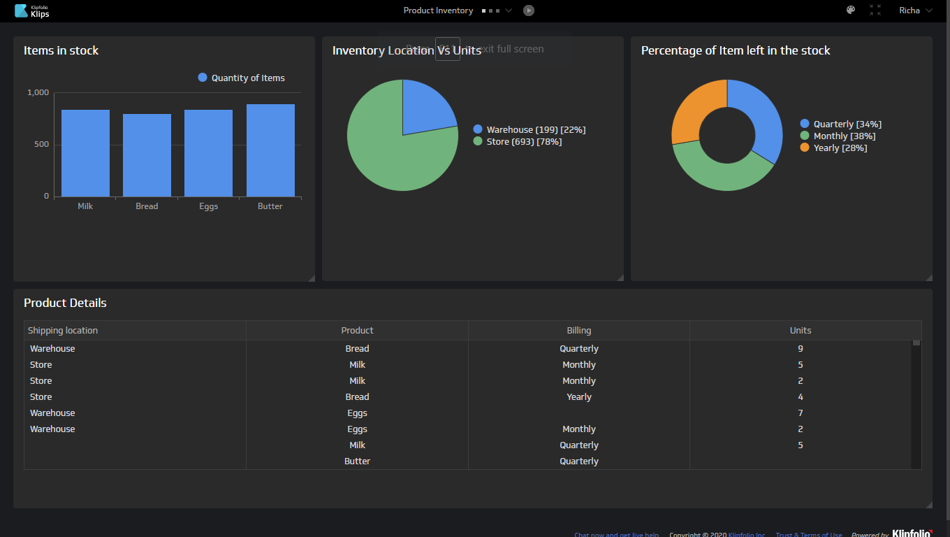
Product Inventory Dashboard:
For instance, Our Data Analytics team has visualized the data showing the total stocks and goods available in the inventory.
Following are the KPI’s:
a. Items in stock: Bar chart showing the different items and quantity of that item in stock.
b. Inventory Location Vs. Units: Pie chart showing the total units are in stock in the warehouses and the store.
c. Percentage of the item left in the stock: Pie chart showing the overall percentage of item-unit remain in-stock.
d. Product Details: Table showing the details of Shipping location, Product, Billing, Units.
Here is the description of the second dashboard:
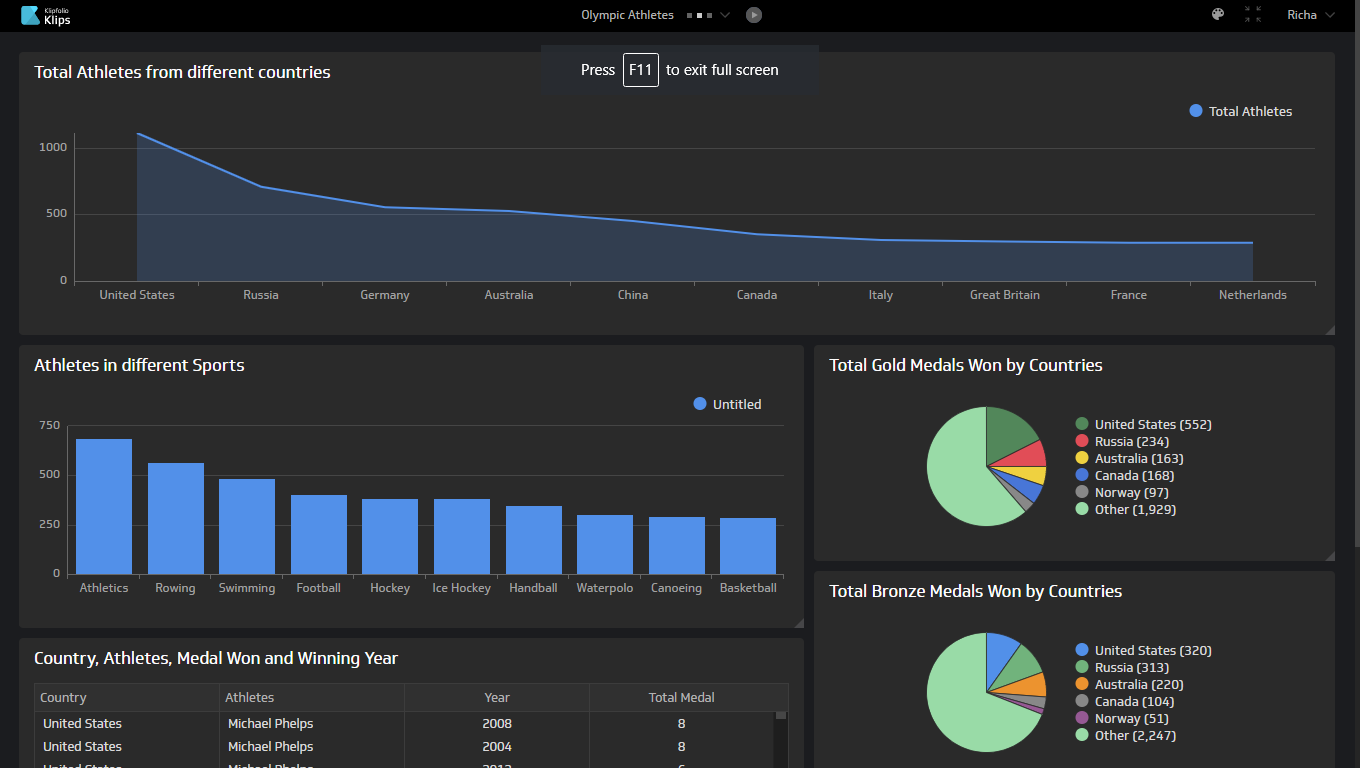
Olympic Athletes
You can check the second dashboard. Our Data Analytics team has visualized the data showing the details of the Athletes of the different country winning medals.
Here are the following KPI’s:
a. Total Athletes from different countries: Bar chart showing the topmost country from where the most number of athletes coming.
b. Athletes in different Sports: Bar chart showing the top 10 athletes won the most medal in different sports.
c. Total Gold Medals Won by Countries: Total Gold medals won by all the countries.
d. Total Silver Medals Won by Countries: Total Silver medals won by all the countries.
e. Total Bronze Medals Won by Countries: Total Bronze medals won by all the countries.
f. Country, Athletes, Medal Won, and Winning Year: Shown the details in the Table.
Conclusion
Klipfolio will make it easier to share, publish, and communicate the insights they hold with the rest of your organization to help you nurture a data-driven decision making culture. It is a unique enterprise-level BI tool with leading functionality and flexibility at a very affordable price to help enable millions of everyday people to succeed with data.
You can visit our site for data services consulting. The link mentioned below:

https://www.loginworks.com/data_services_consulting
You’ll be able to interact directly with your data anytime, anywhere, with both custom and pre-built options. And hundreds of device connectors ensures you will be able to fit the reporting of the dashboard into your everyday life.
I excel when it comes to making bespoke data dashboards and visualizations that users and clients absolutely love. Sharing about things I enjoy doing is my hobby, whether it's about a project, collaboration, feedback, or just simple how-to guides about visualization.
If you have something to ask or share, I'd love to hear from you!
- Business Intelligence Vs Data Analytics: What’s the Difference? - December 10, 2020
- Effective Ways Data Analytics Helps Improve Business Growth - July 28, 2020
- How the Automotive Industry is Benefitting From Web Scraping - July 23, 2020