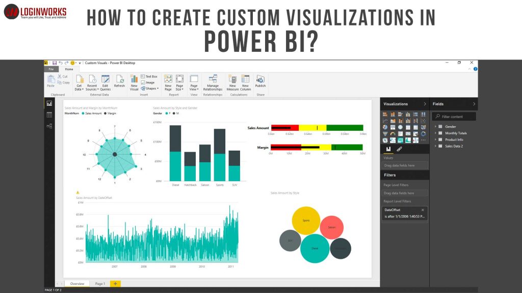
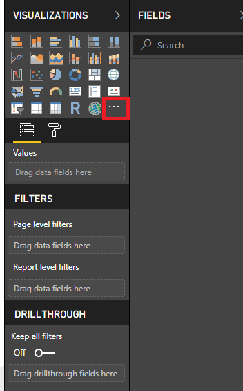
Hello friends, in this article I am going to explain how to create Custom visualizations in Power BI. First, let’s understand its meaning. As we all know that when you create a report in Power BI desktop, Power BI provides us a visualization pane which contains different types of visualizations like Bar chart, Line chart, Scatter chart or a Pie chart which we can use to create interactive graphs. If you check properly, these visualizations are very less. The below picture is showing the same thing.
You can easily count these visualizations. If suppose you want to show some data but the visuals that are present is not a visualization you want. At that time you want some other kind of visualization which is your Custom visualization. You are not limited to these visualizations only. We are going to discuss how we are going to achieve this task.
Jump to Section
Types of Custom Visualizations
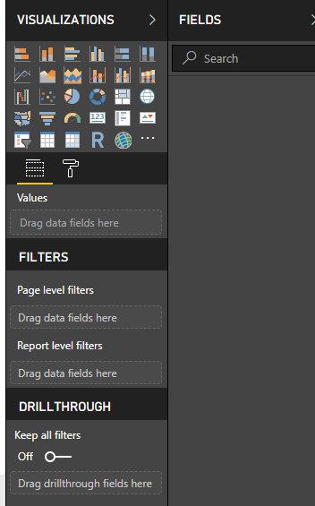
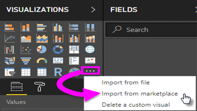
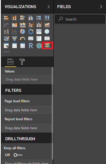
Custom visuals are mostly created by developers so that users can create visuals that fit for their business best. Report creator can import these visuals and use them in their reports. Custom visuals are divided into three categories. To reach through each category you need to click on three ellipses present in Visualization pane (look like this…).
You will see three options. Let’s go through each category one by one:-
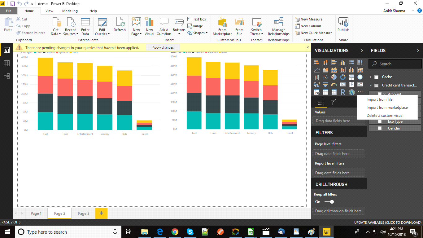
1. Custom Visual Files
2. Organizational Visuals
3. Marketplace Visuals
Custom Visual Files
Custom visual are the files created by developers using .NET SDK with the file extension .pbiviz. These files can be created by anyone and the author can import this file very easily. But this can be very risky. Actually, it is not created by Microsoft. You need to trust the author or creator of the file. And after importing you can use this visualization in your reports. In this blog, I am not going to show you how to create your own custom visuals through coding, because it will be a lengthy process. I am going to write a separate blog for this process. Here, I am telling you to follow these steps first.
1. Click on ellipses (…).
2. Click on Import from File.
3. Choose the file with (.pbiviz extension) from your local machine (wherever it is present) and import it into your Power BI desktop.
4. You will see one more visualization is added in your Power BI desktop. Click on the visualization and use it into the report.
Organizational visuals
Power BI gives one more functionality for admins. A Power BI admin can upload or deploy a visual in his organization so that authors can easily find out that the admin has approved this visualization and can be used in their reports. By using this functionality an admin can choose specific visuals for their organization. An admin can enable, disable or delete the visuals.
For importing Organizational visuals follow these steps.
1. Click on these ellipses (…) as shown below.

2. Click on Import from marketplace. A new window appears.
3. From this window Select My Organization as shown below.
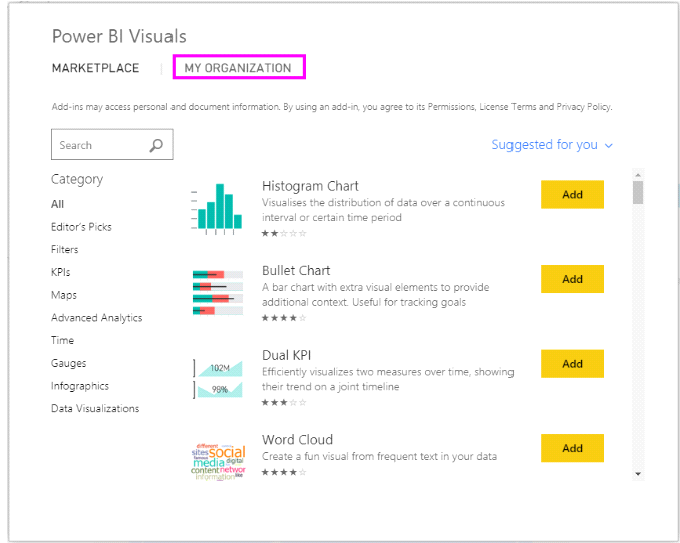
4. From the above list, you can select any visualization according to your needs.
5. To add the visualization click on Add. It will be added in your visualization pane as shown below and is ready to use in the report.

Marketplace Visuals
Marketplace visuals are those visuals which are created by Microsoft team for the end users and can be easily downloaded and imported into the Power BI reports. There is no risk in using these visuals as we see while adding custom visuals files. These all are Microsoft certified and tested by their development team.
How to download custom visuals from Marketplace App Source?
Power BI provides a simple process to download the custom visual from marketplace. In this section, we will follow the following steps.
- Import custom visuals within Power BI Desktop.
2. Select the ellipses in the visualization pane as shown below.
3. Select Import From Marketplace. You will see a new window appears
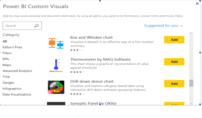
4. You will see a list of charts appears. You can download any chart from here. As we can see there are different charts like Box and Whisker chart, Drill down donut chart, Thermometer by MAQ software etc. There is one sidebar also. You can easily filter the charts based on your requirements so that you do not need to download the complete list. For example, if you want to create a map chart, simply click on maps from the sidebar and you will only see the list related to map charts. Same with other categories like Filters, Time and Infographics etc.
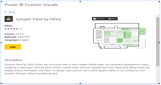
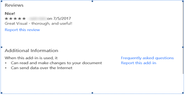
6. For reviews, scroll down to the bottom.
7. Click on Add to see the visuals in the visualization pane and it is ready to use in the reports.
Conclusion
In this complete section, I have explained you all the major three steps to import custom visualizations in your Power BI desktop. For creating your own custom visual file, I will come up with another blog. For now, you can go through and understand its concepts because it requires strong coding skills. If you have any query regarding this article, you can post your queries in the comment section. Thanks!
I excel when it comes to making bespoke data dashboards and visualizations that users and clients absolutely love. Sharing about things I enjoy doing is my hobby, whether it's about a project, collaboration, feedback, or just simple how-to guides about visualization.
If you have something to ask or share, I'd love to hear from you!
- Business Intelligence Vs Data Analytics: What’s the Difference? - December 10, 2020
- Effective Ways Data Analytics Helps Improve Business Growth - July 28, 2020
- How the Automotive Industry is Benefitting From Web Scraping - July 23, 2020
1 thought on “How To Create Custom Visualizations In Power BI?”