In this article, we are going to discuss how we create visualizations in Google Data Studio. As we all know that Data is present everywhere. Data can be your company’s Sales Data or it can be Retail Data. It would be very difficult to understand the Data by just looking it because there are thousands of rows present. For a common user, it is very hard to understand. To understand it in a much better way Google has developed a visualization tool named Google Data Studio. It is an online visualization tool which will turn your data into informatory, easy to understand reports through Data Visualization. You can easily share these reports with other clients or you can put some data access rules like if you want to give read-only access to the client, you can easily achieve this or you can download the complete report in a PDF format.
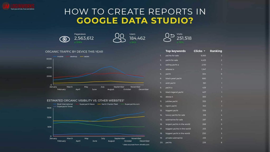
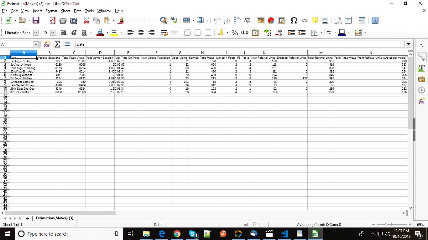
Google Data Studio provides different kinds of visualizations to represent data in a Graphical manner like a bar chart, line chart, combo chart, pie chart or in a tabular format. You can easily change the style of the visualization like font size, background color and also put an image logo of your company. In this article, I am going to show you the complete steps for building a complete report. The data I am going to use can be seen below. You can use any data. But the file must be in .csv format. It’s just a sample data of my company.
Jump to Section
How to start working in Google Data Studio?
Before creating any reports, let’s first understand where we will find Google Data Studio. Actually, it’s an online service. You do not need to download any desktop application. To access this, you first check this link https://marketingplatform.google.com/about/data-studio/. First, you need to sign in with your google account. When you sign in with your account, you will see a page look like as shown below.
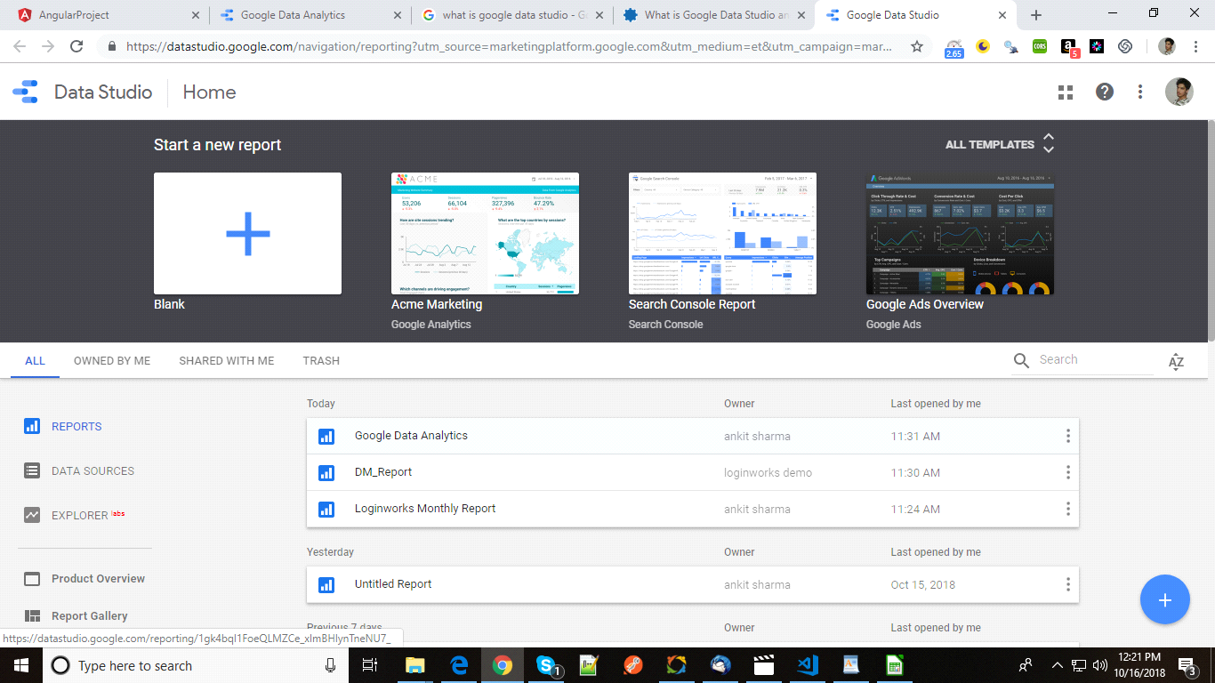
This is the home page of our Data Studio. There are four tabs present. You can filter the reports. You can choose All (by default selected) or Owned By Me. In this case, you will get to see those reports which are created by you or Shared With Me as you can understand with its name.
Google Data Studio provides some template by default as showing in the image Acme Marketing, Search Console Report, Google Ads Overview. You can view these templates by clicking on the title. The look and feel are provided in Google Data Studio I don’t think so it is provided in other visualizations tools. Don’t worry, we are also going to create such kind of reports.
How to connect to Data?
Now, we are moving towards the interesting part. Our data can be present anywhere or in any form. It can be present in any database like MySQL, Oracle or it can be present in a file format like .csv or a spreadsheet.
To connect it and upload it into the tool you need to click on + sign as showing in the above image. It will open a report section where you will create a report. But, before creating the report you will need to create a New Data Source. You can also get some data which is provided by this tool. For this report, you need to click create new Data Source. It will take you to the Google Connectors page as shown below.
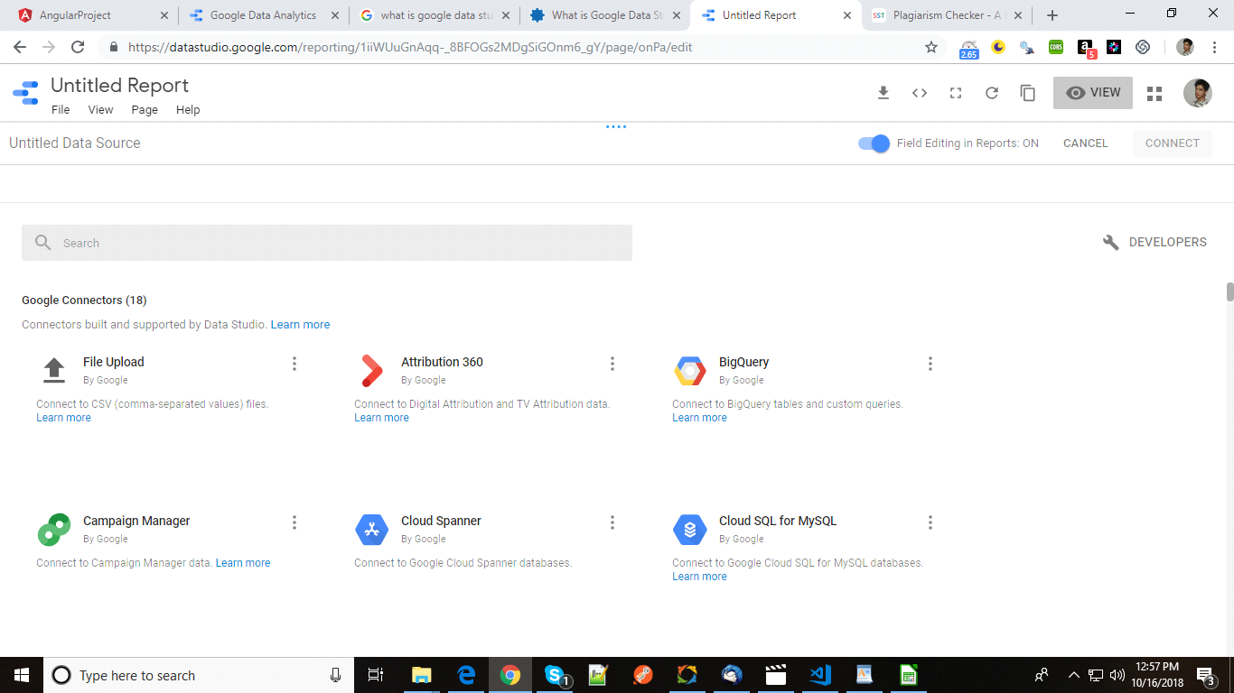
There are total 18 connectors, all created and maintained by Google team. Also, there are some third-party connectors which are created by developers of different communities. You can choose the connector where your data resides. I am going to choose File Upload method. This method is used for uploading csv data. Click on it and it will redirect you to the next page which looks like this.
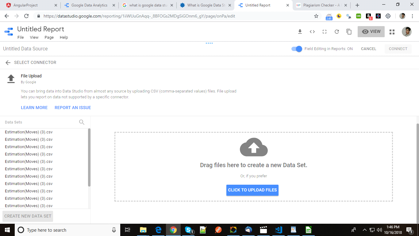
Now, you need to upload the file here. After uploading, you need to click on Connect as showing in the figure.
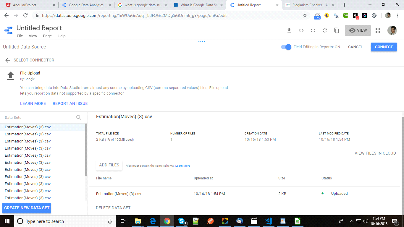
It will show your all columns present in the table. You can change the datatype of a column. Suppose, for the date column you need to change the datatype to date to create a time series. Our next is going to be to add these columns into the report by clicking on Add Report. The next step is report generation which is discussed below.
How to create a report?
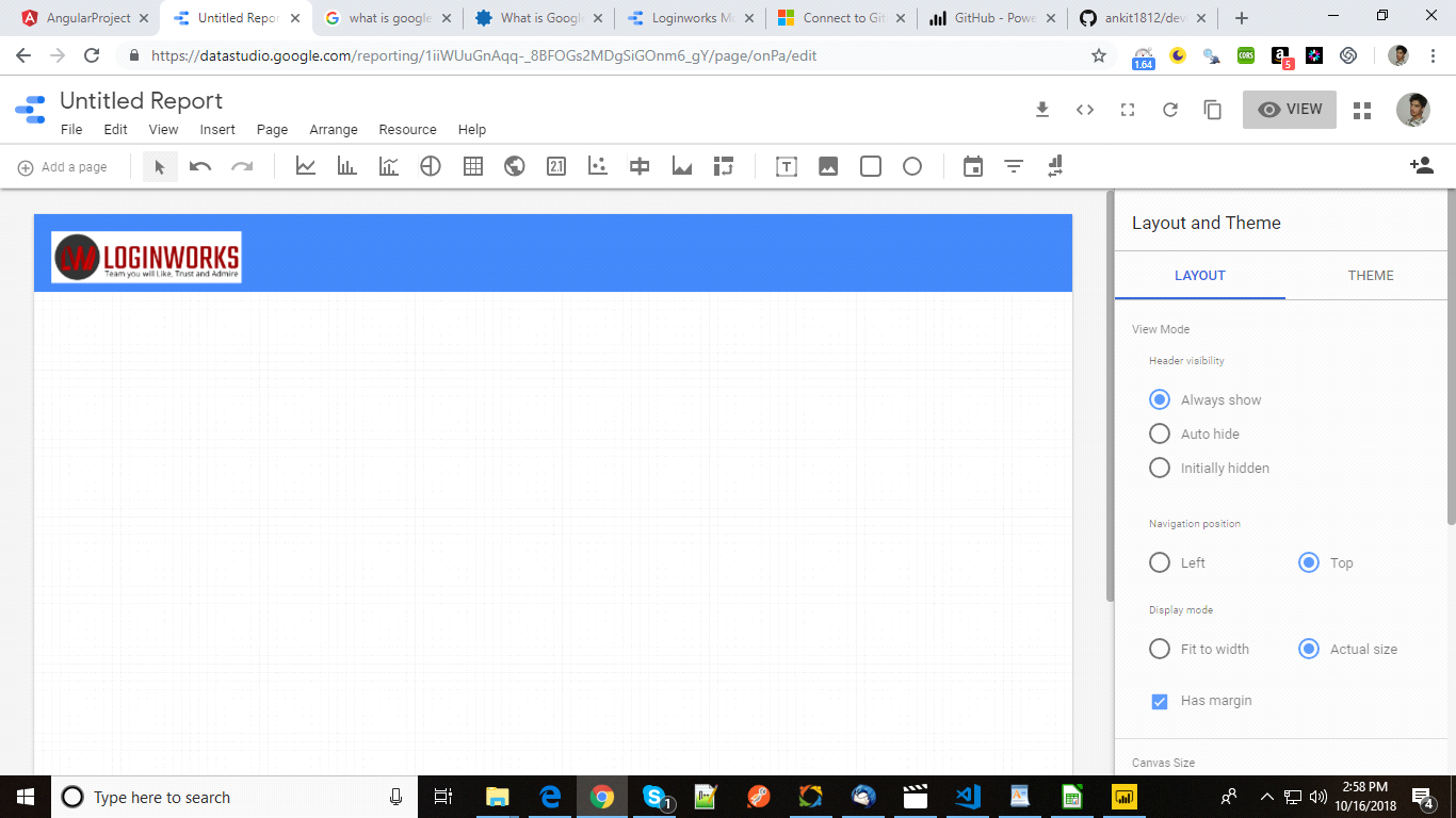
It totally depends on you which visualizations you want to show into the report. In my case in the first row I want to add a header and in the header, I want to add a logo of my organization. So first select a rectangle shape as shown below and create a rectangle by using your mouse. You can give a background color in rectangle properties which are to the right of the canvas area.

Now, to add an image click on image icon and create the area inside the rectangle where you want to show the image. In the right, you need to select the file from your local machine and click open. You will see a logo image in the header added.
You can change the style like background color and border color of the image. Now, I am going to add five scorecards in the canvas. You need to select the canvas and draw it in the box. You will see a card is created automatically. It is showing total youtube subscribers. You can change it if you want to show any other metrics in Data column and can choose any other metric.

After creating five cards, let’s go to some actual charts. Let’s create a bar chart. First I select the bar chart icon and create an image. It will directly create a bar graph with default metrics. You can change according to your need. After that, I have created one more bar chart and then created two tables and put some style and the report look like this.

Conclusion
In this article, I have explained you about the basics of report generation and how to create a simple report in Google Data studio. You can use it in your applications. There are so many other options which I have hardly explained but whatever concept I have explained in this blog, I hope you find this useful and informative. You can check my other blogs too. Thanks!
I excel when it comes to making bespoke data dashboards and visualizations that users and clients absolutely love. Sharing about things I enjoy doing is my hobby, whether it's about a project, collaboration, feedback, or just simple how-to guides about visualization.
If you have something to ask or share, I'd love to hear from you!
- Business Intelligence Vs Data Analytics: What’s the Difference? - December 10, 2020
- Effective Ways Data Analytics Helps Improve Business Growth - July 28, 2020
- How the Automotive Industry is Benefitting From Web Scraping - July 23, 2020