
Hello Everyone,
Today, we will learn how to create and design the map in power BI using power BI desktop. Let’s discuss some key pointers that are given below:-
1. Import Data Set.
2. Create a Graph
3. Shape & Beautification of Map using Visualizations
4. Conclusion
5. Summary
1.Import Data Set:
Firstly, Let’s Click on Power BI to create a new report than from the ‘menu bar’ we can import data by two given ways one is ‘get data’ and the second is ‘file section’. After importing dataset we will see a list of data. However, if the data is not valid then we cannot draw map pattern so data should have the full address, state, city, zip code as this information is necessary to validate the address so, it can be further used to sketch the map into the report.
I have imported the data and data listing as shown in the image given below.
Here, I am using Retail Data as I want to display a total number of superstores that are available on zipping/address that can be visualized over on map.
2.Create a Graph:
Now I will be selected from the following 3 types of maps from the ‘visualize’ option.
I have selected Map option that is highlighted in red color and separated the map the two parts as shown in the above image.
Now, I have selected two data pointers first is ‘country’ and second is’ zip’ as seen in the image given below.
Although, zip has been excluded from the list as it’s out of the range.
In ‘type map’ we could display multiple locations by highlighting the zipcodes of different locations in the country.
The second part of the image is showing the location of the country, this can be easily done by clicking on the dashboard, then select ‘map’ followed by clicking on ‘column’ and then the Map will be drawn on the page.
3.Shape & Beautification of Map using Visualizations:
Visualization is a very important part of any report, Hence, the report should have a proper color combination.
The Map should have all the relevant information, whatever we may want to highlight or display and that’s when we need the help of visualization for shaping and beautification of the Map.
Now let’s discuss as of how to input visualization in the map.
Firstly, we need to go to the map section, then select ‘styling section’ as this would enable you to select the style according to the data that needs to be displayed in the map.
Below are the following sections that are used in styling the Map:-
(i)location (ii)Filters (iii)Drillthrough
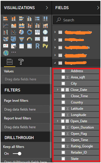
I. The location has own parameter like legend, latitude, longitude, longitude
II. Here we can apply the visual level filter, page level, report label filter.
However, if you want to know more about filter then read this article https://docs.microsoft.com/en-us/power-bi/power-bi-report-add-filter
III. Drillthrough means show data from bottom deep inside data select filed and apply the Drillthrough filter.
Then we have a list of ‘Format’ as given below, that helps in improving the design of the map:-
-Data colors
-category
-Bubbles
– Map
-controls
-Map styles
-Background
-lock aspect
-border
-Theme (like roadmap, light, grayscale, dark areal)
-Tooltip
Title: This section manage text beautification like font-color, font-family alignment of text etc. You can randomly apply filters as whatever may be the changes it will be shown in real- time. Now, I am going to visualize the second part of the page which is represented country wise.
Here, in my second report, I will be showing only one country in this map which has the same styling as I did not make any changes except for some in the graph like the selection on the theme, font size, map region, and color.
These are very easy steps to visualize map, However, if you want to work on complex maps like path draw, heat map and more then you would need to follow some more steps as given below:-
Click on the visualization section, then click on the three dots (…) as given below in the image
After you click on dot(…) it will give you a drop-down menu to select 1. import from file 2.import from marketplace 3. Delete custom visual.
You need to select the second option (import from the marketplace)
This will open a marketplace, then search for the required information you need and if the record matches, then click on add and the result will be shown in the visualize section like others.
Conclusion
Always remember as whenever creating a report then make sure you do EDA of data so you can create a valid report to avoid error in the tables as we may face difficulties while creating the report.
I will give you an example: suppose, I want to create a report of the map and I have not validated the format of the address then how I can identify zip code, so, always break address like zipping, state etc so we can draw map easily.
If you have any query regarding this article you can always write to me in the comment section given.
Vijay Kumar
I excel when it comes to making bespoke data dashboards and visualizations that users and clients absolutely love. Sharing about things I enjoy doing is my hobby, whether it's about a project, collaboration, feedback, or just simple how-to guides about visualization.
If you have something to ask or share, I'd love to hear from you!
- Business Intelligence Vs Data Analytics: What’s the Difference? - December 10, 2020
- Effective Ways Data Analytics Helps Improve Business Growth - July 28, 2020
- How the Automotive Industry is Benefitting From Web Scraping - July 23, 2020