
Microsoft Power BI is a powerful suite of business analytics tools capable of delivering valuable insights into business performance through a sophisticated analysis of multiple data sources. The software excels at simplifying data, presenting complex information through interactive dashboards and providing reports which offer a 360-degree view of the business. The visual interpretation of data in Power BI is one of the most exciting tools available. As most datasets include multiple levels of data, the new matrix visualization tool provides some exciting new opportunities for data analysis. In this blog, we will explore some important features of Matrix Visual in Power BI.
Anyone familiar with Microsoft Power BI will already be aware with the broad selection of visualizations that are included within the ‘off-the-shelf’ software. These include bar charts, line graphs, scatter charts, pie charts, funnels and gauges amongst many more. In addition to these stock visualizations, it is possible to download further options from the increasingly popular online Power BI community where users can also ask questions and share advice.
Matrix Visual
As a fairly new addition to Power BI, Matrix Visual offers a powerful new addition to the suite of analytics tools. This feature focuses on the analysis of parent-child relationships within a business, making it easier to interact with and analyse hierarchical data. We can illustrate this with examples from the consumer food retail and electronics retail sectors.
Until recently a food retailer using Power BI might select particular product sales figures from all the different categories of products to produce a visualization. Although useful, this is a straightforward use of the tools applied to fairly simple datasets which might have been based around specific and unrelated categories. For a food retailer, these might include fresh Food, Healthcare, Tinned Products, Frozen Products.
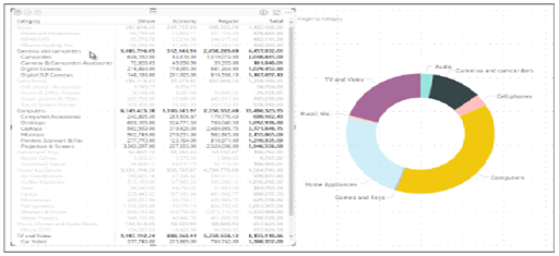
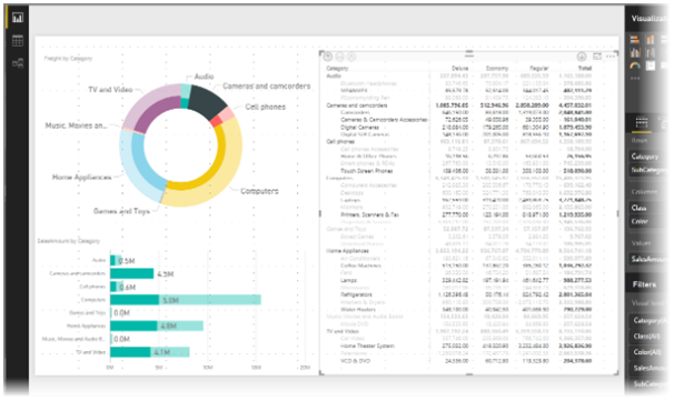
In reality, a retail store will have complex hierarchical sets of data with multiple interrelationships. For examples, if healthcare is a product category, then within healthcare are other groupings such as medicines, oral care, skincare and vitamins. Within each of these groups are further categories. For an electronics retailer, this might translate to categories such as ‘Laptops’, ‘Desktops’, ‘Printers, ‘Cameras’. This creates a hierarchy of different products. The ability to then analyse specific products, brands and product features within the hierarchy all provides useful detail which will support business decision making. The screengrab below illustrates this using the example of consumer electronics, and in the example below the hierarchy of products is clearly illustrated.
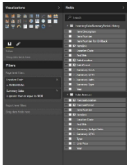
To access and evaluate hierarchical information, Matrix Visual offers a ‘drill down’ feature which enables users to drill down into the data to offer new data analysis opportunities, including the ability to carry out analysis using specific rows, columns, individual sections and cells within the datasets. These tools are all accessed through the Visualizations pane which provides a number of possible options for users to interrogate data and to carry out data analysis.
Getting Started with Matrix Visual
To get started with Matrix Visual users need to enable the drill down function on the data set rows of matrix visual – this then sets up the data to allow a detailed analysis of the hierarchy. It is then possible to select specific categories and to then drill down into that category to view subcategories, enabling users to then apply visualization tools to a greater range of data and to explore the interrelationships that exist to provide more detailed and meaningful data.
Matrix Visual provides different options for viewing data and works with existing controls such as cross-highlighting to deliver impactful data and visual interpretations which can be manipulated easily to provide sophisticated interpretation to support management information systems and business decision making.
For the retail client example that we highlighted earlier, Matrix Visual makes it possible to compare store locations, product categories and sub-categories to understand which products sell best in each store location. For online retailers, the data could be used to identify where most customers are located and to provide heat mapping of particular postcode areas. For a consumer electronics brand, it is possible to make decisions that will inform the selection of products which should be stocked in different stores based on location, sales patterns and brands.
As we noted at the beginning of our blog, the Power BI Community is a great source of advice and support for Power BI users, and Microsoft is bringing out new upgrades and enhancements almost every month currently, many of which further enhance the functionality and use of Matrix Visual. In a world where businesses collect huge volumes of data all the time, we think it’s an exciting time to work in data analytics. Working with Power BI to provide interesting, insightful data to improve and enhance business decision making is leading us towards an exciting new technological revolution which can only help to improve the way our clients do business.
For more information on Power BI write to us at [email protected] or call at our toll-free number +1-434-608-0184
I excel when it comes to making bespoke data dashboards and visualizations that users and clients absolutely love. Sharing about things I enjoy doing is my hobby, whether it's about a project, collaboration, feedback, or just simple how-to guides about visualization.
If you have something to ask or share, I'd love to hear from you!
- Business Intelligence Vs Data Analytics: What’s the Difference? - December 10, 2020
- Effective Ways Data Analytics Helps Improve Business Growth - July 28, 2020
- How the Automotive Industry is Benefitting From Web Scraping - July 23, 2020