Portfolio
Transforming enterprise data silos into dependable insights and interactive visuals for competitive advantage
Tool: Klipfolio
Data source: Sample data: Product Inventory Dashboard
Technology used: Klipfolio
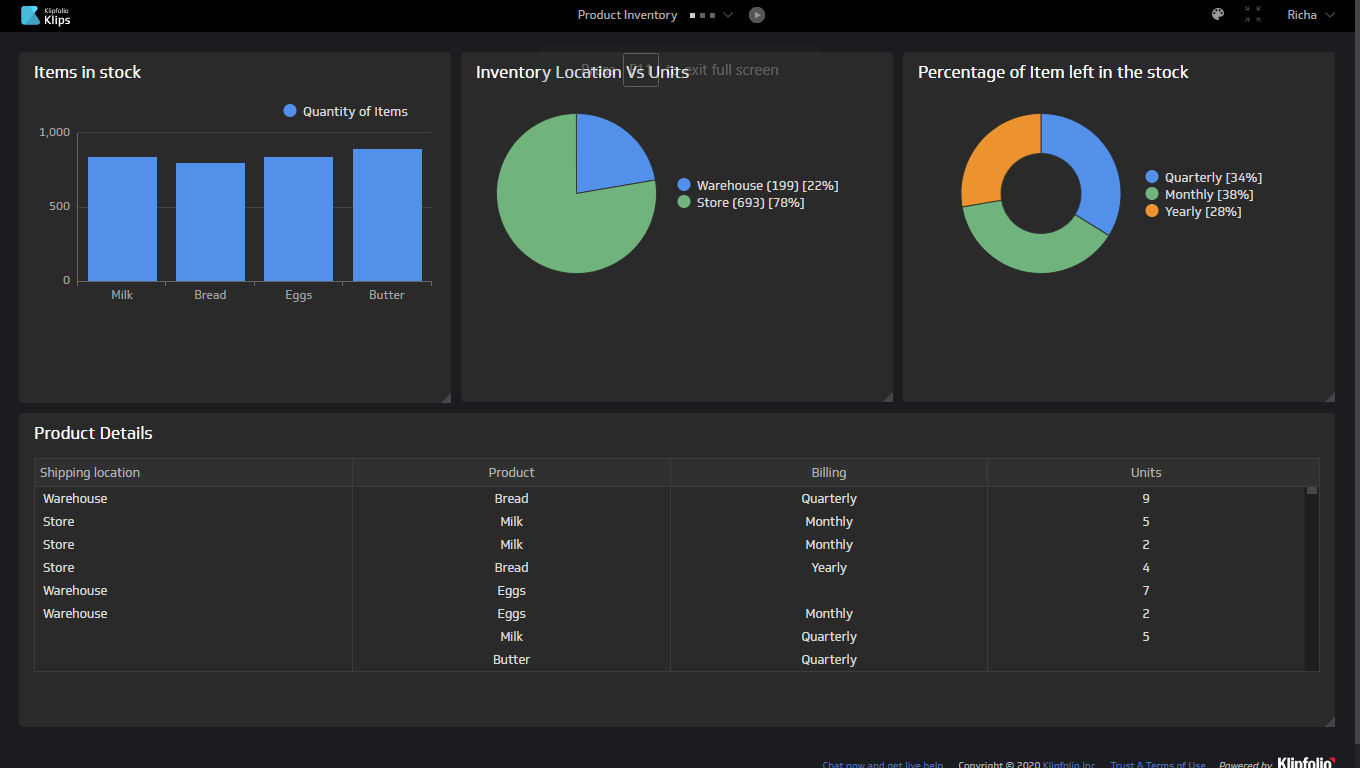
Overview: Items in stock: Bar chart showing the different items and quantity of that item in stock. Inventory Location Vs Units: Pie chart showing the total units are in stock in the warehouses and the store. Percentage of the item left in the stock: Pie chart showing the total percentage of item-unit remain in-stock.Product Details: Table showing the details of Shipping location, Product, Billing, Units.
Tool: Qlik Sense Cloud
Data source: Sample data: Beer & Breweries Dashboard
Technology used: Qlik Sense Cloud
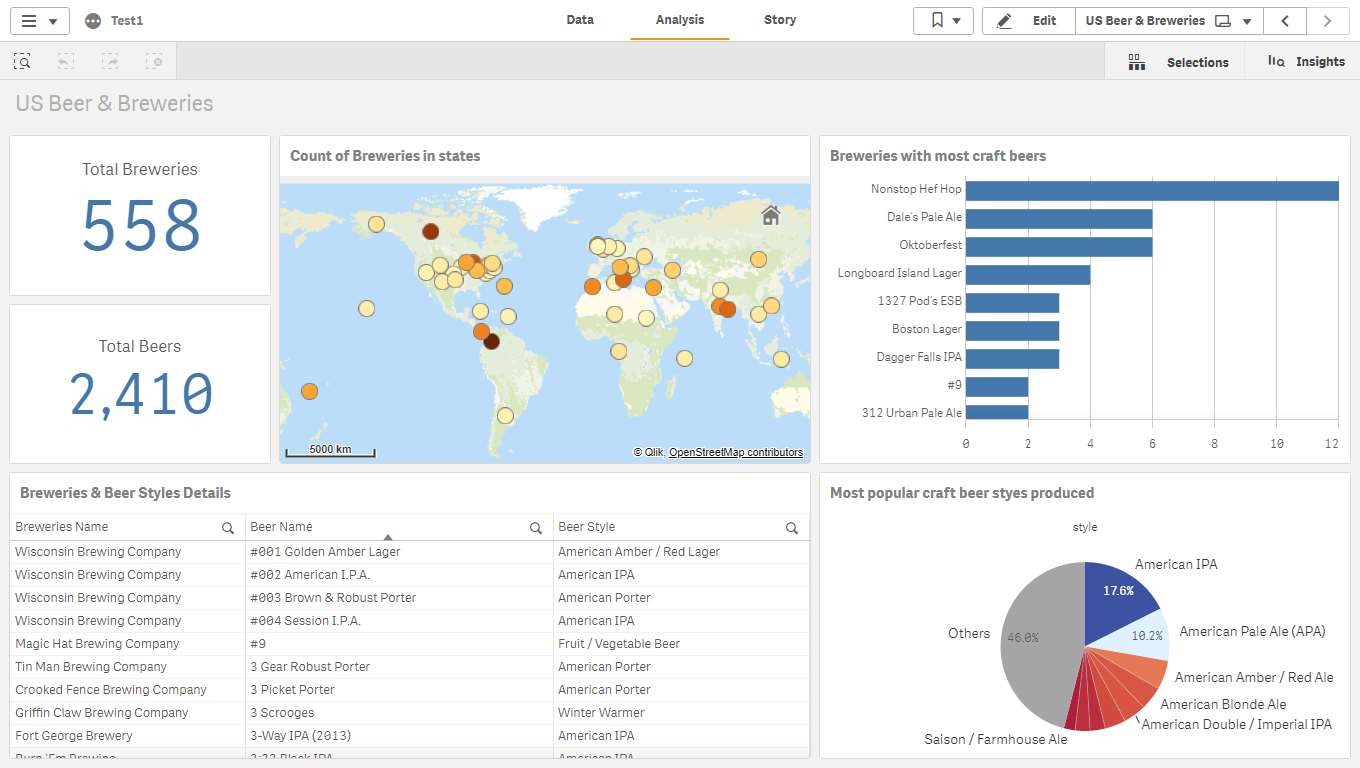
Overview: Total Breweries: The count of the total Breweries in the US, shown in the card. Total Beers: Total count of Beers manufacturing in the Breweries. Count of Breweries in States: a Map showing the number of Breweries is in the different states of the US. Breweries with Most Craft Beers: Horizontal Bar Graph showing the most beer styles manufacturing breweries of states in the US. Breweries & Beer style Details: A table is shown to show the details of the Breweries name and Brand of Beer and the Beer styles they are manufacturing. Most popular craft beer styles produced: The Pie chart showing the Beer Brand manufacturing the most liked and most consumed Beer styles.
Tool: Power BI tool
Data source: Sample data: Shopify Dashboard using the Power BI tool
Technology used: Power BI.
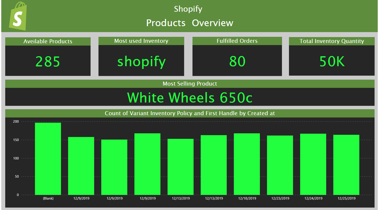
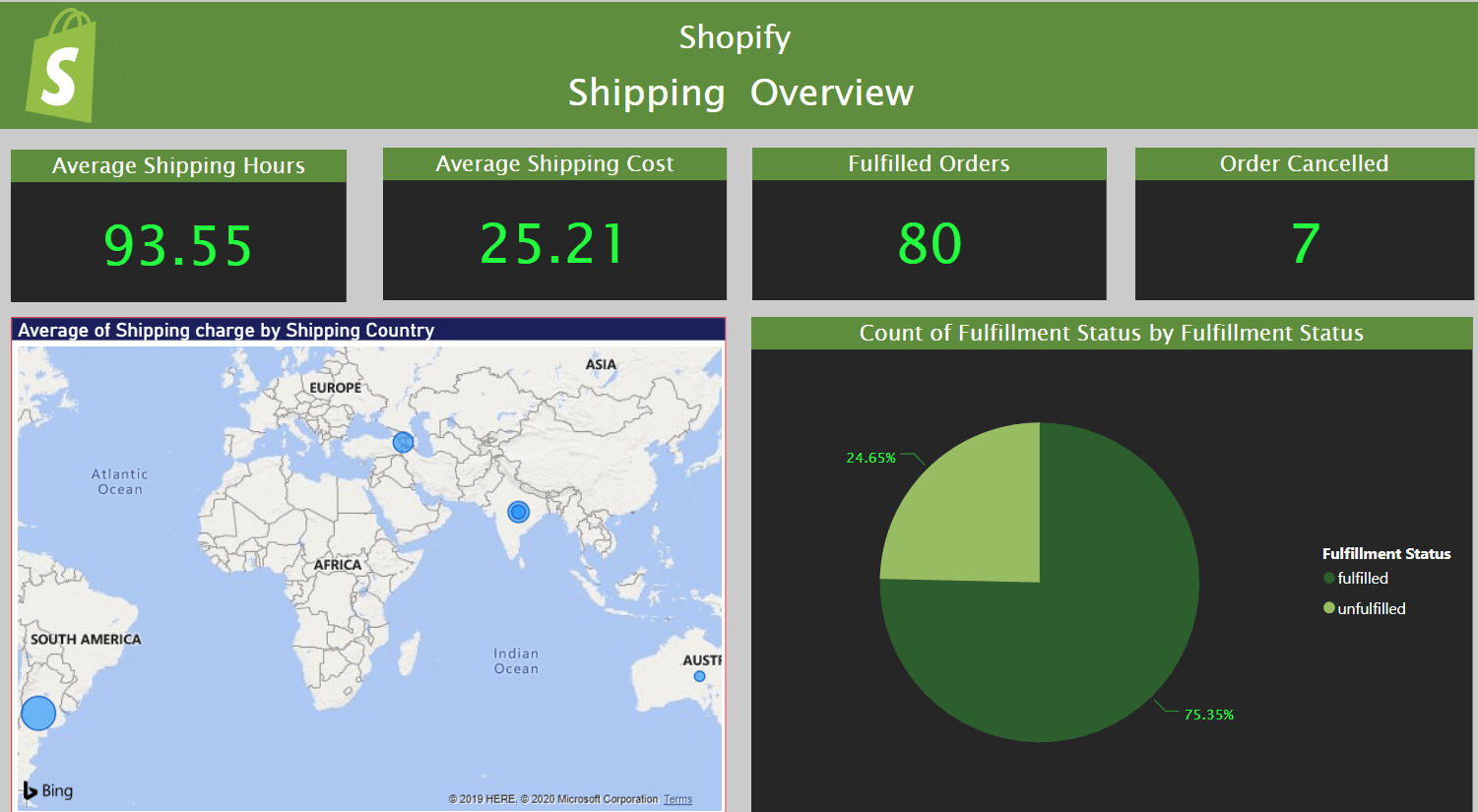
Overview: Products details of the User Shopify Data: Average Shipping Hours. Average Shipping Cost is the average shipping charge cost. Fulfilled Order. Order Cancelled the order canceled and thus returned. Average of Shipping charges country-wise” the order purchased from the country and the average shipping charges applicable to that country. Count of order fulfillment by the financial status. We used the drill-down function in the pie chart to show the percentage of order is fulfilled and unfulfilled. You can drill down again to see the percentage of the order payment paid and the percentage of order payment pending is shown in the pie chart.
Client: Zia Muhammad
Data provided: Excel
Technology used: Power BI
Overview: Redesign of the report.
Client: Shyamal
Data provided: Excel
Technology used: Power BI
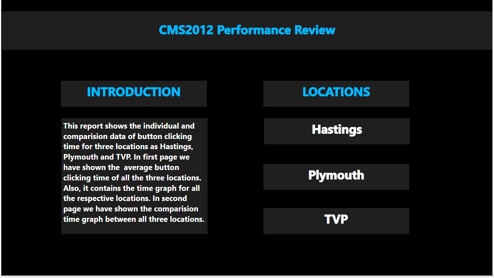
Overview: This report shows the individual and comparison data of button clicking time for three locations as Hasting, Plymouth, and TVP. On the first page, we have shown the average button clicking time of all three locations. On the second page, we have shown the comparison time graph between all the locations.
Client: Araceli Andrade
Data provided: Tableau PostgreSQL
Technology used: Tableau.
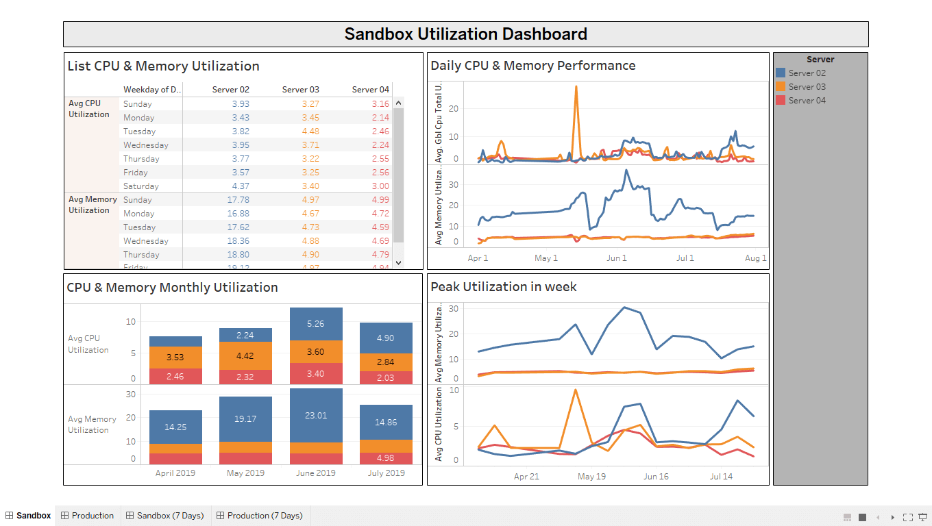
Overview: We helped the client with the Server Log by mapping and monitoring the utilization of the systems. This helps in a better understanding of the efficiency, cost, and duration of each of the systems with Tableau.
Client: Edge Research
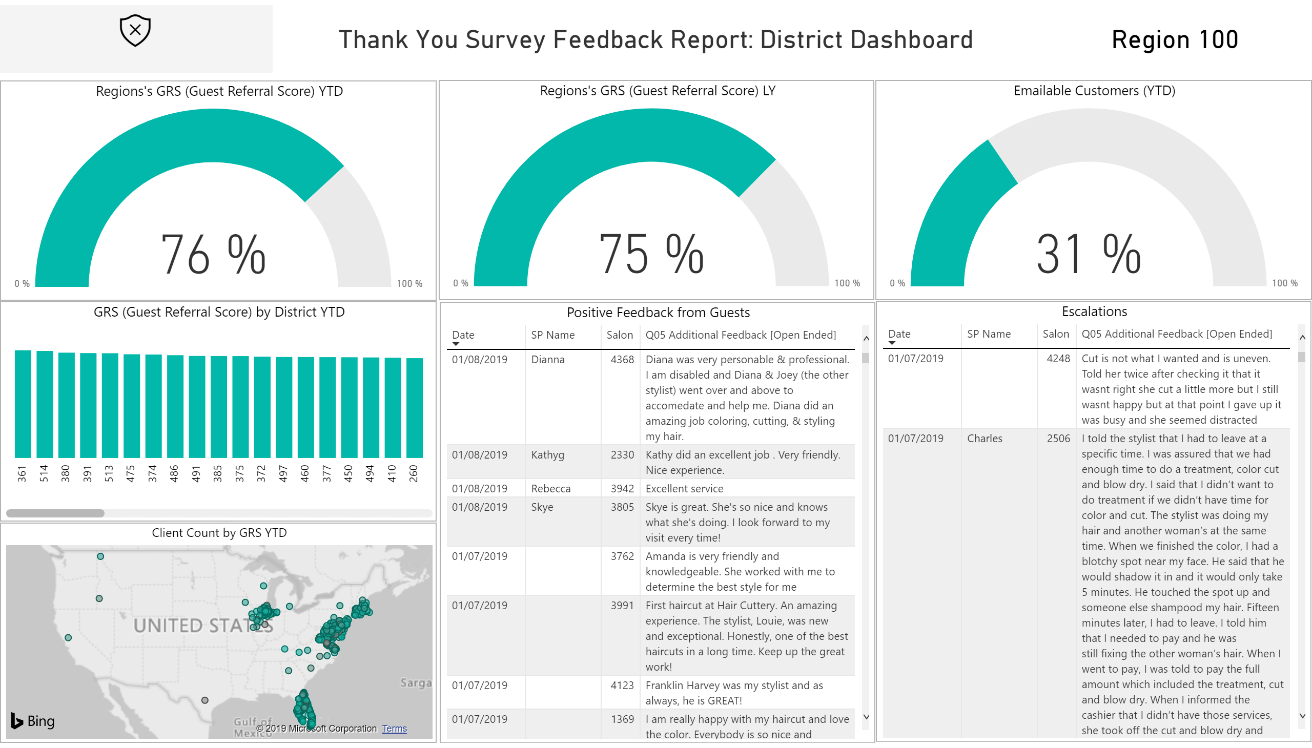
Data provided: Region level survey feedback from popular client.
Technology used: SQL, PHP, HTML5, Power BI.
Overview: With the help of provided data we helped the client to analyse the survey feedback and understand consumer sentiments to enhance service and improve client satisfaction.
Tool: Klipfolio
Data source: Sample data: Olympic Athletes Dashboard
Technology used: Klipfolio
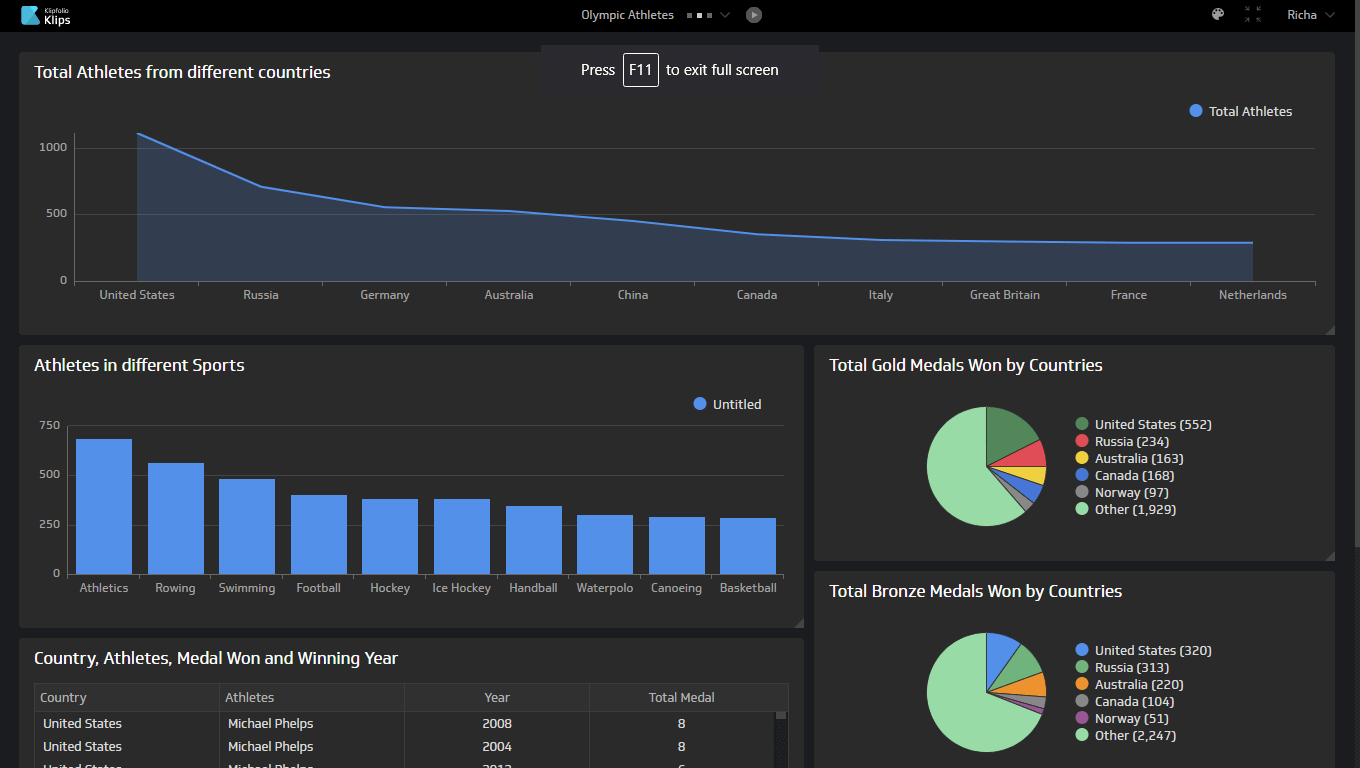
Overview: Total Athletes from different countries: Bar chart showing the topmost country from where the most number of athletes coming. Athletes in different Sports: Bar chart showing the top 10 athletes won the most medal in different sports. Total Gold Medals Won by Countries: Total Gold medals won by all the countries. Total Silver Medals Won by Countries: Total Silver medals won by all the countries. Total Bronze Medals Won by Countries: Total Bronze medals won by all the countries. Country, Athletes, Medal Won and Winning Year: Shown the details in the Table.
Tool: Power BI tool
Data source: Sample data: Shopify Dashboard using the Power BI tool
Technology used: Power BI.
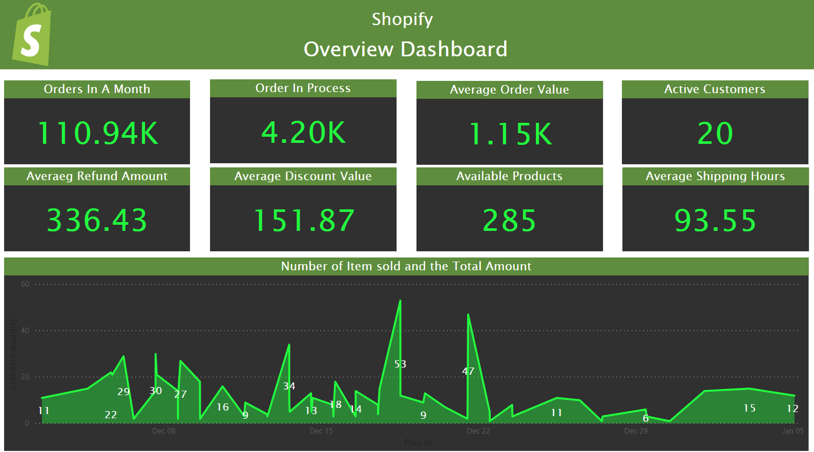
Overview: Overview of the User Shopify Data: Orders in a month the total sale profit of the month. Order in process Count of the total order purchase however left to be paid on delivery. Average Order Value. Active customers. Total refund amount Sum of the amount is to be refunded finally after the order is canceled or returned. Average Discount Value” is the average discount is provided on the orders. Available Product is the total product available in your inventory. Average Shipping Hours” is the average time taken to deliver the order. The number of Items sold and the Total Sales Amount is the total amount profited by the seller and the number of Quantities sold by the seller.
Tool: Power BI tool
Data source: Sample data: Shopify Dashboard using the Power BI tool
Technology used: Power BI.
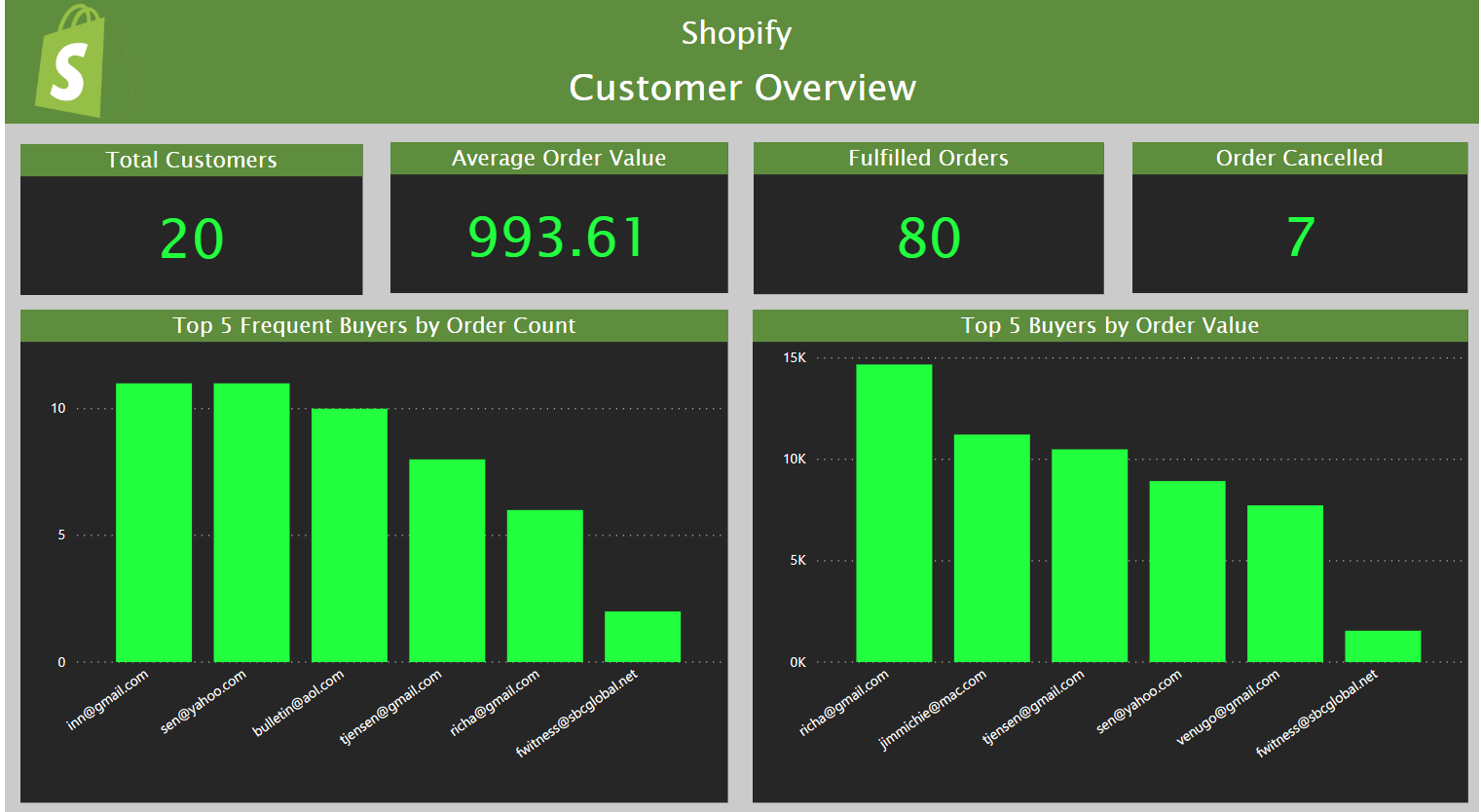
Overview: Shipping details of the User Shopify Data: Total Customers is the number of associated store customers associated. Average Order Value is the customer’s daily average purchase. Fulfilled Order. Order Cancelled. Top 5 frequent Buyers by Order Count is the top 5 buyers purchasing the maximum products. Top 5 frequent Buyers by Order Value is the top 5 buyers purchasing with the maximum order value.
Client: Zach
Data provided: SQL Server
Technology used: Power BI.
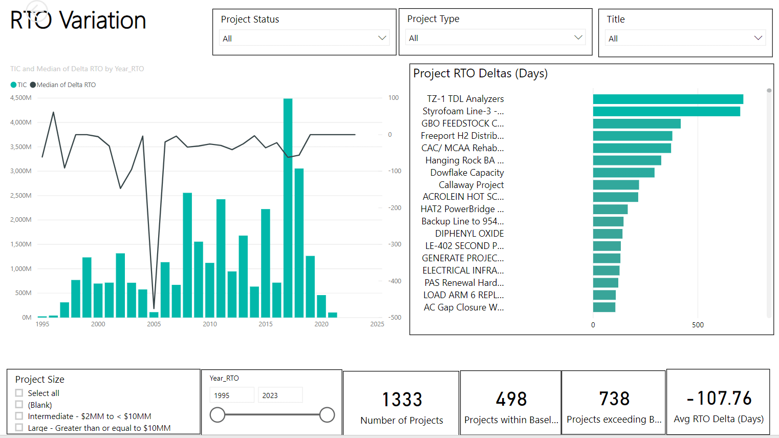
Overview: Showing analytics of RTO, Budget Variance, CEI Variance, etc.
Client: Wade
Data provided: Excel
Technology used: Power BI
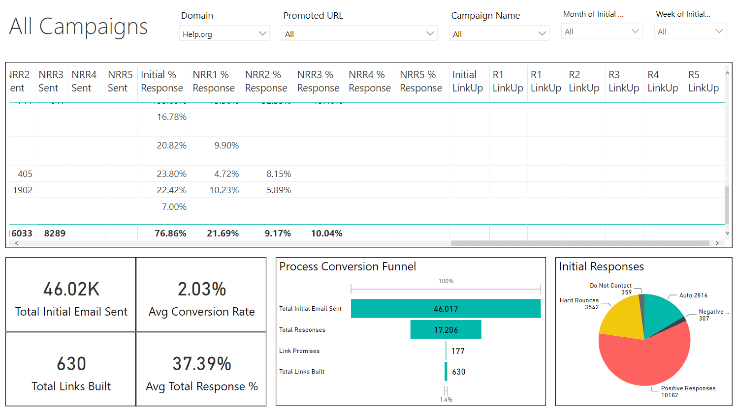
Overview: This report has describing campaigns, conversion rate, etc.
Client: Prediccio
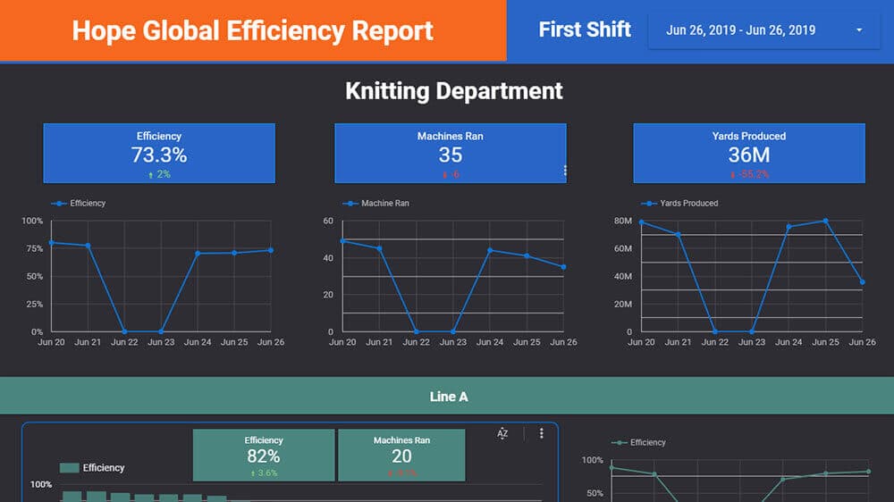
Data provided: Department wise machine efficiency, parameters, work hours, time shifts, source: PostgreSQL
Technology used: Google data studio.
Overview: With the provided data and parameters we created a customized report with interactive visuals and easy-to-understand statistical representation, moreover we also identified the efficiency of each machine as well as each operator which helped the client enhance the Industrial productivity of the factory.
Client: AnaSight
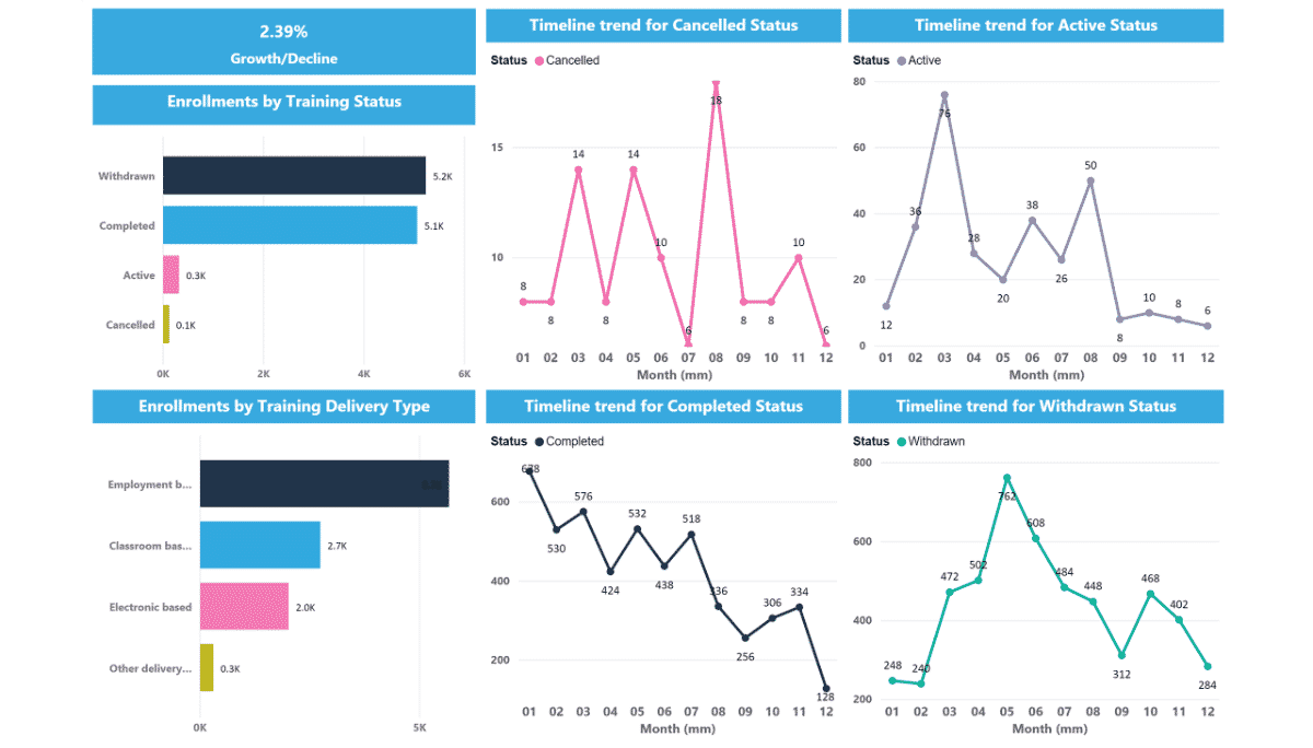
Data provided: Training sessions, enrollments, cancellation, status, delivery type.
Technology used: SQL, PHP, HTML5, VUEJS, MySQL, Azure. .Net, Power BI
Overview: We helped client by creating custom visuals report, eventually embedding the report into the portal, enhancing the admission process and helped the client monitor training sessions.
Tool: Qlik Sense Cloud
Data source: Sample data: Car Sales Dashboard
Technology used: Qlik Sense Cloud
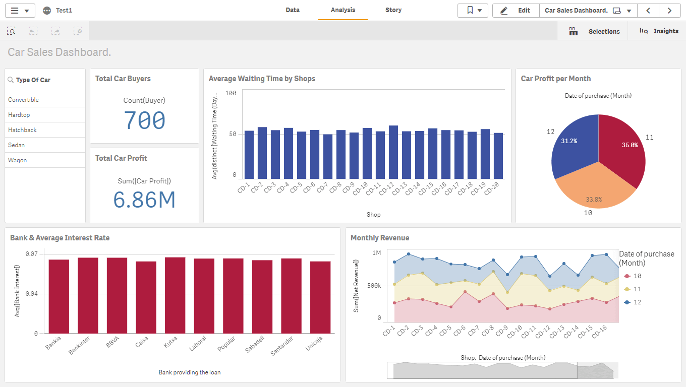
Overview: Type of Car: Filter is used to filtering the data information according to the selected Car. Total Car Buyers: The Count of the customers buying the car. Total Car Profit: The sum of the profit gained from the car selling. Average waiting time by shops: The Average waiting time took by the shop to deliver the car to the customer after purchasing. Car profit per Month: Monthly profit gained from the selling car. Bank & Average Interest Rate: The bank and the Interest rate of loan they are proving, to analyze which banks give a loan on high interest and on the low-interest rate. Monthly Revenue: The total profit gained after removing the shop expenses and employee salaries.
Tool: Power BI tool
Data source: Sample data: Shopify Dashboard using the Power BI tool
Technology used: Power BI.
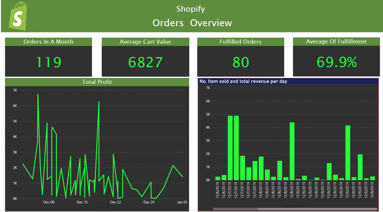
Overview: Order details of the User Shopify Data: Orders in a month Count of monthly order purchased. Average Cart Value Average order amount paid. Fulfilled Order Order place as well as also delivered successfully. Average of fulfillment Percentage showing the total order fulfilled out of the total order made. Total Profit Total profit after selling items every day. Total revenue and the total quantity of the item sold.
Client: Internal Project
Data provided: CSV
Technology used: Power BI, Python
Overview: In this project, we have a sentiment analysis of Amazon product reviews. We have a slicer and filter the data based on rating sentiment type, date, etc.
Client: Carlton
Data provided: pbix file
Technology used: Power BI.
Overview: With the data provided in a simple Power BI .pbix file that comprises only tables, we recreated informative dashboards. The tabular format needed modification for better visualization and understanding of the key points that drive actionable results. We presented the dashboard in a more professional and attractive way by using graphs instead of tables and color themes.
Client: McDonald Schaefer
Data provided: Campaign details, list of donors, donation amount, and other donor details
Technology used: Power BI.
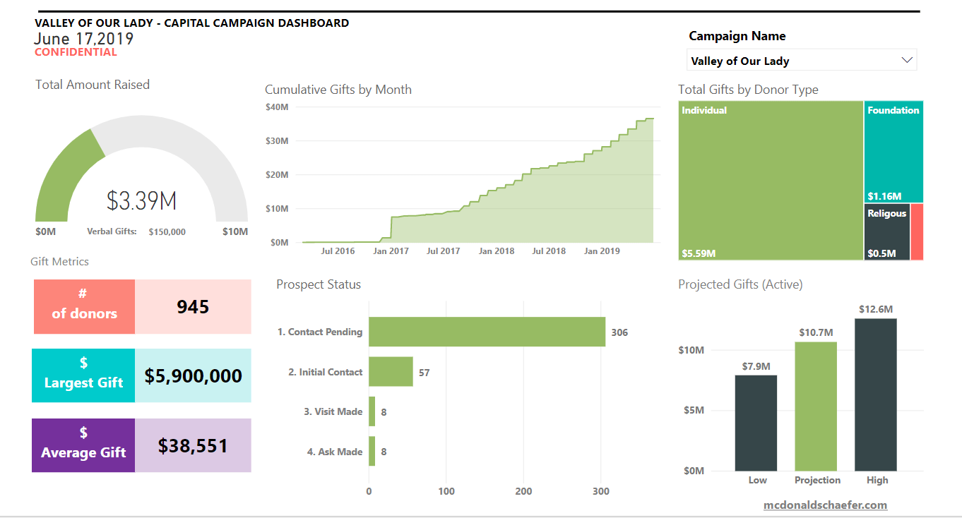
Overview: We helped the client get a 360-degree view of active campaigns, this made mapping and monitoring them easy. He also asked for real-time optimization, so we deployed a schedule refresher.
Client: Mabo Investment LLC
Data provided: Balance sheets, consumer count, cost of labor, product cost, net sales & revenue.
Technology used: Advance Excel, Power BI.
Overview: The dashboard helped client to achieve competetive advantage by right financial insights with different time comparisons, across various business touchpoints.

