Combo chart is used to create a combination of two charts mainly line chart and a column chart or bar chart in power BI. It can be created for one y-axis or more.
Jump to Section
When to use a Combo Chart?
Combo charts are good to use-
- To evaluate the correlation between two measures in one visualization on Power BI
- If the x-axis is quite similar for both line and column chart.
- If you want to find the relation between two measures within a single visualization.
- When you want to use the space properly. Creating two graphs takes more space in the canvas as compared to combining the graphs.
You can use combo charts both in power BI desktop or in power BI service. In this example, we are going to use power BI desktop.
For example, we have a row data sample file of Retail analysis.
To create a combo chart first import the dataset into your power BI desktop by following these steps.
Click on Get Data > Select all the tables>Press Load button. You will see data has been imported.
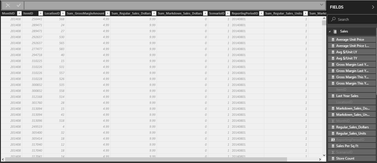
When the dataset is imported on Power BI desktop then we need to edit the data according to our requirements. In this case, we manipulate the data in 5 distinct like Sale, Distinct, Item, Store and Time.
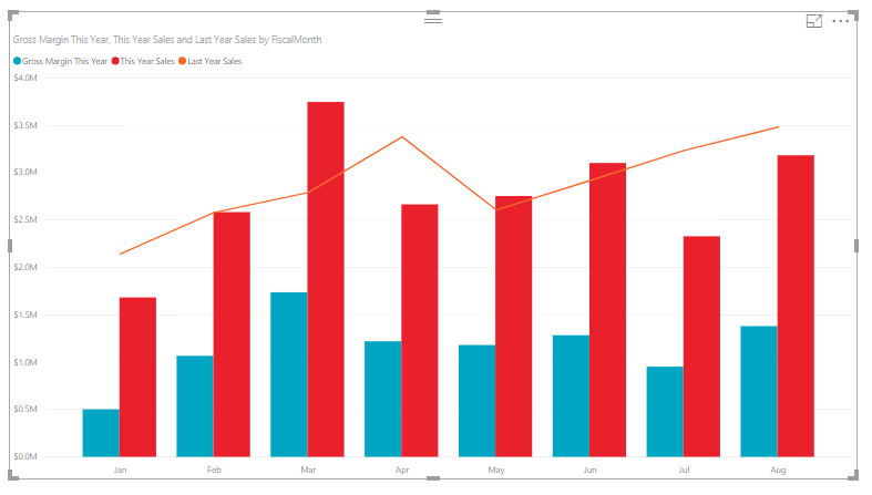
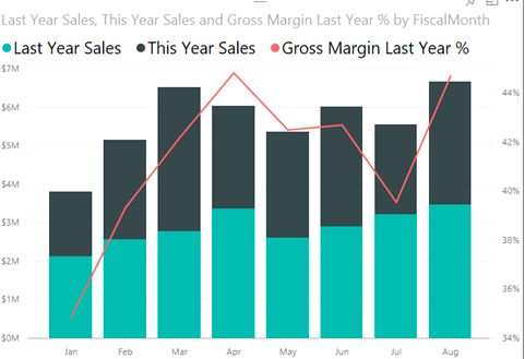
We are going to create Gross Margin this year, this year sales and last year sales by Fiscal Month. To create this
1. First, we take the value of gross margin this year from sales table drag it into the canvas.
2. Then we drag the column name this year sales value and last year sales from sales table.
3. Then we choose the fiscal month from the timetable.
4. Put the last year sales in the line value field.
5. Put gross margin this year and this year sales in the column value field.
6. We will put the fiscal month in the shared axes because it will be the same for both the graph.
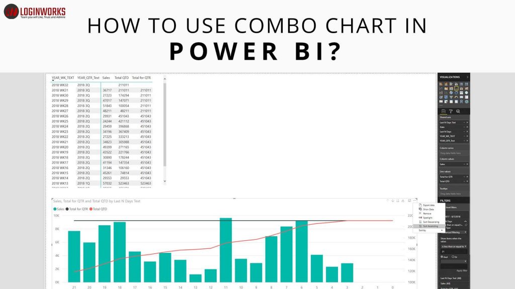
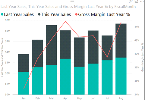
7. There are two visualizations present in this report. You can use either Line and stacked column chart or line and cluster column chart. It is shown below.
8. The below combo chart is going to be created from following the above steps.
How to create a combo chart with two axes?
In this chart, we are going to compare gross margin and sales.
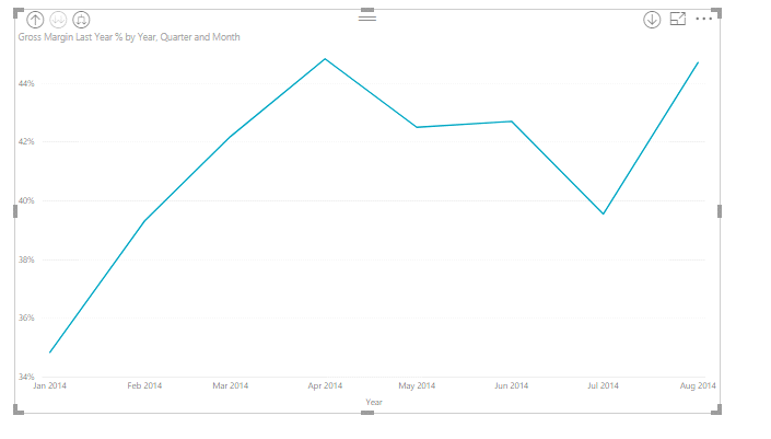
1. First, we will create line chart by dragging two values Gross Margin last year % from Sales table and Month from Timetable.
2. Put the month in axes field and gross margin in the value field and select the visualization line chart. It will create the chart as shown below.
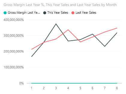
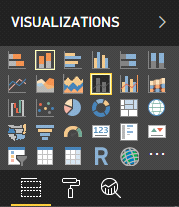
4. To understand it in a better way, convert the line chart into the line and clustered column chart. The following image shows which graph to select.
5. After selecting line and cluster column chart, Drag Gross Margin Last Year % from Column Values into Line Values.
The above graph is showing the same.
Add titles to the axes
To add a title to the graph, first select the image. It will show a format label under which title option is present which is ‘off’ by default.
1. Set it ‘on’ it will show the title text in which you can enter the title. Change the color of the text, make the size bigger.
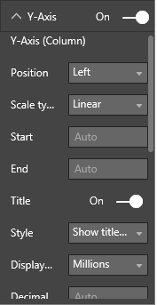
2. To format the Y option, select the Y-axis in which so many options are there and you can change the position of the axes, font color, font weight and display to millions.
3. To change the value of y-axis for the line chart, you must ensure that it shows the secondary option is ‘ON’ and if it’s not then set it ‘on’ and set the format accordingly.
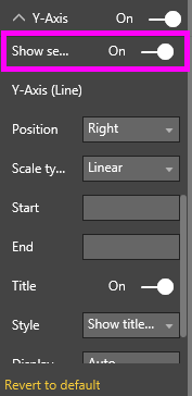
4. For y axis in the line chart, you can change the position which shows the title options. Set it according to your requirements or in a way which looks good
5. Optionally you can add more formatting according to your requirements. You can go through all the formatting options present there and see the changes.
Conclusion
Combo charts are mostly used when you have less space in the canvas and you want to show different graphs so that you can put these graphs into one graph. I have explained you in detail about the combo chart. Now it’s up to you to put the best efforts to create different visualizations. Don’t agree with our recommendations or find a great reason to “break the rules?”
For any query related to this topic, please write down your comment in the comment box.
I excel when it comes to making bespoke data dashboards and visualizations that users and clients absolutely love. Sharing about things I enjoy doing is my hobby, whether it's about a project, collaboration, feedback, or just simple how-to guides about visualization.
If you have something to ask or share, I'd love to hear from you!
- Business Intelligence Vs Data Analytics: What’s the Difference? - December 10, 2020
- Effective Ways Data Analytics Helps Improve Business Growth - July 28, 2020
- How the Automotive Industry is Benefitting From Web Scraping - July 23, 2020