
A data analyst should always keep in mind an important fact that data is only as helpful as it is understandable.
Most of the time, making data more understandable means creating some type of data visualization. Even a simple bar graph might be useful for having a basic understanding. But, making your data both visually understandable and attractive can help you stand out.

Demand for data visualization is increasing day by day as it plays a crucial role in the IT sector. Since every business wants to know about their company data in a manner that can be easily understood, data visualization plays a key role.
A well-designed dashboard is an important starting point for data-driven conversations. An organization can make effective decisions based on data insights, which helps them achieve their goals. There are some important things that one should keep in mind while doing data visualization and are discussed ahead. The following five tips will help you to make your data visualization more engaging and effective.
Jump to Section
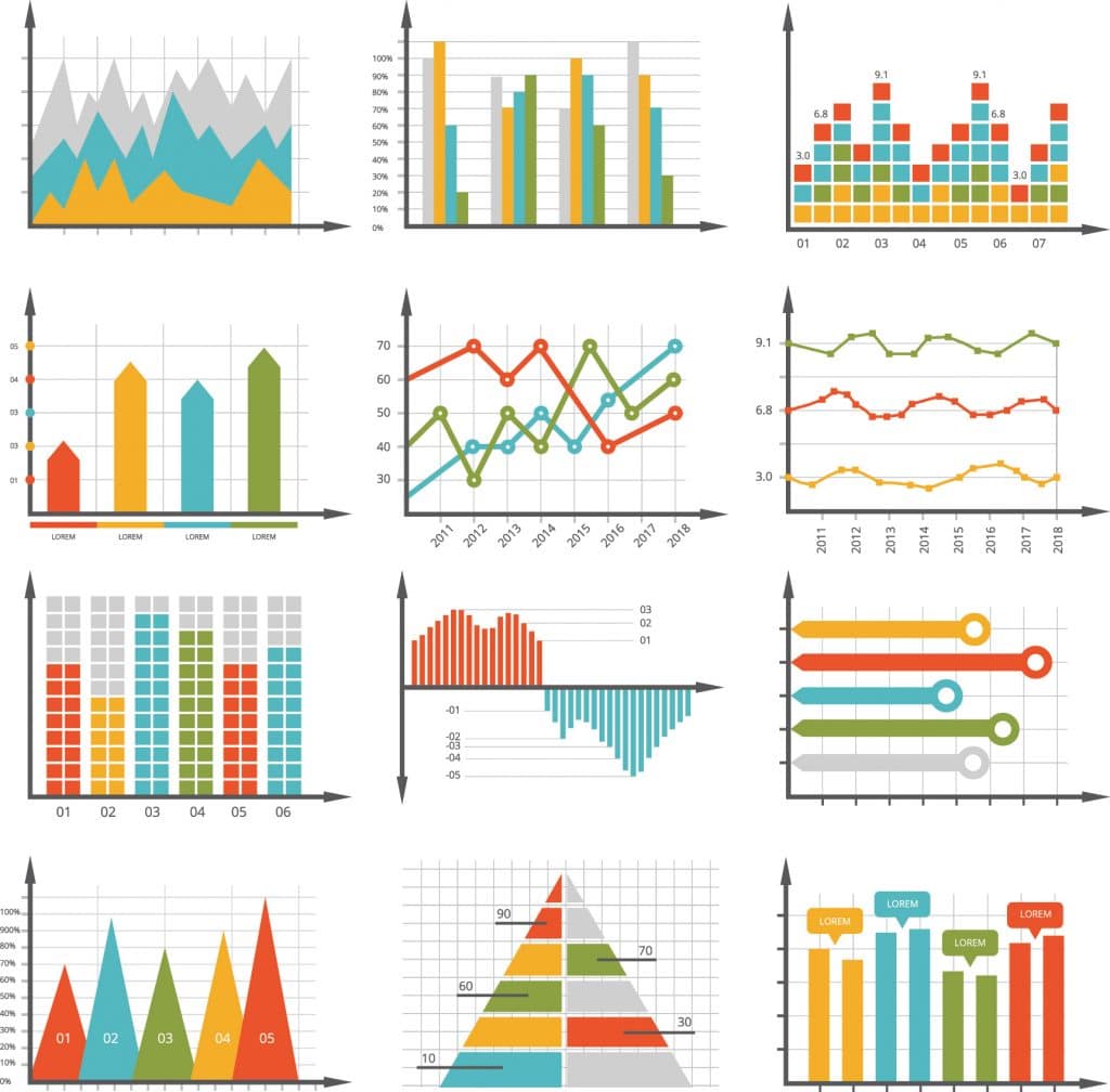
1. Pick the Right Chart
Next time when you have a data-based presentation, don’t forget first to examine your insights into the data and isolate your crucial message. Consider what metrics will support your story and help you pack a punch. Don’t flash unnecessary information just because you’ve got it. Show the primary data in the most appropriate chart and keep the rest of your data concealed but readily accessible if needed. Slide notes, secret slides, or other supporting materials are your friend here. For efficient data storytelling, the right chart will get you on the right track.

There may be more than one way to visualize the data accurately. Consider what you are trying to do in this situation, the message that you are expressing, who you are trying to reach, etc. Ask yourself—are you trying to compare values, show trends, explore distribution, or relationship between variables? Then choose appropriate visual(s) depending on the message you are trying to convey.
2. Choose an Accurate Visualization
You want visual clarity to allow the reader to have a comparison in one glance, hire top data visualization agency and experts to help you. This may mean that you are using stacked bar charts, a clustered bar chart, or a line chart. Whatever you pick, don’t confuse the reader by making so many items compare. Ask yourself how many variables you want to display how many data points you want to show, and how you want to scale your axis. Row, bar, and column charts reflect changes over time. Pyramids and pie charts demonstrate the parts-of-a-whole. While scatter plots and treemaps are useful if you have a lot of data to visualize.
No matter what approach is best for your data, all types of data visualization cover esthetic considerations. Besides merely selecting the best data visualization tool to use, you must choose the best aesthetics to reflect your information and reach your audience.
3. Keep the Headers Clear and to the Point
There’s no need to get smart, wordy, or puntastic. Hold any descriptive text above the chart and have a direct link to the chart below. Remember: Focus on the easiest way to understand. One of the simplest, cleanest ways to convey a message with data visualization is through headings and keys. The more compelling the heading, the more attention the reader pays to the data in the chart or graph. You have to consider the audience to build the most convincing heading possible.
For instance, do not use technical terminology or jargon to interact with the general public. And it doesn’t hurt to be as personal as possible – like using the word “your” makes the data immediately clear to the reader. When it comes to keys, keep them as straightforward and as easy as possible. Short labels and dramatic color variance make them easy to use at a glance, and positioning them in the right location – where they are visible but don’t block any data – helps avoid confusion.
4. Avoid Fonts or Elements That Interrupt
Often you need to emphasize a point. If so, use bold or italic text only to illustrate a point—and do not use both at the same time.
Matching fonts and typing is as complex a topic as matching colors. Still, you can prevent it entirely by selecting a standard typeface (when in doubt, take one of the most common ones from Google Fonts) and sticking to using only that typeface in your complete design. Use two or at the most three separate font weights for a good contrast.
5. Choosing the Color Theme
The choice of color is a significant factor in creating effective charts. A good set of colors will highlight the story you want the data to tell, while a poor one will hide or distract from a visualization’s purpose.
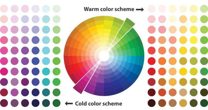
A color is a fantastic tool when properly used. Not only does it confuse, but it can misdirect the reader if misused. Use it wisely in the visualization design.
- To display the same form of data, use a single color: If a bar chart indicates sales month by month, use a single color. But if you compare sales from last year with sales from this year in a clustered table, you can use a different color for each year. The accent color may also be used to highlight an important data point.
- Make sure the contrast between the colors is correct: If colors are too close (medium gray vs. light gray, light brown), then the difference can be hard to say. It would help if you did not use high-contrast variations of colors, such as red/green or blue/yellow, instead.
- Beware of positive numbers and negative numbers: Do not use red for negative numbers or green for positive numbers. Those color associations are so deep that the sense in the viewer’s mind immediately flips.
- Visualization ordering: Visualization of data is meant to help make sense. Random, hard to understand patterns are frustrating and harmful to what you’re trying to convey. That is why ordering plays a significant role during visualization.
- Intuitively sort the results: The hierarchy will be clear. Categories are ordered alphabetically, sequentially, or by meaning.
- Order evenly: use natural increments on your axes (0, 2, 4, 6, 8) instead of clumsy or uneven increments (0, 3, 7, 15, 60).
Conclusion
Data visualization service provides corporate leaders and organizational heads with the ability to collect valuable and meaningful knowledge that can affect their business strategy in an era of cluttered data and multiple data sources.
It’s easy to lose way while trying to make data look great, but note that the successful design is to convey details first and foremost, and beauty is a distant second. In a perfect scenario, your design will be both clear and beautiful, but if you can only choose one, you’ll be clear every time. An ugly but readable graph still conveys details. On the other hand, a brilliant but unreadable graph is useless.
We hope you enjoyed reading this post. Please feel free to share it on your social media. Additionally, if you have any requirements for Data Visualization or a project, please feel free to contact us at Loginworks Software. Have a happy reading!
I excel when it comes to making bespoke data dashboards and visualizations that users and clients absolutely love. Sharing about things I enjoy doing is my hobby, whether it's about a project, collaboration, feedback, or just simple how-to guides about visualization.
If you have something to ask or share, I'd love to hear from you!
- Business Intelligence Vs Data Analytics: What’s the Difference? - December 10, 2020
- Effective Ways Data Analytics Helps Improve Business Growth - July 28, 2020
- How the Automotive Industry is Benefitting From Web Scraping - July 23, 2020