Jump to Section
Introduction
In this dynamic world of technologies the graphs, stats, and plots are used everywhere. Data visualization is very important for being able to read, interpret, and question these diagrams. There is a bunch of tools available in the market for visualization. If you are a Python lover and interested in coding, you can use Plotly. Plotly is an open-source, interactive Python library that provides analytics, graphing, statical tools for data visualization and analysis. Using this library the graphs and diagrams are more attractive and easy to understand. A large number of charts are available in Plotly.
Add/install Plotly to Python as shown below:
pip install plotly==4.4.1
If we dive into the code it is better to do the necessary data modeling using the Pandas library. You can do the data modeling in excel file and you can use that excel file for data visualization.
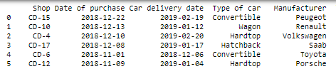
For this blog, we are using car sales data. Let us see some lines of the data and a sample sheet is attached at the end of this blog.
Let’s dive into data visualization:
Bar Graph
A chart or bar chart could be a chart or graph that presents categorical knowledge with rectangular bars with heights or lengths proportional to the values that they represent. The bars will be aforethought vertically or horizontally. A vertical chart is usually known as a column chart.
A bar chart shows comparisons among distinct classes. One axis of the chart shows the particular classes. The other axis represents a measured worth.
Now let’s assume that you have properly installed Plotly to your Python.
We are going to start with the bar graph let’s see how our data looks like.
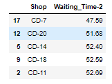
Here, you can see a sample of data that has two columns Shop and Waiting_Time-2.
Imported graph_objs as go from Plotly.
import plotly.graph_objs as go
After importing graph_objs we’ll create a line graph showing Shop vs. Waiting Time.
Plotly graphs have two main components, data, and layout. These components can be customized. Let’s create the bar chart in a vertical orientation.
trace0 = go.Bar(
x = SWT.Shop,
y = SWT['Waiting_Time-2'],
name = "",
marker = dict(color = 'rgba(0,0,255, 0.8)'
),
text = SWT['Waiting_Time-2'],
textposition = 'auto',
hovertemplate = "Shop : %{x}<br>Net Revenue : %{y}"
)

data = [trace0]
layout = go.Layout(barmode = 'relative',
             title = dict(text = "Shops Vs Waiting Time"))
fig = go.Figure(data=data, layout=layout)
fig.show()
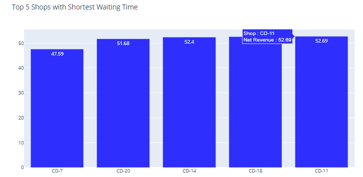
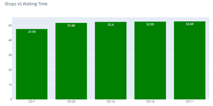
The graph is looking nice. Let’s try to change the color of bars from blue to green.
trace0 = go.Bar(
x = SWT.Shop,
y = SWT['Waiting_Time-2'],
name = "",
marker = dict(color = 'Green'),
text = SWT['Waiting_Time-2'],
textposition = 'auto',
hovertemplate = "Shop : %{x}<br>Net Revenue : %{y}"
)
data = [trace0]
layout = go.Layout(barmode = 'relative',
title = dict(text = "Shops Vs Waiting Time"))
fig = go.Figure(data=data, layout=layout)
fig.show()
In the blue graph’s marker, we have used rgba format of the color, in the green graph’s marker we have used the name of the color which is Green. This shows that you can give the color in both the formats.
Data and Layout Description
trace0: A trace0 is only the name of an object. This object is a collection of data and the properties of which we want our data plotted. You can provide any number of properties in this variable.
Data Customization
- x: the column value you want on the x-axis.
- y: the column value on the y-axis.
- marker: this property is for the color of the bars.
- text: the values you want to show on bars.
- textposition: the position of the text.
- hovertemplate: the text and the fields you want to show on mouse hover.
We can use more properties. Let’s pass trace0 objects to a list called data.
Layout Customization
- barmode: Choose barmode as relative, stack, group.
- format: format the title of the layout.
In Layout we have used only two properties you can use more properties and format the layout.
Line Chart
We are going to start with the line graph let’s see how our data looks like.
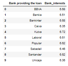
point4 = (Combined_df.groupby("Bank providing the loan", as_index = False)
          ['Bank_interests'].mean()).round(decimals=2)
point4
Using the above data we’ll create a line graph showing Bank Vs. Bank Interest.
trace = go.Scatter(
x = point4['Bank providing the loan'],
y = point4['Bank_interests'],
mode = "lines",
name = "",
line = dict(color='Green'),
)
data = [trace]
layout = go.Layout(
title = "Bank Vs. Bank Interests",
)
fig = go.Figure(data = data, layout = layout)
fig.show()
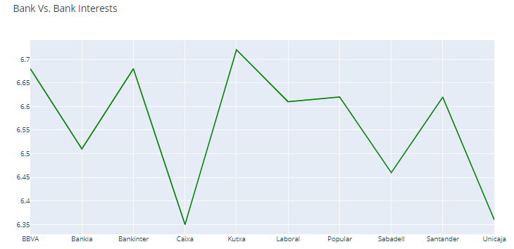
The graph is looking nice. Let’s add some properties to make it more attractive. Let’s add the marker at the end-points of the line and increase the width of the line.
trace = go.Scatter(
x = point4['Bank providing the loan'],
y = point4['Bank_interests'],
mode = "lines+markers",
name = "",
line = dict(color='Green', width=4),
marker = dict(
color = "Green",
line=dict(
color='Green',
width=12
)))
data = [trace]
layout = go.Layout(
title = "Bank Vs. Bank Interests",
)
fig = go.Figure(data = data, layout = layout)
fig.show()
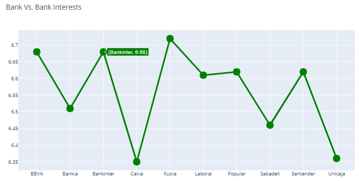
The graph is looking nice. Let’s modify the hover information.
trace = go.Scatter(
x = point4['Bank providing the loan'],
y = point4['Bank_interests'],
mode = "lines+markers",
name = "",
hovertemplate = "Bank Name : %{x}<br>Bank Interest : %{y}",
line = dict(color='Green', width=4),
marker = dict(
color = "Green",
line=dict(
color='Green',
width=12
)))
data = [trace]
layout = go.Layout(
title = "Bank Vs. Bank Interests",
)
fig = go.Figure(data = data, layout = layout)
fig.show()
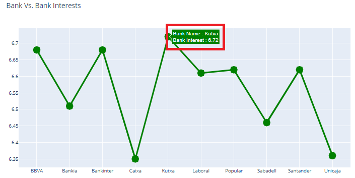
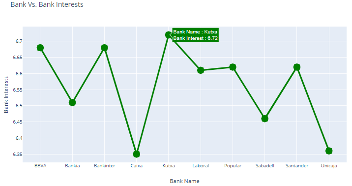
Now the hover information becomes more readable as shown in the above image. Let’s customize the layout of the graph and add the axis’ titles.
trace = go.Scatter(
x = point4['Bank providing the loan'],
y = point4['Bank_interests'],
mode = "lines+markers",
name = "",
hovertemplate = "Bank Name : %{x}<br>Bank Interest : %{y}",
line = dict(color='Green', width=4),
marker = dict(
color = "Green",
line=dict(
color='Green',
width=12
)))
data = [trace]
layout = go.Layout(
title = "Bank Vs. Bank Interests",
xaxis = dict(title = "Bank Name"),
yaxis = dict(title = "Bank Interests"),
)
fig = go.Figure(data = data, layout = layout)
fig.show()
Conclusion
This blog should give you a good first impression of Plotly bar and line charts. For any query related to Plotly feel free to contact us and stay tuned with us in our next blog for more magical graphs in Plotly.
To know more about our services please visit Loginworks Softwares Inc.
I excel when it comes to making bespoke data dashboards and visualizations that users and clients absolutely love. Sharing about things I enjoy doing is my hobby, whether it's about a project, collaboration, feedback, or just simple how-to guides about visualization.
If you have something to ask or share, I'd love to hear from you!
- Business Intelligence Vs Data Analytics: What’s the Difference? - December 10, 2020
- Effective Ways Data Analytics Helps Improve Business Growth - July 28, 2020
- How the Automotive Industry is Benefitting From Web Scraping - July 23, 2020