In the previous blog (Part I), we revealed an introduction about Plotly. We also introduced two of its graphs (the bar graph and the line chart). In part I, we have explained both the graphs in brief with examples. With this blog, we shall try to explain about multi-line chart and the pie chart, as both these charts are very important in data visualization.
Jump to Section
Multi-Line Chart
Let’s design the data set for a multi-line chart.
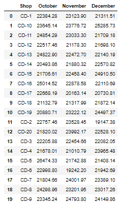
data = {'Shop': ['CD-1', 'CD-10', 'CD-11', 'CD-12', 'CD-13', 'CD-14',
                'CD-15','CD-16', 'CD-17', 'CD-18', 'CD-19', 'CD-2',
                'CD-20', 'CD-3', 'CD-4', 'CD-5', 'CD-6', 'CD-7',
                'CD-8', 'CD-9'],
        'October': [22384.28, 23645.14, 24854.29, 22517.46, 24822.9, 20493.86,
                    21706.61, 25014.52, 22668.19, 21132.79, 20880.71, 22757.46,
                    21820.02, 22205.88, 21678.01, 26474.33, 22998.8, 21804.66,
                    24298.96,23345.24],
        'November': [23123.9, 23776.72, 23033.3, 21178.3, 22472.7, 21880.32,
                     22458.4, 22878.58, 20163.14, 21317.99, 23222.12, 23528.45,
                     23992.17,22454.66, 21010.79, 21742.88, 19242.2, 24001.97,
                     23201.95, 24793.8],
        'December': [21311.51, 25285.73, 21709.18, 21698.1, 22140.19, 22570.82,
                     24910.5, 22110.69, 20730.81, 21872.14, 24497.37, 19147.38,
                     22528.1, 22082.05, 23965.48, 21408.14, 21942.69, 23389.1,
                     23017.26, 24149.86]
}
df1 = pd.DataFrame(data, columns = ['Shop', 'October', 'November', 'December'])
df1
Above is the data of shops that show the net revenue of each shop in October, November, and December. Let us see how the data looks like.
Let’s plot a line chart from the above data, and then we’ll move to a multi-line chart.
trace0 = go.Scatter(
x = df1.Shop,
y = df1.October,
mode = 'lines+markers',
name = '',
hovertemplate = "Shop : %{x}<br>Net Revenue : %{y}"
)
data = [trace0]
layout = go.Layout(title = 'Shop Profit per Month',
xaxis = dict(title = 'Shop'),
yaxis = dict(title = 'Net Revenue'),
)
fig = go.Figure(data = data, layout = layout)
fig.show()
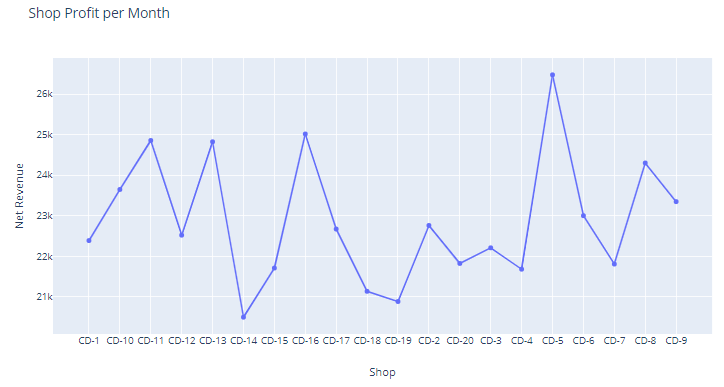
We have created only one trace (i.e., trace0), so we get only a single line chart. To draw a multi-line chart, we need to create multiple traces. Let us add more traces and see the change in the graph.
trace0 = go.Scatter(
x = df1.Shop,
y = df1.October,
mode = 'lines+markers',
name = '',
hovertemplate = "Shop : %{x}<br>Net Revenue : %{y}"
)
trace1 = go.Scatter(
x = df1.Shop,
y = df1.November,
mode = 'lines+markers',
name = '',
hovertemplate = "Shop : %{x}<br>Net Revenue : %{y}"
)
trace2 = go.Scatter(
x = df1.Shop,
y = df1.December,
mode = 'lines+markers',
name = '',
opacity = 1,
marker = dict(color = 'rgba(247, 202, 24, 1)'),
hovertemplate = "Shop : %{x}<br>Net Revenue : %{y}",
)
data = [trace0, trace1, trace2]
layout = go.Layout(title = 'Shop Profit per Month',
xaxis = dict(title = 'Shop'),
yaxis = dict(title = 'Net Revenue'),
)
fig = go.Figure(data = data, layout = layout)
fig.show()
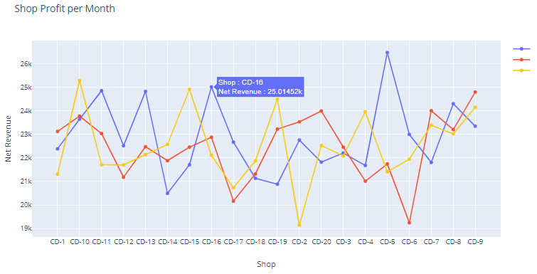
We have drawn a multi-line chart, and the graph looks nice. The graph shows the shop name and net revenue on mouse hover, but we want to show the month name also on mouse hover. Let’s do the change in hovertemplate. You can see the change in bold, i.e., “Shop : %{x}<br>Month : October<br>Net Revenue : %{y}”.
trace0 = go.Scatter(
    x = df1.Shop,
    y = df1.October,
    mode = 'lines+markers',
    name = '',
    hovertemplate = "Shop : %{x}<br>Month : October<br>Net Revenue : %{y}"
)
trace1 = go.Scatter(
    x = df1.Shop,
    y = df1.November,
    mode = 'lines+markers',
    name = '',
    hovertemplate = "Shop : %{x}<br>Month : November<br>Net Revenue : %{y}"
)
trace2 = go.Scatter(
    x = df1.Shop,
    y = df1.December,
    mode = 'lines+markers',
    name = '',
    opacity = 1,
    marker = dict(color = 'rgba(247, 202, 24, 1)'),
    hovertemplate = "Shop : %{x}<br>Month : December<br>Net Revenue : %{y}",
)
data = [trace0, trace1, trace2]

layout = go.Layout(title = 'Shop Profit per Month',
              xaxis = dict(title = 'Shop'),
              yaxis = dict(title = 'Net Revenue'),
              )
fig = go.Figure(data = data, layout = layout)
fig.show()
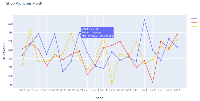
In the above image, we have successfully added the month on mouse hover information. You can change the color of the lines, the width of the lines, and multiple things, according to you. The color and width of the line we already explained in our previous blog (Part I). we think it is enough for the line chart
Pie Chart/Donut Chart
A donut chart also called a pie chart with a part of the middle cut out.
Pie charts are generally criticized for focusing readers on the proportional areas of the slices to at least one another and the chart as a full. This makes it powerful to examine variations between slices, particularly once you try and compare multiple pie charts along.
A donut chart somewhat rectifies this drawback by de-emphasizing the utilization of the area. Instead, readers focus a lot on reading the length of the arcs, instead of comparing the proportions between slices. Also, donut charts are a lot of space-efficient than pie charts; as a result of the area, the blank space with a donut chart can be used to display info within it.
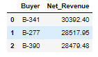
Let’s create the dataset for the donut chart. We have a large dataset of buyers, but we want to show the top three buyers in the donut chart, so we have filtered out only the top three buyers along with the revenue generated by them. See the dataset below.
data = {'Buyer': ['B-341', 'B-277', 'B-390'],
'Net_Revenue': [30392.4, 28517.95, 28479.48]
}
df1 = pd.DataFrame(data, columns = ['Buyer', 'Net_Revenue'])
df1
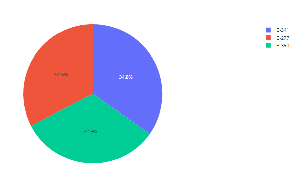
The simple code to create a pie chart.
import plotly.graph_objects as go

Buyer = ['B-341', 'B-277', 'B-390']
Net_Revenue = [30392.4, 28517.95, 28479.48]

fig = go.Figure(data=[go.Pie(labels = Buyer, values = Net_Revenue)])
fig.show()
Let’s modify the code and make some changes to the code. We will use the data (trace) and layout to create the pie chart.
trace = go.Pie(
labels = df1['Buyer'],
values = df1['Net_Revenue'],
name = "",
marker = dict(line = dict(color = "#000000", width = 2)),
textinfo = "label+percent",
hovertemplate = "Buyer : %{label}<br>Net Revenue : %{value}"
)
data = [trace]
layout = go.Layout(
title = "Top 3 Buyer by Revenue",
)
fig = go.Figure(data = data, layout = layout)
fig.show()
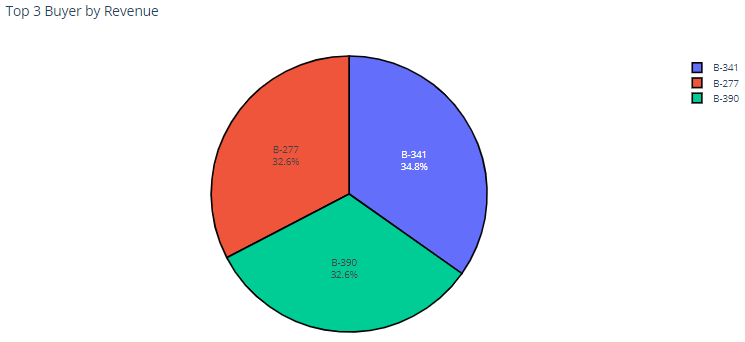
You can compare each chart and see the difference. Here, we have given the title to the chart and added buyers to the slices of the pie chart. The color of the graphs is the same. Try to change the color of the chart and change the outline of all the slices to white.
colors = ["rgba(30, 130, 76, 1)", "Gold", "rgba(30, 139, 195, 1)"]
trace = go.Pie(
labels = df1['Buyer'],
values = df1['Net_Revenue'],
name = "",
marker = dict(colors = colors, line = dict(color = "#FFFFFF", width = 2)),
textinfo = "label+percent",
hovertemplate = "Buyer : %{label}<br>Net Revenue : %{value}"
)
data = [trace]
layout = go.Layout(
title = "Top 3 Buyer by Revenue",
)
fig = go.Figure(data = data, layout = layout)
fig.show()
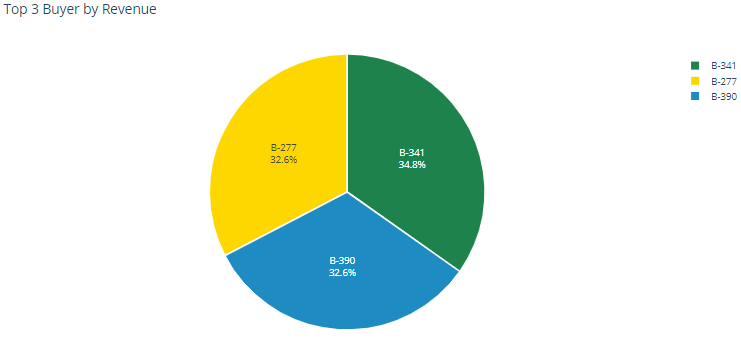
To change the color, we have added a color list at the top of the code. We have added the name and rgba format for the colors in this list and passed this to marker (marker = dict(colors = colors, line = dict(color = “#FFFFFF”, width = 2))
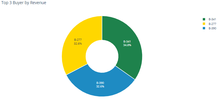
Now we are familiar with the pie chart. Let’s convert this pie chart to the donut chart.
Donut Chart
colors = ["rgba(30, 130, 76, 1)", "Gold", "rgba(30, 139, 195, 1)"]
trace = go.Pie(
labels = df1['Buyer'],
values = df1['Net_Revenue'],
name = "",
hole = .4,
marker = dict(colors = colors, line = dict(color = "#FFFFFF", width = 2)),
textinfo = "label+percent",
hovertemplate = "Buyer : %{label}<br>Net Revenue : %{value}"
)
data = [trace]
layout = go.Layout(
title = "Top 3 Buyer by Revenue",
)
fig = go.Figure(data = data, layout = layout)
fig.show()
To create a donut chart, add a hole property in trace and set a number for the hole, which defines the area of the hole in the middle of the donut chart.
Conclusion
We have explained the multi-line chart, pie chart, and donut chart. We know that this is not the end of data visualization; there are lots of graphs. As a beginner, it will help you. You can take any dataset and try this by yourself. Create the graphs and share your code in the comment box, and if you have any queries, feel free to contact us in the comment box.
To know more about our services, please visit Loginworks Softwares Inc.
I excel when it comes to making bespoke data dashboards and visualizations that users and clients absolutely love. Sharing about things I enjoy doing is my hobby, whether it's about a project, collaboration, feedback, or just simple how-to guides about visualization.
If you have something to ask or share, I'd love to hear from you!
- Business Intelligence Vs Data Analytics: What’s the Difference? - December 10, 2020
- Effective Ways Data Analytics Helps Improve Business Growth - July 28, 2020
- How the Automotive Industry is Benefitting From Web Scraping - July 23, 2020