
Radar charts, also known as spider charts, are described by datavizcatalogue.com as follows:
Radar Charts are a way of comparing multiple quantitative variables. This makes them useful for seeing which variables have similar values or if there are any outliers amongst each variable. Radar Charts are also useful for seeing which variables are scoring high or low within a dataset, making them ideal for displaying performance.
Each variable is provided with an axis that starts from the centre. All axes are arranged radially, with equal distances between each other, while maintaining the same scale between all axes…Each variable value is plotted along its individual axis and all the variables in a dataset and connected together to form a polygon.
Data visualization with Tableau is commonly used in today’s industry for data analysis. Users can create and distribute an interactive and collaborative dashboard that displays patterns, variations, and data density in the form of graphs and charts.
Tableau is a potent business intelligence (BI) tool, but sometimes it has its challenges. In today’s blog, we will discuss a case study for one of our clients, wherein he asked to create a spider chart into the Tableau dashboard for his data. Please note that there is no spider chart or Radar chart feature in Tableau charts. In this article, we will discuss how to resolve this challenge in Tableau.
Jump to Section
How to Create a Spider Chart Into the Tableau Dashboard
We research the web for the solutions, and we came over some of the mathematical methods and alternative methods.
Mathematical Method
By using the trigonometry formula, it is essential to use it to create an axis, and it depends on the number of metrics you want to display. For example, if you’re going to display 5 axes (= 5 metrics), you have to use different formulas than the 6 axes chart. Our client used a 12 axes chart, so we had to use several formulas. Thanks to the Internet, we were able to find different formulas and create a calculation in Tableau for X-axis and Y-axis.
Calculation for [Xaxis]
case [Dimension]

when "Member 1" then 0

when "Member 2" then [Value] *(1/2)

when "Member 3" then [Value] *(sqrt(3)/2)

when "Member 4" then [Value]

when "Member 4" then [Value] *(sqrt(3)/2)

when "Member 5" then [Value] *(1/2)

when "Member 6" then 0

when "Member 7" then [Value] *(-1/2)

when "Member 8" then [Value] *(-sqrt(3)/2)

when "Member 9" then [Value] *(-1)

when "Member 10" then [Value] *(-sqrt(3)/2)

when "Member 11" then [Value] *(-1/2)

end
Calculation for [Yaxis]
case [Dimension]

when "Member 1" then [Value]

when "Member 2" then [Value]*(sqrt(3)/2)

when "Member 3" then [Value]*(1/2)

when "Member 4" then 0

when "Member 5" then ([Value])*(-1/2)

when "Member 6" then [Value]*(-sqrt(3)/2)

when "Member 7" then [Value]*(-1)

when "Member 8" then [Value]*(-sqrt(3)/2)

when "Member 9" then [Value]*(-1/2)

when "Member 10" then 0

when "Member 11" then [Value]*(1/2)

when "Member 12" then [Value]*(sqrt(3)/2)

end
It is crucial to have the same [Value] scale for each [Dimension] members! Indeed, the 12 axes have to be the same. In this case, the scale was from 0 to 100.
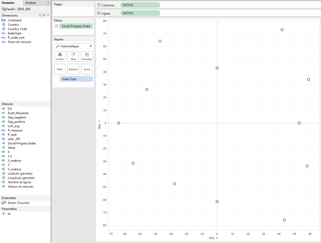
After the creation of calculations, we had to build the chart. To do this, we just have to drag and drop them [Yaxis] on the lines shelf and the [Xaxis] on the columns shelf.

You can note that we have to use the aggregation Average (because Sum will return a wrong result). Here we have only 1 point. To create the radar, we have to use several dimensions ([Country] and [IndexType]). The [IndexType] allows us to draw 12 axes because this is a dimension with 12 members; [Country] allows us to draw 1 radar by country. If you want to draw the average radar chart, you can remove the [Country] field. To have several points, we have to add [IndexType] on the Mark shelf as a Level of Detail.
After that, we have to change the Mark to draw a polygon and add [Country] as a quick filter.
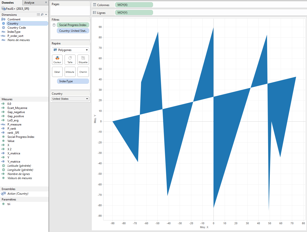
To have a beautiful radar, the last things to do are put [IndexType] as a Path to follow and Fix axis between -110 and 110 (or whatever you want to have enough space between borders and chart).

To give some design to our chart, we chose to remove gridlines, Zero lines, and borders, and to hide headers. Moreover, we decided to provide some transparency and a border to our polygon to have a more beautiful chart.

Finally, we drew a background image to have a reference axis to give some visual impact. Indeed, we think it is better if you know where the maximum is.

To add beautiful tooltips, it is important to put AVG([Value]) on the Mark shelf and to configure the tooltip like this:

Alternative Method
Another technique is to use a background picture from the sources. When you haven’t created a map with a custom background picture before, it’s pretty easy – you just need to know the limits on the X-Y scatter plot that the image will be within. As we were styling ours on excel, we did a screengrab of an empty excel version, and so had our background.

For the data, we’ve only generated some of the requisite fake details in an excel file, i.e., 5 lines of data to make 5 points.

After first locating the X-Y coordinates of the endpoints in the background image, the X and Y coordinates took a bit of math, assuming the center is (0,0).
It was applied to the data source, and then we used Tableau to calculate where the relative point will be depending on the value of the point compared to the maximum value on the chart.

Place the Relative X field on Columns, the Relative Y field on Rows, using the Line type with the point ID as the Path, color it by the name of the path, and there we go.

Almost.
Because it is a cyclic plot, the first and the last points are to be joined together. It fits for a polygon, but not a line chart. Go back to the excel, add another data point, same as the first, then go back to Tableau again, refresh and there we go – it works.

To finish the view, we first added a no-change “Lookup” table calculation to allow only one of the two lines to be seen, without changing the maximum number, and thus the positions.

The next thing you must do is add the label. This was rendered more complicated by the fact that the Tableau v8 layout engine does not overlay labels for two points if they are of the same type. This means that the start/endpoint is a bit odd, so we just need to use the measured field to use the value if it is not the last point on the line
IF LAST()<>0 THEN SUM(Value) END

Put SUM(Result) onto size if you want, but there we have the radar chart in Tableau.
Conclusion
And that’s all there’s to it. One of the major benefits of Tableau spider charts is that it helps to analyze and display data using Tableau and make better, more data-driven decisions. If you’re using this template to build your radar map, we would love to see it. But please don’t create one just because you can. Be sure to carefully track the use case and make sure it is the correct sort of chart first. Visit our website https:/www.loginworks.com/data services consulting to see how our experts can help with your data visualization projects. Please share your feedback and your thoughts on what you think about this blog. We hope you enjoyed the post. Do visit our blog for more tableau tips and strategies.
I excel when it comes to making bespoke data dashboards and visualizations that users and clients absolutely love. Sharing about things I enjoy doing is my hobby, whether it's about a project, collaboration, feedback, or just simple how-to guides about visualization.
If you have something to ask or share, I'd love to hear from you!
- Business Intelligence Vs Data Analytics: What’s the Difference? - December 10, 2020
- Effective Ways Data Analytics Helps Improve Business Growth - July 28, 2020
- How the Automotive Industry is Benefitting From Web Scraping - July 23, 2020