The current marketing industry stands as a perfect amalgam of science and art. The science consists of all kind of data that is required for reporting and is subject to analysis to find trends that are going to affect the future. The art part involves a creative display of this data to create campaigns and reports attractive enough to gain eyeballs in a time when attention span is decreasing rapidly. In this modern era of digitalization, marketing no more works on a spray and pray attitude, rather every campaign is data-backed. To make a particular decision, a lot of data points are taken into consideration. But, the huge amount of data that we get every day might cause an analysis paralysis if the right tools are not employed to visualize them nicely on a canvas. Data Visualization is one such fusion of science and arts that gives us a path out of the data deluge by presenting it in a visually appealing manner.
What does data visualization stand for in marketing?
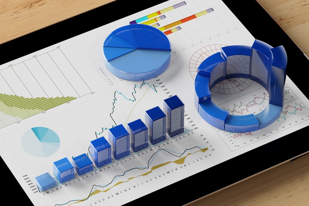
In layman’s language, data visualization is the visual representation of data on a canvas using suites like Microsoft Power BI or Tableau. The advanced function of data visualization through these tools unveil patterns, trends outliers, and correlation in data. It gives you angles that you might not have thought before. It provides an unwavering picture of exactly how your business is performing in the industry and how much it can excel. For example, if you are not sure which advertising solution you should opt for to push your sales, pull out the performance data of your previous campaigns, feed it in the data from all platforms and compare the success from all angles to decide where to invest.
Importance of Data Visualization in Marketing
Unearth Patterns and Trends
If you are deep into marketing or follow your own company’s marketing very closely, you must have wondered several times about who visits the website most? Which working day brings more sales than others? Which city has better lead conversion ratio etc? On a smaller scale you can manage it manually, but what if you are expanding continuously and have no time to visit ground zero, you may want to get insights that can help you in the longer run. For that, you need data visualization consultants who can convert conveniently your huge amount of data coming to you into a piece of single page information that is important for your leadership. You discover more patterns instantly by giving commands in your natural language. Once you employ such a data service consultancy, you won’t believe how helpful raw data is for your business functionality and future progress.
Simple and Efficient Reports
Another very important feature of data visualization is that it distills complex data into lucid reports that are understandable for everyone. Just imagine a scenario where all your technical reports are on one dashboard and as a leader, you don’t need to ask anyone to understand it. That’s the power of data visualization which can be achieved by using Power BI or Tableau suites. Plus the human factors come in. The human brain can perceive and understand an image 60,000 times faster than text. In addition to this, 93% of human communications are through visuals. Going through a sheet full of numbers can be very painstaking in comparison to graphs and pie charts that are quite simple to understand and self-explanatory. Data visualization suites and experts are more focused on insights rather than heaps of useless data that lies around the office. In the longer run, it can save a lot of paper by being available anytime on your mobile and laptop screen. In short, converting numbers into visuals helps you simplify those complex rows and columns into easily consumable information chunks and unmask the power of data.
Drive Your Point Home
Imagine a situation where you want to more budget for a project that has proven to be very successful. Rather than presenting a complex report that will take a huge amount of convincing, a simple canvas with all major KPIs and highlights on one page can convince the boards in minutes to approve your marketing campaign. In short, data-backed charts and diagrams are better bid than long and tedious reports that are hard to make sense of. Data visualization helps portray data in a purposeful manner and influence decision makers.
Data Visualization = Quality Content
In the cut-throat world of marketing, it is very important to know exactly what product feature or marketing strategy is working. Data visualization through Power BI can help you understand those points and then you can make your customer understand that you know their business inside out to shell out just the right campaign for them. A campaign or headline based on numbers perform way better than any other style due to the sense of reliability from the crowd.
If you think data is brought, think again. As a marketing expert it could be you x-factor that will lead you to better data-backed campaigns that no one else is providing. If you want to opt for Power BI or Tableau consultancy to process your company’s valuable data, contact us at www.loginworks.com. Loginworks is a leading force to curate IT and data visualization solutions that boost business efficiency and productivity. Loginworks has served industries like retail, finance, healthcare, real estate, e-commerce, advertising, PR and hospitality, to name a few. Some of our outstanding projects include a point-of-sales system, office collaboration software, mobile data capture using RFID, server management application, and the recently added – mobile ordering system.
Contact us now to rule the marketing world.
I excel when it comes to making bespoke data dashboards and visualizations that users and clients absolutely love. Sharing about things I enjoy doing is my hobby, whether it's about a project, collaboration, feedback, or just simple how-to guides about visualization.
If you have something to ask or share, I'd love to hear from you!
- Business Intelligence Vs Data Analytics: What’s the Difference? - December 10, 2020
- Effective Ways Data Analytics Helps Improve Business Growth - July 28, 2020
- How the Automotive Industry is Benefitting From Web Scraping - July 23, 2020