Jump to Section
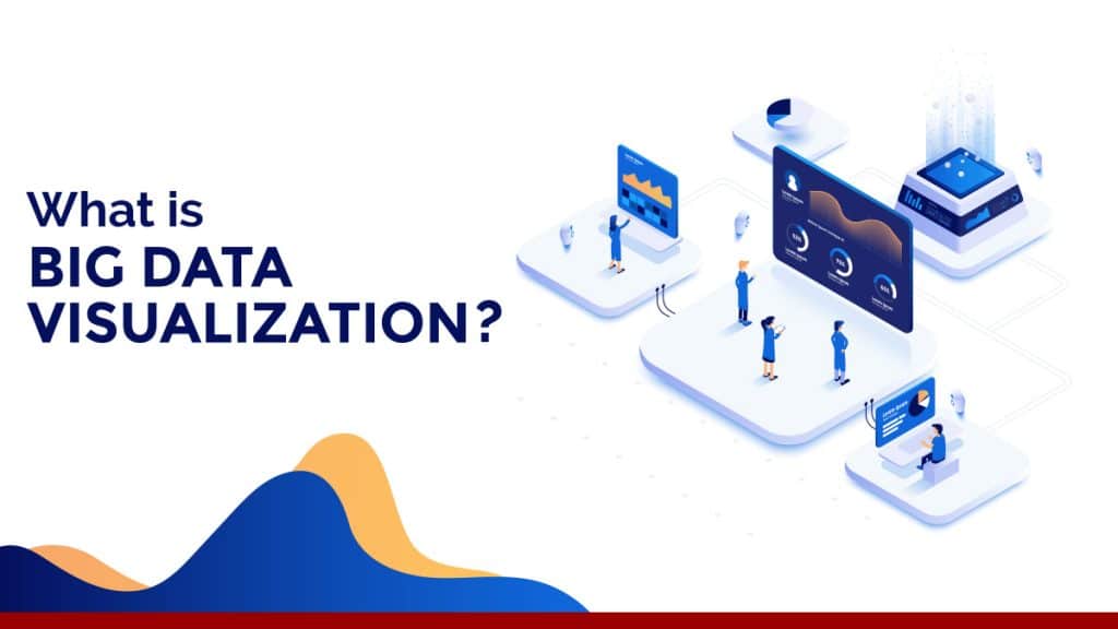
Introduction to Data Visualization
With the recent advancements in big data, it has become necessary to showcase the data in an understandable and meaningful format so that the amount of data doesn’t become overwhelming. The visualized large data sets can be utilized for various purposes, such as finding the trends/patterns of data that can help in any business’s decision-making process.
Data visualization is defined as the graphical or pictorial representation of data so that the viewer can clearly understand the data trends. Visual elements are used so that the data can recognize and evaluate the trends, outliers, and patterns.

Charts, maps, and graphs are different methods used for data visualization, and so on. These tools are designed so that the information can be understood and grasped just by looking at the presentation instead of studying the data thoroughly so that time is saved for the end-user.
Types of Data Visualization
Data Visualization is defined as the pictorial representation of the data to provide decision-makers with fact-based analysis as text data may not be able to disclose the pattern or patterns used to recognize data, based on the visualization it is classified into 6 different types, i.e. Temporal (data is linear and one-dimensional), Hierarchical (within a larger group, it visualizes organized groups), Network (with visualization for linking datasets to datasets), Multidimensional (temporal kind contrast), Geospatial (spatial or Geo-spatial maps associated) and Miscellaneous.
Big Data Visualization Tools
Raw data is really hard to understand and it requires much time to get meaningful information from that data. The other ways are to introduce visualization big data to get something that everybody can easily digest. We can make sense of it easily, we can analyze and show interesting patterns that wouldn’t be apparent from looking only at stats.
Add visualization to it and you get something that can be quickly digested by anyone. Not only can you make sense of it easier, but fascinating trends can also be found that wouldn’t be evident by just looking at numbers.
One problem with the sheer amount of data created on a regular basis is that, in general, enormous numbers such as those above appear to slip right off the bottom.
Here is the list of five analytics visualization tools that are been mostly used by our developers and analyst:
Tableau
Tableau Software is one of the fastest-growing data visualization tools currently in use in the business intelligence (BI) industry. With zero technical skills and coding knowledge, it is the easiest way to change or turn the raw data collection into an easily understandable format.

Tableau is loaded with a lot of important as well as useful features listed below:
- By means of visualizations, visual objects, text, etc., Tableau Dashboards provide a healthy view of your results.
- A healthy view of your information is provided by Tableau Dashboards.
- In the form of visualizations, sheets, dashboards, etc., Tableau offers convenient options to interact with other users and share data instantly.
- Tableau as in-memory data ensures access to all live data sources or data extraction from external data sources.
- All data sources are accessible on Tableau, ranging from on-premise files, spreadsheets, relational databases, non-relational databases, data warehouses, big data, and on-cloud data.
- You can render visualizations in Tableau as simple as a:
- Bar chart
- Pie chart
- and as advanced as a:
- Histogram
- Gantt chart
- Bullet chart
- Motion chart
- Treemap
- Boxplot
- Tableau has the ability to build customizable mobile layouts for your mobile device-specific dashboard.
- Bar chart
- Pie chart
- and as advanced as a:
- Histogram
- Gantt chart
- Bullet chart
- Motion chart
- Treemap
- Boxplot
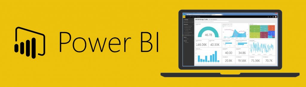
Power BI
Power BI is a platform for data visualization and business intelligence that transforms data into interactive dashboards and BI reports from various data sources. Multiple applications, connectors, and services are included in the Power BI suite – Power BI desktop, SaaS-based Power BI service, and mobile Power BI apps for different platforms. We have the best of the Power BI experts to help you out with your projects.
We have had a brief overview of what Power BI is let’s have a quick look at its features:
- Quick Insights: In Power BI, this function was developed in conjunction with Microsoft Research and a set of advanced analytical algorithms were developed.
- Ask a Question: This function allows the user the freedom to add within the report a ‘question’ icon.
- Integration with R: A user can run R scripts with Power BI using the R connector. Then, the resulting data sets can be imported into a Power BI data model.
- Intelligent App Suggestions: The sophisticated model of this feature helps the users to list down their app based on popularity, relevance, content and review of other users.
- Integration of Azure Machine Learning: With integration of Machine Learning in Power BI, users can now visualize the results of Machine Learning algorithms by just dragging, dropping and connecting data modules to create big data charts.
- For big data visualization Power BI allows you to connect directly to your Spark cluster and explore and monitor data without requiring a data model as an intermediate cache. This allows interactive exploration of your data and refreshes the visuals automatically without needing a scheduled refresh. Armed with the Google essentials and more (thanks to powerful integrations with Sabermetrics, Power My Analytics, etc.)
Google Data Studio
Google data studio integrates with Big data visualization as:
- To share with your customers, Google Data Studio helps you to create branded reports with data visualizations. When combined with C Data Connect Cloud, for visualizations, dashboards and more, you get instant, cloud-to-cloud access to Spark data. This article demonstrates how to create a Spark virtual database and generate reports in Google Data Studio from Spark data.
Google Sheets
- Google Sheets is a spreadsheet app on steroids. It looks and works much like any other spreadsheet tool, but it provides much more than most spreadsheet tools because it’s an online app.

Plotly
Plotly is a graphing and plotting library in Python similar to Matplotlib. The difference between the two is the fact that Plotly creates dynamically, interactive charts and graphs.
The Plotly Python library (plotly.py) is an open-source, interactive plotting library that supports more than 40 different types of charts covering a wide range of cases of statistical, financial, geographical, science and 3-dimensional use. The Plotly Python library (plotly.py) is an open-source, interactive plotting library that supports more than 40 different types of charts covering a wide range of cases of statistical, financial, geographical, science and 3-dimensional use.
We use all the above approaches to make the data insights approachable and user friendly for our clients to understand. If you need such assistance, we can be a great help.
- What Is Big Data Visualization? - January 22, 2021
- Five Benefits of Big Data Analytics for E-commerce - July 9, 2020
- Google Data Studio Vs. Tableau: Which One is More Suitable for Your Business? - June 25, 2020