Jump to Section
Introduction
Business intelligence tools (zero-coding user-friendly tools) make data visualization easy. For this reason, one can easily become an expert as you do not require any basic programming language knowledge.
There are many free open sources available, as well as many paid tools that give you free trial days for trying them out. However, they have limited functionality and cannot meet one’s individual needs.
Drawbacks
Although business intelligence tools make data visualization easy, they have certain drawbacks which include:
- Their paid version is very costly for an individual to buy.
- Also, the tools are not very reliable for big data.
So, when you are facing the drawbacks of Power BI tools, you can go for other options like data visualization using R or Python.
Data analysis uses R and Python programming tools. However, the difference is that the field of data analysis uses R exclusively, and Python has numerous applications; the data science field is just one of them. Beyond that, R still maintains an advantage in the field of statistics. The development of Python in data analysis has modeled some of the features of R in many places. Also, both R and Python are very much similar in many places.
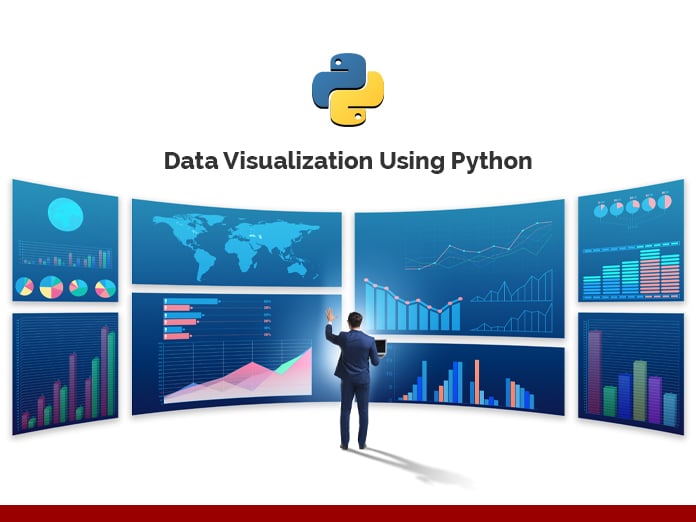
Visualizing Data Using Python

First, let us give you a brief about Python and why learning and using Python is in trend:
- Python is free and open-source.
- It is user-friendly and easy to learn.
- It has vast libraries and frameworks.
- Python is used in the development phase.
- The Data Science field uses Python for:
- Data scraping.
- Data manipulation.
- Machine learning.
- Big data.
There are different Python IDEs and Code Editors:
- PyCharm,
- Spyder,
- Pydev,
- Idle,
- Wing,
- Eric Python,
- Rodeo,
- Thonny.
To summarize, we prefer PycCharm as it supports both single and multi-file projects with great ease. Here you can use the standard implemented library of Python. It easily supports virtual environments and a whole range of optional code verifiers, including the Python enhancement proposal (PEP8).
Python enhancement proposal (PEP8) is a proposal with a set of rules for how to format your Python code to maximum readability.
You can download Pycharm from the link given below:
https://www.jetbrains.com/pycharm/download/#section=windows
Let’s begin learning for data visualization using Python.
Top Python Libraries Used for Data Science
- NumPy:
- NumPy is a strong Python library used for scientific computing.
- TensorFlow and several other machines learning Python libraries make use of NumPy.
- Pandas:
- Pandas provide an easy way to create, manipulate, and wrangle the data.
- Time-series data solutions make use of pandas.
- Matplotlib:
- It is a two-dimensional plotting library for the Python programming language.
- It works great with several graphic backends and operating systems.
- SciPy:
- SciPy is used for integration, linear algebra, optimization, and statistics.
- NumPy array is the basic data structure of SciPy.
- SciKit-Learn:
- It is used for logistics regression and nearest neighbors.
- There is more feature to implement data mining and machine learning algorithms, like classification, clustering, model selection, reducing dimensionality, and regression.
- TensorFlow:
- It is used for training and designing deep learning models.
- TensorFlow simplifies the process of visualizing each part of the graph.
- Keras:
- It is used for models of a neural network, includes convolutional, embedding, fully connected, pooling, and recurrent models.
- Seaborn:
- Seaborn is a library used for data visualization, making statistical graphics in Python.
- NLTK:
- Natural Language Toolkit (NLTK) is used for accomplishing symbolic and statistical natural language processing.
- Gensim:
- Unsupervised learning handles large text collections using Gensim.
Likewise, all the libraries mentioned above are the most important Python libraries. Therefore, the data science field of machine learning, big data, as well as data analytics and visualization, are done using Python.
Data Visualization

Above all, Python offers various graphing libraries. It has different visualization functions, in addition to its characteristical features. Lastly, with this quick description of Python in the data science field, we are taking you to the very first graph using pandas, Matplotlib, and more libraries step by step:
Download the Iris dataset – it is available online.
import pandas as pd
import warnings
warnings.filterwarnings("ignore")

import seaborn as sns

import matplotlib.pyplot as plt

sns.set(style="white", color_codes=True)
iris = pd.read_csv("filepath/input/Iris.csv")
iris.plot(kind="scatter", x="SepalLengthCm", y="SepalWidthCm")

sns.boxplot(x="Species", y="PetalLengthCm", data=iris)

from pandas.tools.plotting import andrews_curves

andrews_curves(iris.drop("Id", axis=1), "Species")

Final Words
Thank you for the read. I hope that you have enjoyed the article. If you like it, please do share it on social platforms and with your friends. We will be happy to hear your feedback. If you have some questions, feel free to ask them in the comments section below.
I excel when it comes to making bespoke data dashboards and visualizations that users and clients absolutely love. Sharing about things I enjoy doing is my hobby, whether it's about a project, collaboration, feedback, or just simple how-to guides about visualization.
If you have something to ask or share, I'd love to hear from you!
- Business Intelligence Vs Data Analytics: What’s the Difference? - December 10, 2020
- Effective Ways Data Analytics Helps Improve Business Growth - July 28, 2020
- How the Automotive Industry is Benefitting From Web Scraping - July 23, 2020