Before the development of Bootstrap in the field of Web Designing, most of the people used to create their own set of CSS file for their projects. Most of the people follow the use of this method, but let’s face it, this is not the most efficient way for creating projects. Creating a proper CSS framework includes:
- follow-up of latest standards
- must be flexible
- should be closely tested
It will take many days of work and it becomes a project itself. Most of the designers do not have much time to follow the above-listed things. Nowadays, keeping up with the upgraded/new technologies and making responsive websites is very time-consuming.
So, what do you think how designers can create a website in an easy way?
There are different numbers of Cascading Style Sheets (CSS) framework but Bootstrap is one of my favorite. Due to the current demand for responsive website design, Bootstrap is the most widely used framework. These days, most of all smartphone’s users use their phones to surf the internet rather than laptops or computers. Now it is essential that website have to adjust according to the varying screen size of the mobile devices. This is one of the main reason why Responsive Web Design (RWD) is in demand.
Now, I think you have a question about RWD.
So, let’s move forward and know about RWD.
Jump to Section
What is RWD?
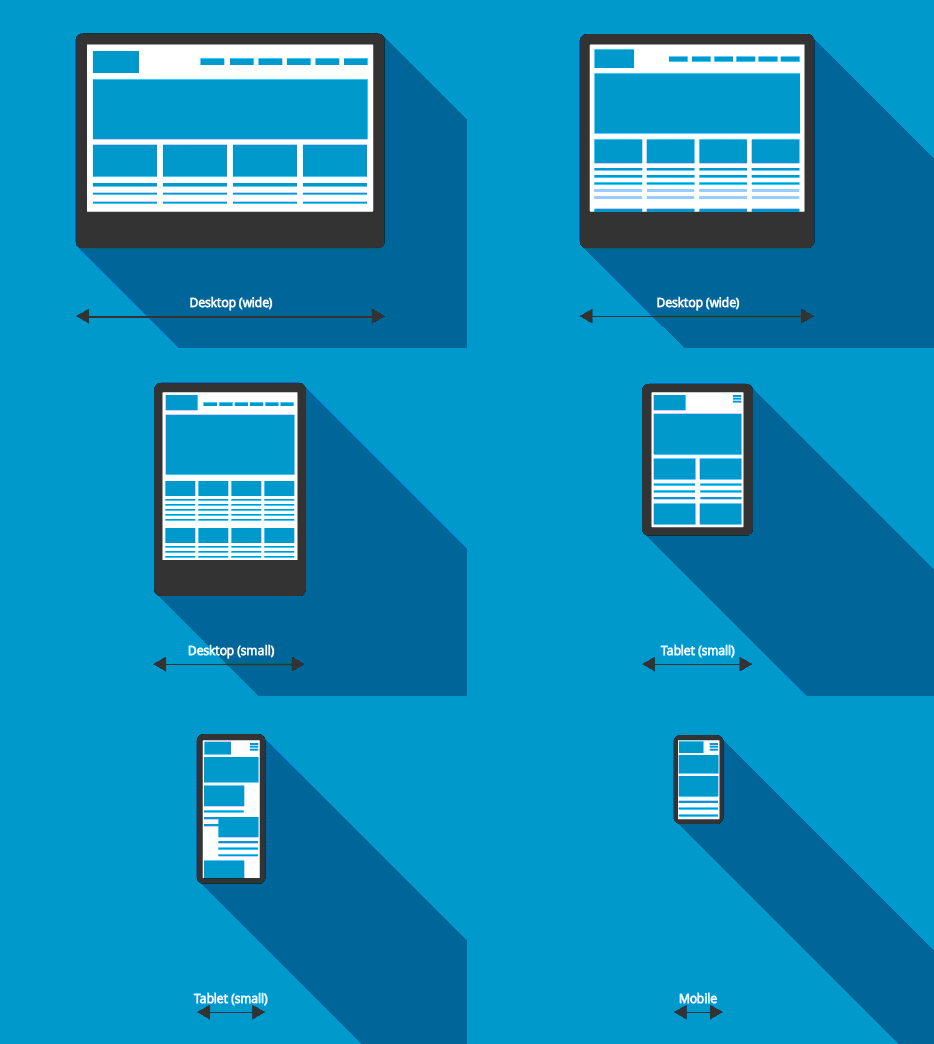
Responsive web design (RWD) approach used to design a website that automatically adapts to the devices of different screen sizes. This technique is already at its apex and is in the current demanding design strategy.
RWD process use with the help of different frameworks like Bootstrap, Skeleton, Foundation, Kube, and many other. It is not necessary to use frameworks to design responsive websites. As there are many updated/new and efficient frameworks available for designing a responsive website, they have many advantages. Some of the ways through which frameworks can help:
- Avoid repetitive action
- Utilize the responsive design concepts
- Add consistent to the projects
- Create consistency between developers
Before going to the topic, let’s have some knowledge about the background of Bootstrap.
Bootstrap Background
Mark Otto and Jacob Thornton developed Bootstrap as a framework to encourage consistency across internal tools. It was originally named as Twitter Blueprint. Many different libraries were created before the development of bootstrap. At the time of interface development, these libraries were used which led to instability and a high maintenance burden.
Prior to release, its name was changed from Twitter BluePrint to Bootstrap.
As Twitter developer Mark Otto said:-
“A super small group of developers and I got together to design and build a new internal tool and saw an opportunity to do something more. Through that process, we saw ourselves build something much more substantial than another internal tool. Months later, we ended up with an early version of Bootstrap as a way to document and share common design patterns and assets within the company.”
Releases of Bootstrap
- Bootstrap 1 – On August 19, 2011, and released as an open source project.
- Bootstrap 2 – On January 31, 2012. This release added:
- a twelve-column responsive grid layout system.
- inbuilt support for Glyphicons
- several new components
- changes to many of the existing components.
- Bootstrap 3 – On August 19, 2013. This release had features as:
- mobile first approach.
- redesigned components to use flat design.
Alpha and beta versions were released before the official release of Bootstrap 4.
- Alpha version – On August 19, 2015.
- Beta version – On 10 August 2017.
- Bootstrap 4 – On January 18, 2018. This release includes:
- SASS support
- Flexbox support
So now, let’s move towards the main point.
What is Bootstrap?
Bootstrap is a free and open source framework. It is a front-end development framework use to design websites and web applications. It contains HTML and CSS based design templates as well as optional Javascript extensions. As there are different web frameworks available to create RWD but bootstrap relate itself to front-end development only. It also gives you the facility to easily create responsive designs.
This framework needs JavaScript library called jQuery which is popular and widely used. This library jQuery comes in use to simplify and to add cross-browser compatibility.
Bootstrap 4 is break up into two main/major files:
- bootstrap.css: This contains CSS files which describe how HTML elements are to be displayed on a screen, paper, or in other media. These CSS files are used with HTML to design the user interface of a website.
- bootstrap.js: This contains javascript files. The code of javascript is written into an HTML page as it is a client-side scripting language. When a user requests an HTML page, the script which contains javascript code is sent to the browser and it’s up to the browser to do something with it.
In Bootstrap 3 there is one more file available:
- glyphicons (font icons): These are the icon fonts which can use in the projects and were first introduced for mobile applications. Now, they are not only used for mobile apps but are also used for creating visual navigation on websites or web applications. In this version, around 260 glyphs from the Glyphicon Halflings set are included.
Features of Bootstrap
I think by now you may have come to know about some of its features. Furthermore, it has many features and some of them are:
- Easy to Use: As bootstrap contains HTML and CSS based design templates this makes it easier to use and those who have just basic knowledge of HTML and CSS can use bootstrap. It is very adaptable.
- Mobile-Friendly: The version Bootstrap 3 first introduce the approach called Mobile-first approach. This means that nearly all things have been redesigned to start with a lower screen size.
- Responsive Features: As you know nowadays everyone uses their smartphones to surf the internet. So, RWD approach designs a website that automatically adapts to the devices of different screen sizes.
- Browser Compatibility: It is compatible with almost all the modern browsers. Some of them are as follows:
- Chrome
- Firefox
- Internet Explorer
- Safari
- Opera, and etc.
- Great Grid System: The bootstrap grid system allows up to 12 columns across the page. Designers can use grids according to their need whether they want a fixed grid or responsive grid.
- Extensive list of Components: It provides so many components which help in web designing and development. Some of the components are:
- Dropdowns
- Navigation Bar
- Breadcrumbs
- Button Groups
- Labels
- Badges
- Alerts
- Progress Bar
- Thumbnails
- Alerts
- Media object
- List group
- Panels, And many others.
- Bundled Javascript plugins: The bootstrap package contains many javascript plugins. These plugins help in making interactive components. Using these plugins in a project only needs few lines of code.
- Good Documentation: As you know it has different features. Along with these features, it also provides a great documentation with examples and demo. Documentation makes it easier for even someone new.
I think maybe now you are eager to download it. So, let’s start with this process.
Steps to Download Bootstrap
Step 1:
Now the main point is From where you can download it?
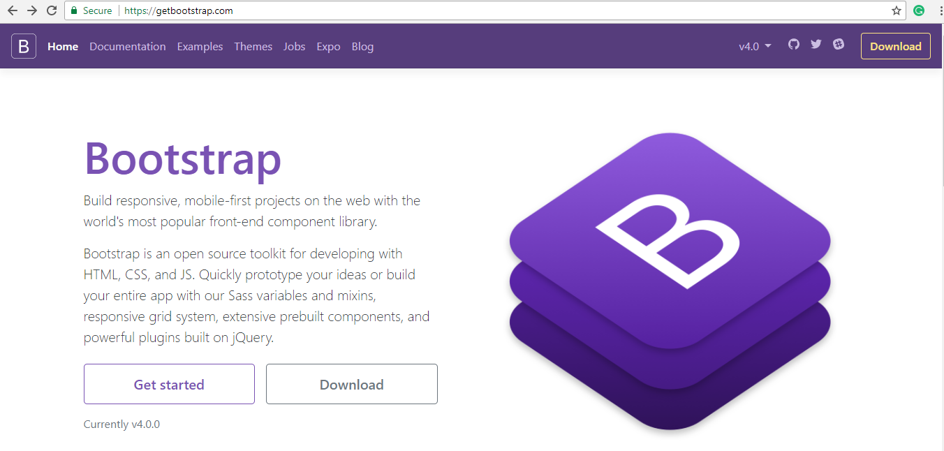
So, Go to the link: https://getbootstrap.com/
Step 2:
Click on the button Download.
Step 3:
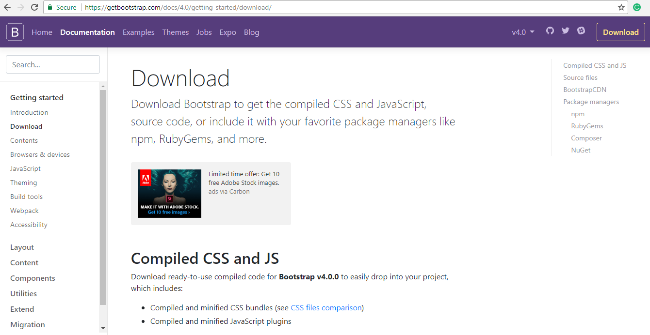
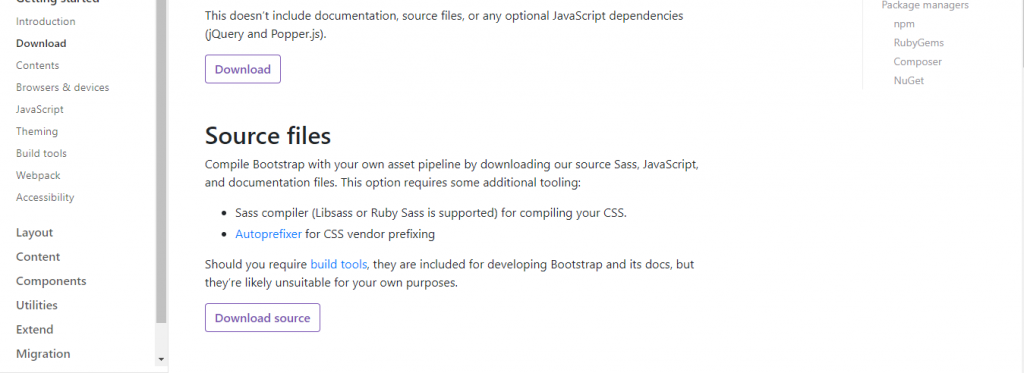
Now, this page will open.
Here you can download both Compiled CSS and JS and Source files as shown in the image.
Step 4:
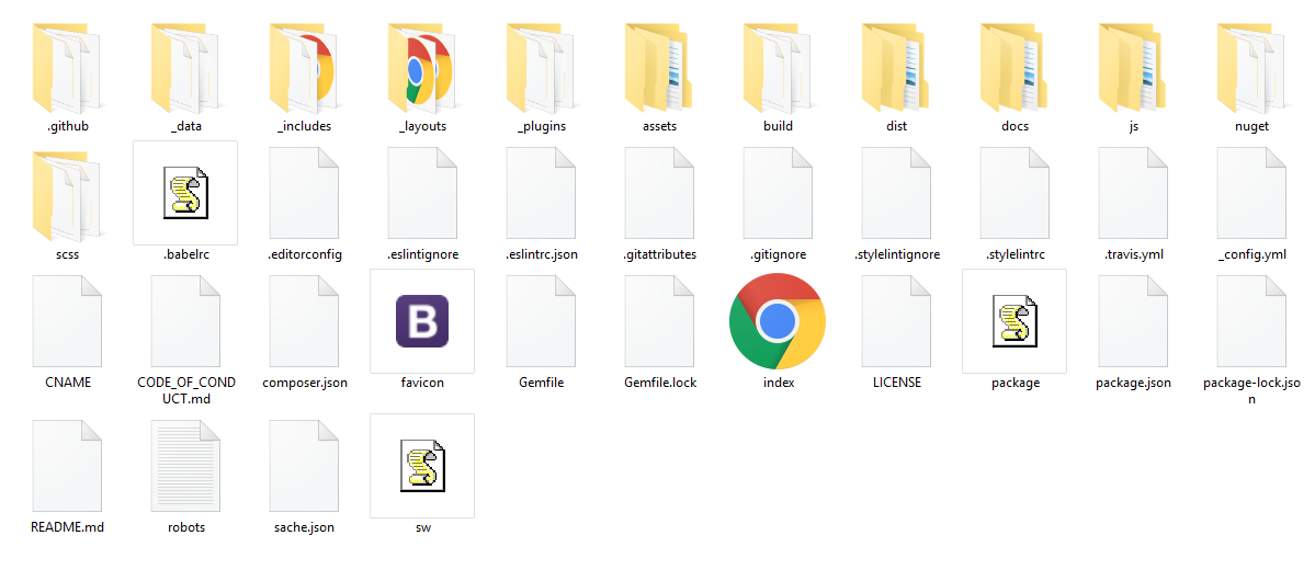
After downloading both Compiled CSS and JS and Source files, you will get 2 Zip files.
Now to work with them first you have to unzip these files then open these files.
In these files content will like:
Now it’s been downloaded.
I am sure you have a question…
NOW, WHAT?
So, let’s understand it with a simple example.
How to create a bootstrap file?
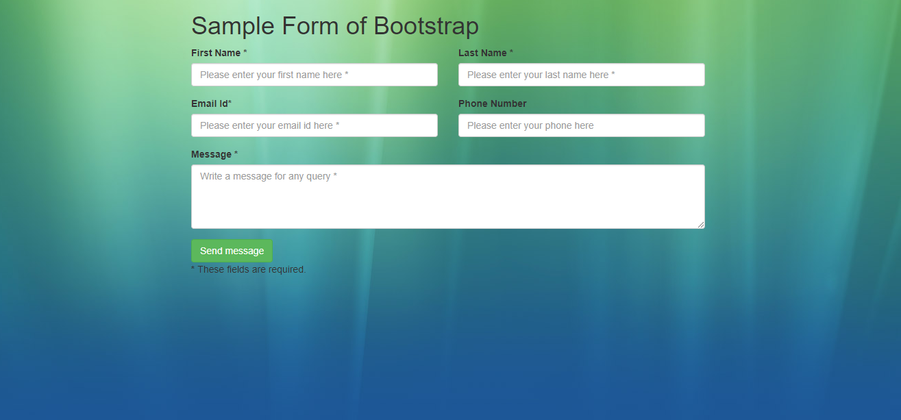
Now let’s create a simple form to understand how to work with it.
Step 1:
Create a notepad file and save it with the name “form.html“.
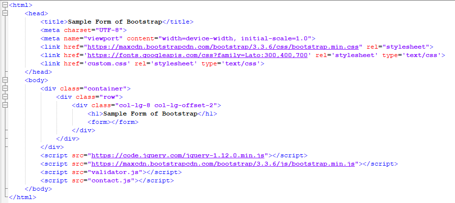
Now, start with a simple HTML layout for the form.
Here,
- In the <head> </head> tag, we include the Bootstrap stylesheet and a local custom.css stylesheet along with Lato from Google fonts.
- In <body> </body> tag, we include jQuery and Bootstrap scripts.
- A local contact.js file is also included which will handle AJAX sending of the form.
Step 2:
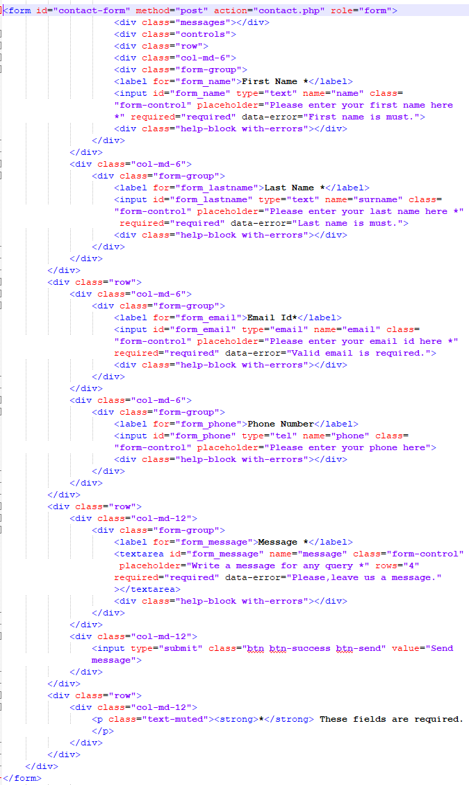
Now, we will create a form which we write in <form> </form> tag.
Step 3:
You can make a form attractive by adding a background image in the form.
<body background=”bg_Image.jpg”>
Step 4:
Now let’s have a look at the form.
Advantages of Bootstrap
There are several advantages of bootstrap:
- It is very easy to use for web designing and development as it contains HTML and CSS based design templates.
- This framework is a brisk framework which is quite a fast framework than other frameworks.
- Due to the current demand for responsive websites, bootstrap use Responsive Web Design (RWD) technique. This technique helps bootstrap to craft a mobile ready site smoothly and easily and sets web design as per the dimensions of the particular device.
- Bootstrap saves time because it has sample templates, cross-browser capabilities, and responsiveness.
- It provides big support for the problems and queries. Along with this, it also provides documentation with examples and demos.
- Integration/ Alliance is very easy with Bootstrap because this framework easily integrated with bulk frameworks uninterrupted with existing sites or the new one.
- It is a framework which follows the basics of HTML. It means that bootstrap holds the base styling HTML elements like:
- Buttons
- Forms
- Tables
- Lists
- Images
- Typography
- Icons, And etc.
- Websites or mobile apps, created with Bootstrap technology, can ensure you the awesome consistency of developers and the designers.
- It is customizable. Developers can customize it as per the project specifications. As it has Common utilities, CSS, Javascript Components, and components which are available to create ease for developers.
- It is a consistent framework which has cross-browser capabilities.
As everything has advantages, they also have some disadvantages.
Disadvantages of Bootstrap
- To make every website different, you have to do heavy customization. Otherwise, all your websites will look same.
- If you want to deviate your design from bootstrap customary design then it requires a lot of styles overriding or rewriting files which require a lot of time.
- In this, Javascript is connected to jQuery and jQuery is the most common library which have many number of plugins. But you used very few of them which leads most of the plugins to be unused.
- As one of the advantages of Bootstrap is Frequent updates but it is also a disadvantage because updating a bootstrap framework can be a pain. The main issue is that updates in bootstrap are not easy to integrate.
- As this framework has HTML based design templates. This means they have predefined styles, but nowadays to make a website attractive designers have to use different styles.
Conclusion
Bootstrap is the trendiest front-end design framework and the main factor behind this is a large number of resources are accessible through it. It provides a great documentation with examples and demos. Documentation not only helps designers to design their website but also helps new learners. This provides the facility to design responsive websites. These responsive websites adjust themselves according to the size of the device.
As Bootstrap holds a very big online community, help is easily available if you have any issues/ query. Every Component and plugin is available in documentation with their live examples which makes it easier to use. It allows you to design the structure of the website first and then every other style. Keep one thing in mind, you should have the working knowledge of web development concepts like HTML and CSS.
For any further queries, you are free to place your valuable comments in the comments section below!
- What Is Big Data Visualization? - January 22, 2021
- Five Benefits of Big Data Analytics for E-commerce - July 9, 2020
- Google Data Studio Vs. Tableau: Which One is More Suitable for Your Business? - June 25, 2020

