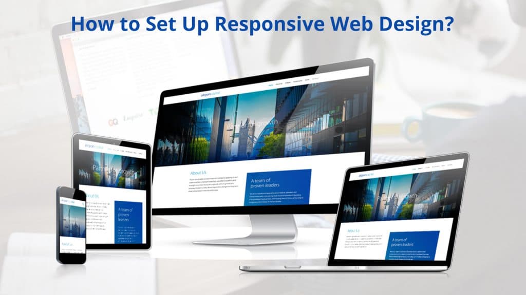
Whether you are a beginner or an experienced in the genre, here is the guide to tell you regarding how to set up responsive web design. Since, creating the responsive design can be confusing, you need to think radically. With time, responsive design is getting drifted from the source of passing fads and will rapidly enter the genre of standard practice. There is the magnitude of the paradigm shifting, therefore, fundamental there is the transition from the table based layout to the form of CSS. This is the most innovative way of designing and stylising the website for the reason of future display.
As a result, in the past few years the concept of responsive designing has become extremely popular in the website design genre. Here is the summary to help you catch up with the concept.
Jump to Section
What do You Mean by responsive Web Designing?
You can get right into the concept by following the algorithms. This is an article telling you in details regarding responsive designing. For this, you have to move into action and open the article on the desktop browser. Then it is time to make the browser thin and wide. You should view the magical layout for adjustment. This will help you comfortably fit the new width of the specific browser. You can even make the page skinny just like the resolution of the mobile device.
When talking about responsive website designing, you need to talk about the creator and Ethan Marcotte is the name. In the article, all the key ideas regarding responsive web design are better discussed. In the technical sense, it is not just a single thing to attempt. Here you have the amalgamation of the technologies and the ideas that create the entire thing. If this sounds confusing then it is the best to break down the entire concept and enter each step separately.
Exact Version of Responsive Web Design
It is important to know about the exact version of responsive designing. It is a major question to ask that whether responsive design can help in solving a problem? However, you should be aware that computer hardware is not the only one to make use of the web browser. Many other devices make use of the same, and this has helped in changing the face of the mobile web. With the changing of the landscape of the web browser, there are possible changes in the expectations of the users.
People now can make use of the web browser on the phone and this makes it easy to search and navigate things without having to sit before the desktop. Thus, in response to the same, the web designing community started to create the mobile versions based on the websites. And, it has become imperative these days for every website to have both desktop versions and mobile versions for the sort of preferred navigation.
Technology never stops from proceeding. After the phone market was revolutionized in the way some more changes came about in the industry. In the context, apart from phones more devices came to the scene and these are like touchscreen tablets, small notebook computers and the rest. Along with these, the netbooks started appearing everywhere. Adding to these the large screen resolutions started appearing at the best, and the web designers did not waste time in taking advantage of the same.
It has already been mentioned that responsive design is not just a single concept. It is mainly a collection of ideas and techniques. Now, it is the time when you should talk about the individual parts of this bigger solution at large. 
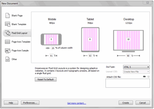
Fluid Grid
The most important idea behind the responsive web design is fluid grid. In recent times, it has become the practice to create the liquid layout that can expand with the widening of the page and it has been quite popular in creating the fixed width layouts. This helps in matters of page designing and this comes with the numbers of fixed pixels and these are automatically centered as part of the page. If you consider the massive numbers of screen resolutions in the present market, you cannot deny the advantages of the liquid layouts. Here lies the importance of fluid grid.
 Media Queries
The second and undeniable part of responsive web design is CSS3 media queries. This is the one to currently enjoy the sort of decent digital support across most of the contemporary browsers. If you are not aware regarding the concept of CSS3 media queries, it is best for you to know that they basically allow you to have all latest data regarding the site visitor and the unconditional use of the CSS style. However, most users are interested in the min width media feature, and this helps in allowing the specific use of CSS style. If you want to apply styling to the mobile phone you need to consider the option of media queries.
Resources
The concept of responsive web design has now completed several years, therefore, there are best of resources to help you. This is the article to help you avoid all confusions regarding responsive web designing. In case, you have the plan to utilize the same in matters of web application you can naturally do so with the best of success. Remember, it is important that you make use of the major resources in order to perfectly access the option of responsive web designing.
What is Responsive Web Design in Actual?
Responsive web design is something to make your web page appear good on almost all devices. Responsive web design makes use of only CSS and HTML. You cannot call the same program or a JavaScript. The web pages should be designed in the way so that they can be viewed by using several devices like desktop, phones, tablets and the rest. Responsive designing makes the web page look good and easy for usage regardless of the device you are using. This is the kind of designing process to help all data fit into the device. Now, there is no omitting of the vital information.
It is known to be responsive web design when you make use of the CSS and the HTML for the reason of resizing, shrinking, hiding and enlarging or moving the content in the manner to make it appear admirable on the screen.
Setting of Responsive Web Design
In the making of the responsive web pages, you should make sure to add the following element in almost all the web pages.
Example
<meta name="viewport" content="width=device-width, initial-scale=1.0">
This will help in setting the viewport of the page, as a result, this will help in giving instructions to the browser.
Consequently, now you know how to control the dimension of the page and scaling.
Responsive Images
Responsive images are those images that scale perfectly to fit properly the size of the browser.
Making Use of the Width Property
In case of CSS, the width property can be set to 100%. Now the image becomes responsive with the perfect up and down scaling.
Example
<img src="img_girl.jpg" style="width:100%;">
CSS can make the image large compared to the original size of the image. In this case, a better solution would be to make use of the max width property.
Making Use of the Max Width Property
In addition, the max width property can be set to 100%. Furthermore, this will make the image scale down & never make it appear big when compared to the original size.
Example
<img src="img_girl.jpg" style="max-width:100%;height:auto;">
Different Images Based on Browser Width
The picture HTML component will allow you to define various images for different browser for window sizes. Hence, you can well resize the browser widow to see how the image appears depending on the width of the image.
Example
<picture>

<source srcset="img_smallflower.jpg" media="(max-width: 600px)">

<source srcset="img_flowers.jpg" media="(max-width: 1500px)">

<source srcset="flowers.jpg">

<img src="img_smallflower.jpg" alt="Flowers">

</picture>
Responsive Size of the Text
The size of the text can be reset by making use of the “vw” unit. This means the “viewpoint width”. In the way the size of the text will follow the shape and intensity of the web browser.
Media Queries
With the resizing of the text and the images, it is usual to make use of the media queries in matters of the responsive web pages. With the help of the media queries, you can completely define the various styles in matters of the different browser sizes. One can sit in resizing the browser window to view the three div elements below. This will help in horizontal display on the larger screens and can be vertically stacked especially on the small screens.
More Info
The responsive web design should make the web page look impressive on the larger desktop screens and appear small on the display of the mobile phones.
Because there are several CSS Frameworks offering with the Responsive Design, the process has become easier.
These are free and can be easily used for the purpose. The best way to create the responsive web page is to make use of the responsive style sheet like the W3.CSS. The component of W3.CSS will make it easy for developing the sites that appear to be nice in any shape ready to fit desktop, laptop, tablet or phone.
Bootstrap
Another most popular framework is the Bootstrap. It makes use of CSS, HTML and jQuery for the making of the responsive web pages.
CSS and HTML Code
It is quite challenging to learn how to code CSS & HTML in successful building of the websites and this can be quite challenging. For this, you need to make use of explanations and additional help which is going to work a long way. For your advantage, there are plenty of online schools, workshops and boot camps.
Conclusion
The usage of internet has become quite popular and in trend these days, as a result, and the recent years the growth of mobile usage has exploded the scene. Therefore, more people are downloading things from the internet on the mobile devices. As a result, usage of responsive mobile design is at all-time high.
With the use of Responsive Web Design, one can at best develop a suitable website which can fit well on every design and every screen size. Therefore, the size of the desktop or the mobile screen does not matter. Responsive web design is all about providing the kind of intuitive and the gratifying experience for all users. All the cell phone and computer users can enjoy the advantages of the responsive website. You may deploy mobile phones for the reason of regular internet usage. Web pages are large and it is tough to make them fit the mobile screen.
In conclusion, Responsive Web Design can help making things appear exact and clear on the mobile and the desktop screens.
- What Is Big Data Visualization? - January 22, 2021
- Five Benefits of Big Data Analytics for E-commerce - July 9, 2020
- Google Data Studio Vs. Tableau: Which One is More Suitable for Your Business? - June 25, 2020
Like!! Thank you for publishing this awesome article.