Data visualization is presenting your data in a way that makes it easier to comprehend and gain informative insights effectively. It is simply making your data more interactive. These data visualizations can then be used for a variety of purposes: annual reports, informative dashboards, sales and marketing reports, investor slide decks, and virtually anywhere where information needs immediate interpretation.
But getting clean and valuable insights can become a complex task without the right tools. Fortunately, we have penned down the five best data visualization tools that can automatically create engaging visualizations.
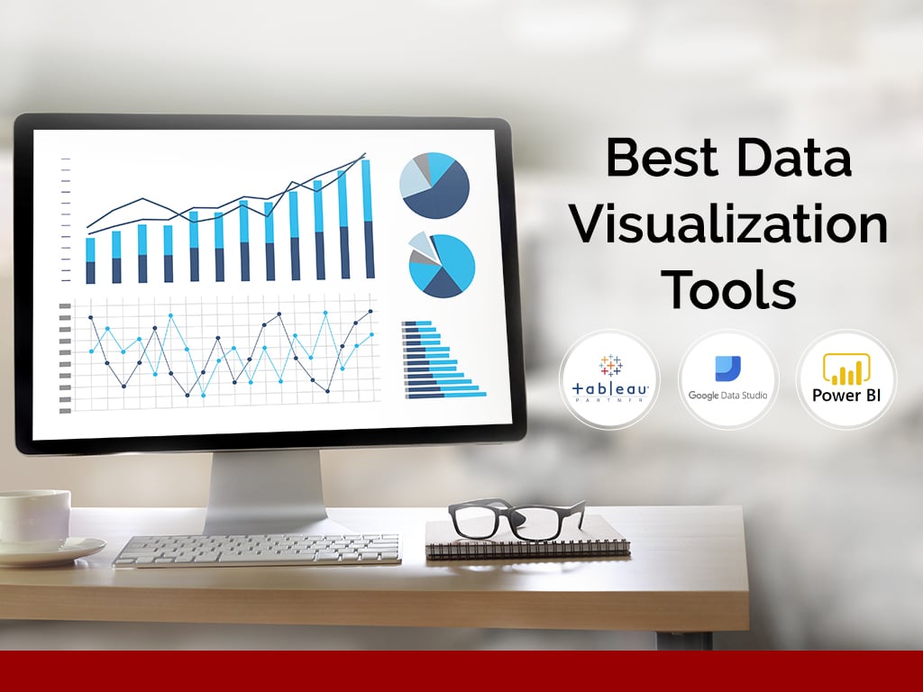
Here’s a look at some of the best data visualization tools:
Jump to Section
Tableau
One of the most popular and effective data visualization tools in the market, Tableau is considered simple and easy to use. It is available in a range of versions, including Desktop, Server, Mobile, Online, and Tableau Public that’s free.
The reason why most users prefer Tableau is the variety of tools it offers. What’s interesting is that even its Public version offers a great deal in terms of options. Data visualization companies have experts who know how to create stunning visualizations on the basis of your need – be it scatter plots, bubble maps, or any other chart.
For the uninitiated, the Tableau Public version comes with official supporting documentation that’s easy to understand and follow. You can also download some sample data sets to help you comprehend better.
Google Data Studio
Google Data is a useful tool that is used by most data visualization experts as it helps in making data accessible so that your audience can understand what you’re trying to explain.
The data source does not matter here – Google Data Studio takes care of data authentication, access rights, and structures for use in data visualizations. What’s more, you can import data from various sources, including Analytics, Google Ads, Campaign Manager, and MySQL, among others.
You just have to upload your raw data and follow the instructions to create simple reports and dashboards. It’s easy to create charts and graphs in a few steps.
Plotly
When it comes to data visualization, interactivity plays a significant role. That’s a big reason why Plotly is favored by data visualization companies. If you’re looking for embeddable interactive charts, then your search ends right here. Not only do you get much flexibility, but each chart is very interactive, and with this, it enhances the user experience.
Previously, complex and sophisticated data visualizations involved a large team of people. However, with Plotly, this concern is resolved in a simple manner. This web-based data visualization platform can be used to create everything from simple charts to anything complex directly in the web browser.
The interface of the tool is intuitive and user-friendly and comes packed with several features. If you want access to the entire pool of features, then you need to subscribe to this service.
RAW
In its own words, RAW calls itself the “missing link between spreadsheets and vector graphics.” This open web app built with the D3.js Javascript library enables users to represent their data in an effective manner, without worrying about coding or technical expertise.
It’s one of the tools that’s being used by most of the data visualization experts as it’s helpful for complex data visualizations in formats that can be further edited in design tools.
You can create a range of charts, including Voronoi tessellations to hexagonally binned heatmaps. Generally, these are difficult to make, but with RAW, it’s much simpler and hence preferred!
Visage
When you want to create chart-heavy reports or dashboards, look no further than Visage. Since visual communication is an important aspect of marketing, this tool helps communicate your brand vision in an effective manner, without any sort of coding. It comes with a simple interface and is extremely user-friendly – now that’s a win-win for sure!
Visualize all your data into informative insights within minutes with the best data visualization tools. Get in touch with our experts to help you achieve amazing results with your data.
- What Products Should You Sell on Amazon? - November 18, 2020
- 10 Reasons Why You Should Start Selling on Amazon - October 22, 2020
- Comparative Study of Top 6 Web Scraping Tools - September 3, 2020