Hi, we are here to discuss “Scatter plot charts and Polar charts”, but before we start our discussion on these two charts first we all have to understand what is charts and why we need it. So, a chart is nothing but a graphical representation of data.
The data which is to be used here is of any kind such as tabular numeric data or functions or quantitative data. The data is represented by symbols like lines in line charts, bars in bar charts, circular statistical graphic in polar charts and cartesian coordinates to display values for two variables for a set of data in scatter polar charts.
In addition, here we are only focusing on polar and scatter plot charts.
Jump to Section
What is chart?
A chart is a graphical representation of tabular numeric data or functions or quantitative data. Take a look at the below diagram of the chart.
Why we need charts?
As we all know that it is very difficult to maintain or understand a large amount of data. So, for that purpose we need charts to display that large amount of data.
These charts are generated by either manually or automatically through computer programs.
Chart Design and style
Before, going to discuss the types of charts we need to know about chart design and style.
we can set the various properties of the chart as shown below.
Charts
By using charts object we can set the spacing between title and edge of the container and also margin from the labels of x-y axis.
chart: {
             // spacing
             spacingBottom: 15,
             spacingTop: 10,
             spacingLeft: 10,
             spacingRight: 10,

             // Width and height of a chart is defined in the style of container
            width: null,
            height: null
 }
Credits
Credits of a chart can be set by using the below object.
credits: {
    position: {
        align: 'left',
        verticalAlign: 'bottom',
        x: 10,
        y: -10
    }
}
Axis Labels
We can set the alignment of axis labels by using this.
labels: {
    align: 'right',
    x: -10,
    y: 0
}

// Labels can rotated by using rotation option inside labels. By, default it is
auto rotated.
Title and Subtitle
We can also set the properties of title and subtitle as below.
title: {
    text: 'Title of the chart',
    floating: true,
    align: 'right',
    x: -30,
    y: 30
}
Borders
We can set the various border properties as shown below.
charts:{
      borderWidth: 1px,
      plotBorderWidth: 1px,
      borderColor: 'red',
      plotBorderColor: 'green',
      shadow: true,
      plotShadow: true
}
Backgrounds
We can set the background properties also.
charts:{
      backgroundColor: 1px,
      plotBackgroundColor: 'Light gray',
      plotBackgroundImage: 'image url'
 }
Fonts
We can change the font family also.
Highcharts.setOptions({
    chart: {
        style: {
            fontFamily: 'serif'
        }
    }
});
Tool-tip
Tool-tip is HTML div, that is visible only when we hover on some point. We can set the properties of tool-tip as below.
tooltip: {
       headerFormat: '<b>{series.name}</b><br>',
       pointFormat: '{point.x} ft, {point.y} kg',
       backgroundColor: {
                     linearGradient: [0, 0, 0, 60],
                     stops: [[0, '#FFFFFF'],[1, '#E0E0E0']]
                        },
      borderWidth: 1,
      crosshairs: [true,true]
}
Types of charts
1. Scatter plot chart
2. Polar chart
Scatter Plot chart
It is basically a collection of points on the chart, in which every point has values in the form of x-y coordinates. Here, we use Highchart library to display the scatter plot chart. In this chart, data scatter everywhere on the x-y coordinates.
In addition, we can easily differentiate multi-set of data point because of the different structures. Hence, it is a very useful chart. It does not connect one point to another. Also, below is the representation of scatter plot chart.
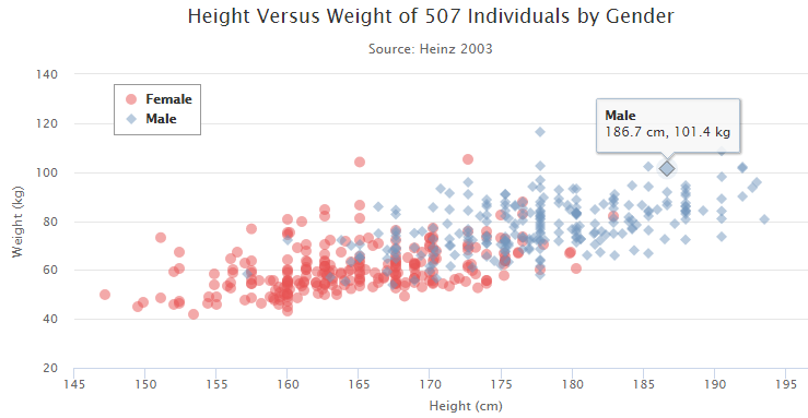
In above chart there are two sets of data one is represented by the red mark and other is represented by the blue mark. So that we can easily distinguish them.
To scatter plot chart we need to set the chart.type object to be scattered as shown below.
chart : {
 type : 'scatter',
 zoomType : 'xy'
 }

// If we have so many points on the chart and they are very close to each other, then we need to set zoomType to be 'xy'.
Options for scatter plot chart
Title
It is used to set the title of scatter plot chart.
title : {
 text : 'Height Versus Weight of 507 Individuals by Gender'
 }
Subtitle
It is used to set the subtitle of scatter plot chart.
subtitle : {
 text : 'Source: Heinz 2003'
 }
xAxis
It is used to set the label or title for the x-axis. Also, to show the start or end point tick.
xAxis : {
    title : {
           enabled : true,
           text : 'Height (cm)'
           },
    startOnTick : true,
    endOnTick : true
 }
yAxis
It is used to set the title for the y-axis.
yAxis : {
     title : {
           text : 'Weight (kg)'
            }
 }
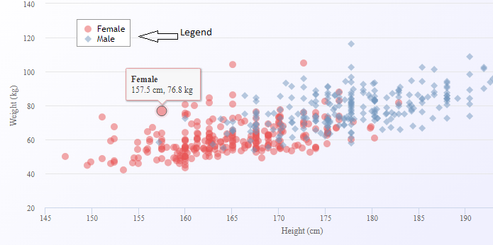
legend
legend : {
       layout : 'vertical',
       align : 'left',
       verticalAlign : 'top',
       x : 100,
       y : 70,
       floating : true,
       backgroundColor : (Highcharts.theme && Highcharts.theme.legendBackgroundColor) ||'#FFFFFF',
       borderWidth : 1
 }
Below is the example of legend on the chart.
plotOptions
It is used to set the properties of data point like color and the tooltip for that point.
plotOptions : {
      scatter : {
      marker : {
      radius: 5,
      states: {
          hover: {
             enabled: true,
             lineColor: 'rgb(100,100,100)'
               }
             }
          },
      states: {
          hover: {
              marker: {
                    enabled: false
                    }
                }
             },
      tooltip: {
           headerFormat: '<b>{series.name}</b><br>',
           pointFormat: '{point.x} cm, {point.y} kg'
            }
         }
     }

/* In series.name the value of "name" comes from the series object */

/* In point.x and point.y the value of "x" and "y" comes from data:[ [ x,y ] ]*/
series
It contains the data part that is to be displayed on the chart.
/* data : [ [ x,y ] ] */

series: [{
 name: 'Apple',
 color: 'rgba(220, 56, 65, .5)',
 data: [[32,43],[45,65],[54,44],[64,24]]

}, {
 name: 'Mango',
 color: 'rgba(119, 152, 191, .5)',
 data: [[28,46],[76,67],[78,95],[55,52]]
 }]
We can display multi-set of data on scatter plot chart.
Code for scatter plot chart is shown below:
<!DOCTYPE HTML>
 <html>
 <head>
 <meta http-equiv="Content-Type" content="text/html; charset=utf-8">
 <meta name="viewport" content="width=device-width, initial-scale=1">
 <title>Scatter plot chart Example</title>

<style type="text/css">

</style>
 </head>
 <body>
 <script src="https://code.highcharts.com/highcharts.js"></script>
 <script src="https://code.highcharts.com/modules/exporting.js"></script>

<div id="chartjs"></div>

<script type="text/javascript">
 Highcharts.chart('chartjs', {
 chart: {
      type: 'scatter',
      zoomType: 'xy'
       },
 title: {
      text: 'Height vs Weight chart representation'
       },
 xAxis: {
      title: {
           enabled: true,
           text: 'Height (cm)'
           },
      startOnTick: true,
      endOnTick: true
      },
 yAxis: {
      title: {
           text: 'Weight (kg)'
            }
       },
      legend: {
           layout: 'vertical',
           align: 'left',
           verticalAlign: 'top',
           x: 100,
           y: 70,
           floating: true,
           backgroundColor:(Highcharts.theme && Highcharts.theme.legendBackgroundColor)||'#FFFFFF',
           borderWidth: 1
       },
 plotOptions: {
           scatter: {
                  marker: {
                        radius: 5,
                        states: {
                             hover: {
                                 enabled: true,
                                 lineColor: 'rgb(100,100,100)'
                                   }
                                }
                          },
                  states: {
                         hover: {
                              marker: {
                                    enabled: false
                                     }
                               }
                        },
                 tooltip: {
                        headerFormat: '<b>{series.name}</b><br>',
                        pointFormat: '{point.x} cm, {point.y} kg'
                        }
                 }
          },
 series: [{  name: 'Apple',  color: 'rgba(220, 56, 65, .5)',  data: [[32,43],[45,65],[54,44],[64,24]] }, {  name: 'Mango',  color: 'rgba(119, 152, 191, .5)',  data: [[28,46],[76,67],[78,95],[55,52]]  }]
    });
</script>
 </body>
 </html>
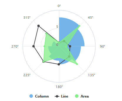
Polar chart
Polar chart is a graphical representation of multiple data in the form of two dimensional chart of more than three variables. It is also known as radar chart. It uses polar coordinates. Here, we need highcharts-more.js file to generate polar chart. Also, below is the representation of polar chart.
To generate polar chart we need to set chart.polar object to be true as shown below.
chart : { polar : ture }
Options for the polar chart are
chart
when this has been set true then, the cartesian coordinates are transformed into polar coordinates.
chart : { polar : ture }
title
This is used to set the title of the polar chart.
title : { text : 'Example of Polar Chart' }
pane
It acts as the container for axes for polar charts.
pane : {
    startAngle : 0, // Starting angle of polar chart
    endAngle : 360 // Ending angle of polar chart
 }
xAxis
It is used to set the intervals between starting angle and ending angle on the pane.
xAxis : {
     tickInterval : 45,  // Interval between starting and ending angle
     min : 0,  // Minimum angle of x-axis
     max : 360 // maximum angle of x-axis
 }
yAxis
y-axis should be zero.
yAxis : {
    min : 0
 }
plotOptions
plotOptions : {
          series : {
          pointStart : 0,
          pointInterval : 45
                },
          column : {
         pointPadding : 0,
         groupPadding : 0
               }
 }
series
series : [{
      type : 'column',
      name : 'Column',
      data : [8, 7, 6, 5, 4, 3, 2, 1], // data values which we want to display on chart
      pointPlacement : 'between'
       }, {
     type : 'line',
     name : 'Line',
     data : [1, 2, 3, 4, 5, 6, 7, 8] // data values which we want to display on chart
      }, {
     type : 'area',
     name : 'Area',
     data : [1, 8, 2, 7, 3, 6, 4, 5] // data values which we want to display on chart
 }]
Series types
It is not mandatory to use all three types, but it depends on us how many datasets we want to display.
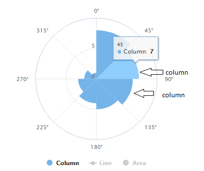
Column ( Below is the chart for column representation of data )
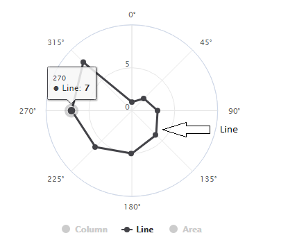
line ( Below is the chart for line representation of data )
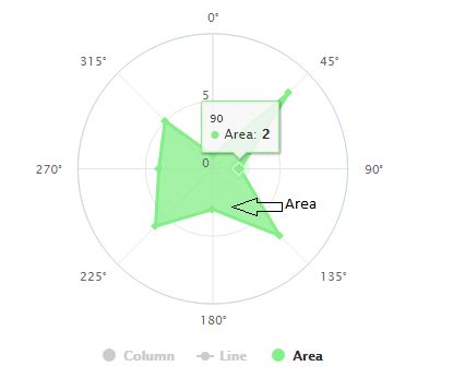
Area ( Below is the chart for area representation of data )
Code for the polar chart
<!DOCTYPE HTML>
 <html>
 <head>
 <meta http-equiv="Content-Type" content="text/html; charset=utf-8">
 <meta name="viewport" content="width=device-width, initial-scale=1">
 <title>Polar Chart Example</title>

<style type="text/css">

</style>
 </head>
 <body>
 <script src="https://code.highcharts.com/highcharts.js"></script>
 <script src="https://code.highcharts.com/highcharts-more.js"></script>
 <script src="https://code.highcharts.com/modules/exporting.js"></script>
 <script src="https://code.highcharts.com/modules/export-data.js"></script>

<div id="container"></div>

<script type="text/javascript">
 Highcharts.chart('container', {

chart: {
    polar: true
 },

title: {
    text: 'Polar Chart'
 },

pane: {
    startAngle: 0,
    endAngle: 360
 },

xAxis: {
    tickInterval: 45,
    min: 0,
    max: 360
     },

yAxis: {
    min: 0
    },

plotOptions: {
          series: {
               pointStart: 0,
               pointInterval: 45
                 },
          column: {
               pointPadding: 0,
               groupPadding: 0
               }
         },

series: [{
      type: 'column',
      name: 'Column',
      data: [1, 2, 3, 4, 5, 6, 7, 8],
      pointPlacement: 'between'
      }, {
      type: 'line',
      name: 'Line',
      data: [5, 6, 7, 8, 1, 2, 3, 4]
      }, {
      type: 'area',
      name: 'Area',
      data: [8, 7, 6, 5, 4, 3, 2, 1]
     }]
 });
 </script>
 </body>
 </html>
How to work with different types of data source
In Highcharts we can specify our data through series.data object inside configuration object. But sometimes we need to add data dynamically from different sources like CSV file, HTML table data and so on.
Loading data from csv file (Using Data module)
In this case, first we need to create a csv file where we write our data to display on a chart using data module but for some data sources, the data module doesn’t work perfectly. So, for that we have to preprocess our data. We will discuss it later. Below are the steps to render the data on chart through data module.
Creating CSV file ( data of Fuel consumption )
Category,Petrol,Diesel
 Amit,3.4,4.5
 Dev,6.2,5.2
 Karan,3.8,4.6
Creating Chart option initialization
Highcharts.chart('container', {
 chart: {
 type: 'column'
 },
 data: {
 csvURL: 'url where your csv data is stored with file name'
 },
 title: {
 text: 'Fuel Consumption'
 },
 yAxis: {
 title: {
 text: 'Units'
 }
 }
 });
// Here data.csv is csv file to render the data.
Loading Data without using data module
Data is same as in above method as shown below.
Content of csv file
Category,Petrol,Diesel
 Amit,3.4,4.5
 Dev,6.2,5.2
 Karan,3.8,4.6
Initialize the chart options
var chartOptions = {
 chart:{
 defaultChartType:'column'
 },
 title:{
 text:'Example of csv data representation without using data module'
 },
 xAxis:{
 categories:[]
 },
 yAxis:{
 title:{
 text:'Units'
 }
 },
 series:[]
 };
Processing the csv data
Highcharts.ajax({
 url:'data.csv',
 dataType:'text',
 success:function(data){
 var lines = data.split('\n');
 lines.forEach(function(line,lineNo){
 var items = line.split(',');
 if(lineNo == 0)
 {
 items.forEach(function(item,itemNo){
 if(itemNo > 0) chartOptions.xAxis.categories.push(item);
 });
 }
 else
 {
 var series = {
 data = [];
 }
 items.forEach(function(item,itemNo){
 if(itemNo == 0)
 {
 series.name = item;
 }
 else
 {
 series.data.push(parseFloat(item));
 }
 });
 chartOptions.series.push(series);
 }
 });
 Highcharts.chart('container', chartOptions);
 }
 });
Loading data from HTML table
Here data is available in HTML table.
HTML data
<table id="tableData">
   <thead>
       <tr>
          <th>Category</th>
          <th>Petrol</th>
          <th>Diesel</th>
       </tr>
   </thead>
   <tbody>
       <tr>
          <td>Arjun</td>
          <td>3.5</td>
          <td>4.5</td>
       </tr>
       <tr>
          <td>Karan</td>
          <td>5.5</td>
          <td>6.5</td>
       </tr>
       <tr>
          <td>Dev</td>
          <td>2.5</td>
          <td>6.2</td>
       </tr>
   </tbody>
 </table>
Rendering the HTML table data
Highcharts.chart('container', {
 chart: {
 type: 'column'
 },
 title: {
 text: 'Fuel Consumption'
 },
 xAxis:{
 title:{
 text:'Person'
 }
 },
 yAxis: {
 allowDecimal:true,
 title: {
 text: 'Units'
 }
 },
 data:{
 table:'tableData' // table id
 },
 tooltip:{
 formatter:function(){
 return '<b>'+this.series.name+'</b><br/>'+this.point.y+',' + this.point.name.toLowerCase();
 }
 }
 });
Loading JSON data
JSON data
[
[1,12],
[2,5],
[3,18],
[4,13],
[5,7],
[6,4],
[7,9],
[8,10],
[9,15],
[10,22]
]
Rendering of JSON data through chart
$(document).ready(function(){
 var chartOptions = {
 chart: {
 type: 'spline'
 },
 series: [{}]
 };

Highcharts.ajax({
 url: 'data.json',
 success: function(data) {
 chartOptions.series[0].data = data;
 Highcharts.Chart('container', chartOptions);
 }
 });
 });
Loading data from the database
PHP code to fetch the data from the database and render it on a chart
<?php
 error_reporting(0);
 while($row=mysqli_fetch_array($result)){
 $data[] = $row['value'];  // fetch the value from database table and insert into data array.
 }
 ?>
 <script>
 var chart = Highcharts.chart('',{
 chart:{
 type:'spline'
 },
 series:[{
 data:[<?php echo join($data,',');?>],
 pointStart:0
 }]
 });
 </script>
Conclusion
From this article, we have learned how to show the statistical or function data graphically using scatter plot and polar charts. Also, we have learned what is charts and why we use it. We have also learned what are the different data types to work with. I hope you will find this article a good source of knowledge. Thank you!
- What Is Big Data Visualization? - January 22, 2021
- Five Benefits of Big Data Analytics for E-commerce - July 9, 2020
- Google Data Studio Vs. Tableau: Which One is More Suitable for Your Business? - June 25, 2020